- Mark as New
- Bookmark
- Subscribe
- Mute
- Subscribe to RSS Feed
- Get Direct Link
- Report Inappropriate Content
Hazard Ratio Event Plot
How Do I generate an Hazard Ratio Event Plot? I managed to calculate HR using Proportional Hazards - but now I am stuck to generate the corresponding Plot.
(JMP Pro 17)
This post originally written in German and has been translated for your convenience. When you reply, it will also be translated back to German.
- Mark as New
- Bookmark
- Subscribe
- Mute
- Subscribe to RSS Feed
- Get Direct Link
- Report Inappropriate Content
Re: Hazard Ratio Event Plot
Hi @ManuelWilbring ,
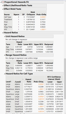
I'm not entirely sure how to do this, as it's not something that I would normally work with, however what I think you're wanting to do is something similar to what is shown in the JMP Clinical online help, here. If so, and you don't have Clinical and using Pro, then after you do your Proportional Hazards Fit, in your Hazards Ratios for Unit or for a categorical variable, I would right click that table in the report and select make into data table.
The below is an example from the JMP sample data, VA Lung Cancer.jmp file.
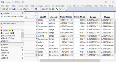
Right clicking the Hazard Ratios for Cell Type and selecting make into data table gives you the following table:
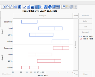
And then you can use Graph Builder to create your Hazards Ratio plot:
At least conceptually this is similar to the JMP Clinic help page from above.
Is this what you're looking to do? It appears as if JMP Clinical has this feature built into its functionality. Can you get JMP Clinical? It might be worth looking into it if you will be doing a lot of analyses like this.
Hope this helps!,
DS
- Mark as New
- Bookmark
- Subscribe
- Mute
- Subscribe to RSS Feed
- Get Direct Link
- Report Inappropriate Content
Re: Hazard Ratio Event Plot
Here are some additional tips to make it similar to what one sees in JMP Clinical if that is what you are looking for.
- Put the Upper and Lower in the interval zone and use custom interval for Error Interval type.
- Create a significance flag column and use that for color.
- Change marker to a simple vertical rectangle chosen from right clicking on the legend to the right. X axis is in log scale
- Add reference lines in the X axis by double clicking on X axis numbers to get axis properties.
Hope that helps.
Data Scientist, Life Sciences - Global Technical Enablement
JMP Statistical Discovery, LLC. - Denver, CO
Tel: +1-919-531-9927 ▪ Mobile: +1-303-378-7419 ▪ E-mail: chris.kirchberg@jmp.com
www.jmp.com


