- New to JMP? Let the Data Analysis Director guide you through selecting an analysis task, an analysis goal, and a data type. Available now in the JMP Marketplace!
- See how to install JMP Marketplace extensions to customize and enhance JMP.
- Subscribe to RSS Feed
- Mark Topic as New
- Mark Topic as Read
- Float this Topic for Current User
- Bookmark
- Subscribe
- Mute
- Printer Friendly Page
Discussions
Solve problems, and share tips and tricks with other JMP users.- JMP User Community
- :
- Discussions
- :
- Graphic template
- Mark as New
- Bookmark
- Subscribe
- Mute
- Subscribe to RSS Feed
- Get Direct Link
- Report Inappropriate Content
Graphic template
Hello,
I would like to add an item in the menu Analyse.
This new item would be "My Fit Y by X". This item opens exactly the same window as "Fit Y by X", but after filling the Yresponse, Xfactor and press OK, the graphic obtained has a specific template I can write in JSL.
In fact I would like only the graph "Normal Quantile Plot -> Plot Quantile by Actual" without "line of fit" and "Normal quantile Label" and additional personalization of colors and sizes.
Is this possible ? Is there an other simple way to apply a template of graphic ?
Thank you.
Accepted Solutions
- Mark as New
- Bookmark
- Subscribe
- Mute
- Subscribe to RSS Feed
- Get Direct Link
- Report Inappropriate Content
Re: Graphic template
Here is a method I like to use for simple scripts.
- Using a typical but simple JMP data table, typically one Y variable one X variable, create a display with customizations that are specific to your template display.
- Save the script to the Script File
- Edit the script, remove the X() and Y() specifications and typically you'd remove all display options specific to X and Y, like special labels and scaling information. Note: I suggest to be more detailed than the script shown below, in particular if you often change preferences. JMP produces the report using preferences, you override them by specifying items such as Line of Fit (0), etc.
- Copy the script
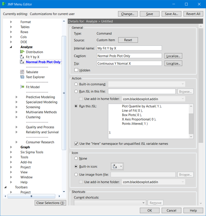
- From the menu select View --> Customize --> Menus and Toolbars --> Main Menu --> Analyze Left click on Fit Y by X and I'd select Insert After . A dialog will appear, see the attached picture #1#. Notice the fields I selected..notice I mistyped Nominal. The entire script is not visible and I will attach below
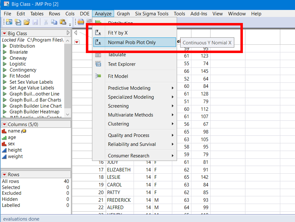
- To run the custom analyses, open your data table, select Analyze. Select your script. See attached pic #2. You will be prompted with the usual Fit Y by X dialog, user interface.
Good Luck!
Oneway(
	All Graphs( 0 ),
	Plot Quantile by Actual( 1 ),
	Line of Fit( 0 ),
	Box Plots( 0 ),
	X Axis Proportional( 0 ),
	Points Jittered( 1 )
);
- Mark as New
- Bookmark
- Subscribe
- Mute
- Subscribe to RSS Feed
- Get Direct Link
- Report Inappropriate Content
Re: Graphic template
Im sure this is possible, please see a small example below.
But I do not see "normal quantile plot" in "Fit Y by X" ...
You simply can use "Column Dialog" for requesting the parameter,
prepare some expressions for your graphs manipulating them with the proper input.
See scripting index for many examples.
BR
Names Default To Here( 1 );
// my platform
dt = Open( "$SAMPLE_DATA\Big Class.jmp" );

cd = Column Dialog(
	ex y = ColList( "Y", Min Col( 1 ), Max Col( 2 ), Data Type( "Numeric" ) ),
	ex x = ColList( "X", Max Col( 1 ), Modeling Type( {"Continuous", "Multiple Response"} ) )
);

Show( cd["ex y"] );
show(cd["ex y"][1]<< get name);

obj_expr = Expr(
	Distribution(
		Continuous Distribution( Column( Expr( cd["ex y"][1] ) ), Outlier Box Plot( 0 ), Normal Quantile Plot( 1 ) ),
		SendToReport(
			Dispatch( {expr(cd["ex y"][1]<< get name)}, "", Picture Box( 5 ), {Set Summary Behavior( "Collapse" )} ),
			Dispatch( {expr(cd["ex y"][1]<< get name)}, "Quantiles", OutlineBox, {Close( 1 )} ),
			Dispatch( {expr(cd["ex y"][1]<< get name)}, "Summary Statistics", OutlineBox, {Close( 1 )} )
		)
	)
);

Eval( Eval Expr( obj_expr ) );
- Mark as New
- Bookmark
- Subscribe
- Mute
- Subscribe to RSS Feed
- Get Direct Link
- Report Inappropriate Content
Re: Graphic template
Thank you Georg,
I will try this, I did not know how to access to the dialogues, your solution is probably the good one.
The normal quantile plot is an optionnal display once the graphic is open (after clic OK), not directly in the Fit Y by X.
Subsidiary question : You may know how to get access to the script of the Built-in Command : "ANALYSE:FIT Y BY X" ?
This command is called via the window : View --> Customize --> Menus and Toolbars --> Main Menu --> Analyse --> Fit Y by X --> Action. I don't know how to access to the script behind. If everything is allready written, why spending time to code and debug...
Many thanks
- Mark as New
- Bookmark
- Subscribe
- Mute
- Subscribe to RSS Feed
- Get Direct Link
- Report Inappropriate Content
Re: Graphic template
Here is a method I like to use for simple scripts.
- Using a typical but simple JMP data table, typically one Y variable one X variable, create a display with customizations that are specific to your template display.
- Save the script to the Script File
- Edit the script, remove the X() and Y() specifications and typically you'd remove all display options specific to X and Y, like special labels and scaling information. Note: I suggest to be more detailed than the script shown below, in particular if you often change preferences. JMP produces the report using preferences, you override them by specifying items such as Line of Fit (0), etc.
- Copy the script
- From the menu select View --> Customize --> Menus and Toolbars --> Main Menu --> Analyze Left click on Fit Y by X and I'd select Insert After . A dialog will appear, see the attached picture #1#. Notice the fields I selected..notice I mistyped Nominal. The entire script is not visible and I will attach below
- To run the custom analyses, open your data table, select Analyze. Select your script. See attached pic #2. You will be prompted with the usual Fit Y by X dialog, user interface.
Good Luck!
Oneway(
	All Graphs( 0 ),
	Plot Quantile by Actual( 1 ),
	Line of Fit( 0 ),
	Box Plots( 0 ),
	X Axis Proportional( 0 ),
	Points Jittered( 1 )
);
- Mark as New
- Bookmark
- Subscribe
- Mute
- Subscribe to RSS Feed
- Get Direct Link
- Report Inappropriate Content
Re: Graphic template
- Mark as New
- Bookmark
- Subscribe
- Mute
- Subscribe to RSS Feed
- Get Direct Link
- Report Inappropriate Content
Re: Graphic template
Hello gzmorgan, this is even faster, perfect.
I just needed to suppress Y() and X() from my template graph script to obtain the dialogue where I can choose the parameters of the graph.
Great !
Thanks, I accept and close the topic.
Recommended Articles
- © 2026 JMP Statistical Discovery LLC. All Rights Reserved.
- Terms of Use
- Privacy Statement
- Contact Us

