- New to JMP? Let the Data Analysis Director guide you through selecting an analysis task, an analysis goal, and a data type. Available now in the JMP Marketplace!
- See how to install JMP Marketplace extensions to customize and enhance JMP.
- Subscribe to RSS Feed
- Mark Topic as New
- Mark Topic as Read
- Float this Topic for Current User
- Bookmark
- Subscribe
- Mute
- Printer Friendly Page
Discussions
Solve problems, and share tips and tricks with other JMP users.- JMP User Community
- :
- Discussions
- :
- Graph a step change in trend (or multiple step changes)

- Mark as New
- Bookmark
- Subscribe
- Mute
- Subscribe to RSS Feed
- Get Direct Link
- Report Inappropriate Content
Graph a step change in trend (or multiple step changes)
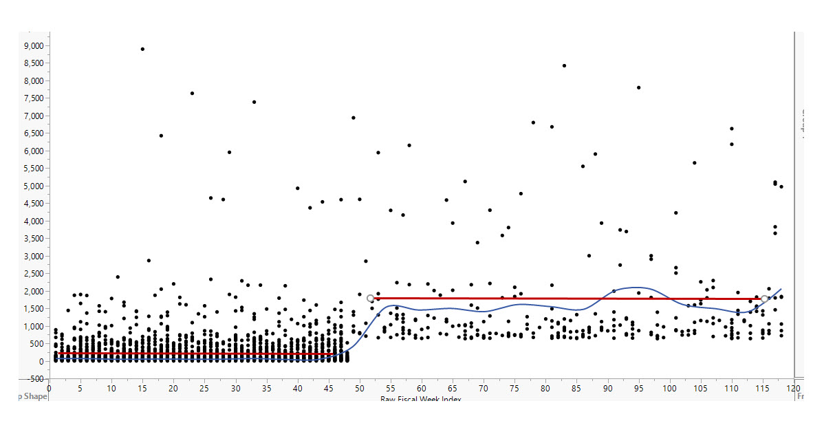
Is there a way to graph a general trend that is a result of a step change (or multiple step changes)? The general trend would be the overall line of fit. The step changes would be lines of fit for various time periods. Visual below. Resaid is there a way to graph the step changes along with the general trend?
This is dummy data. There is an obvious step change in the average (or line of fit) that explains the general trend (I guess I graphed moving average instead of trend line, but you get the idea). How to put in the red lines?


- Mark as New
- Bookmark
- Subscribe
- Mute
- Subscribe to RSS Feed
- Get Direct Link
- Report Inappropriate Content
Re: Graph a step change in trend (or multiple step changes)
Right-click on the plot and select Customize. Click the Add button. You can use the Pen Color() and H Line() functions in a custom graphics script:
Pen Color( "Red" );
H Line( 0, 45, 250 );
H Line( 50, 115, 2000 );
(You can copy it here first and then paste it when you get to the Customize dialog.)
- Mark as New
- Bookmark
- Subscribe
- Mute
- Subscribe to RSS Feed
- Get Direct Link
- Report Inappropriate Content
Re: Graph a step change in trend (or multiple step changes)
Just thinking, let's say I wanted to show multiple step changes. Maybe they represent events or enhancements or some fundamental change in the process or business.
Could I do what you suggested and add variables to adjust the height (Y) and period (range of X)? And potentially link them to averages or medians or whatever stat for that range of X?
Recommended Articles
- © 2026 JMP Statistical Discovery LLC. All Rights Reserved.
- Terms of Use
- Privacy Statement
- Contact Us