- New to JMP? Let the Data Analysis Director guide you through selecting an analysis task, an analysis goal, and a data type. Available now in the JMP Marketplace!
- See how to install JMP Marketplace extensions to customize and enhance JMP.
- Subscribe to RSS Feed
- Mark Topic as New
- Mark Topic as Read
- Float this Topic for Current User
- Bookmark
- Subscribe
- Mute
- Printer Friendly Page
Discussions
Solve problems, and share tips and tricks with other JMP users.- JMP User Community
- :
- Discussions
- :
- Graph a parallel plot using means and showing standard dev for each x variable
- Mark as New
- Bookmark
- Subscribe
- Mute
- Subscribe to RSS Feed
- Get Direct Link
- Report Inappropriate Content
Graph a parallel plot using means and showing standard dev for each x variable
Good afternoon all; I'm pretty new to JMP and am most familiar with using it for multivariate (particularly canonical discriminant) analysis of geochemical data. I'm running into an obstacle to visualizing some data as a parallel plot. I have a dataset containing about 45 rock samples for each of which I measured the concentration of about 30 elements. The samples come from three different rock formations. I have already run discriminant analysis to determine which elements are best at separating the three rock formations but I want to try and visualize this as a parallel plot. I have tried graphing all of the samples and elements on a single parallel plot (elements on x, element concentrations on y, each line color coded by which formation the sample belongs to), or one three graphs (one for each rock formation) but this is still a bit cluttered looking.
What I would like to do is create a single parallel plot that shows the mean value for each element for each rock formation (with rock formations color coded), with a standard deviation bar for each of those points. So, each element on the x axis would have three points, a mean for that element for each rock formation. This would help visualize for my collaborators which elements overlap in concentration across formations and are thus not useful for distinguishing among the formations. Is there a straightforward way to do this in JMP 12?
Many thanks!
- Mark as New
- Bookmark
- Subscribe
- Mute
- Subscribe to RSS Feed
- Get Direct Link
- Report Inappropriate Content
Re: Graph a parallel plot using means and showing standard dev for each x variable
I have attached a screen recording of a couple of views after reading how the way that you describe your data.
![]()
- Mark as New
- Bookmark
- Subscribe
- Mute
- Subscribe to RSS Feed
- Get Direct Link
- Report Inappropriate Content
Re: Graph a parallel plot using means and showing standard dev for each x variable
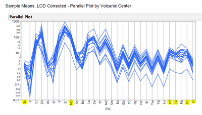
Hi Lou, this is more what I am going for. This parallel plot show the concentrations of elements in individual rock samples (each blue line) from a single volcano on a log scale. What I want to do is create a parallel plot with a single line just showing the mean value for each element and standard deviation error bars. Is there are to do that using the parallel plot option in JMP or another part of the graphing menu? Thanks!
- Mark as New
- Bookmark
- Subscribe
- Mute
- Subscribe to RSS Feed
- Get Direct Link
- Report Inappropriate Content
Re: Graph a parallel plot using means and showing standard dev for each x variable
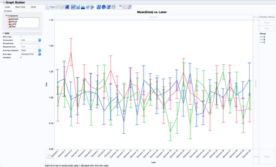
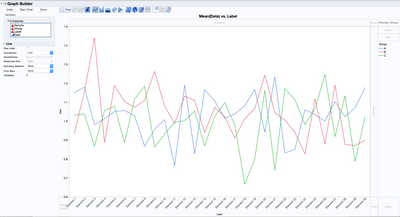
I stacked the data and then used graph builder to obtain this
Recommended Articles
- © 2026 JMP Statistical Discovery LLC. All Rights Reserved.
- Terms of Use
- Privacy Statement
- Contact Us


