- New to JMP? Let the Data Analysis Director guide you through selecting an analysis task, an analysis goal, and a data type. Available now in the JMP Marketplace!
- See how to install JMP Marketplace extensions to customize and enhance JMP.
- Subscribe to RSS Feed
- Mark Topic as New
- Mark Topic as Read
- Float this Topic for Current User
- Bookmark
- Subscribe
- Mute
- Printer Friendly Page
Discussions
Solve problems, and share tips and tricks with other JMP users.- JMP User Community
- :
- Discussions
- :
- Graph Builder: creating error bands instead of bars?
- Mark as New
- Bookmark
- Subscribe
- Mute
- Subscribe to RSS Feed
- Get Direct Link
- Report Inappropriate Content
Graph Builder: creating error bands instead of bars?
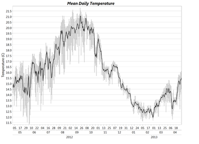
I have data I want to plot in a line chart as mean +/- standard error. However, I would like to plot the standard errors as shaded bands above and below my mean line rather than as individual error bars. I'd like the end result to look something like this:
I know I can plot the mean+SE and mean-SE as separate lines but even then I can't figure out how to shade the area in between. Any ideas? Either in point-and-click or a script?
Accepted Solutions
- Mark as New
- Bookmark
- Subscribe
- Mute
- Subscribe to RSS Feed
- Get Direct Link
- Report Inappropriate Content
Re: Graph Builder: creating error bands instead of bars?
unfortunately, this might be easier to describe with a little JSL than it is with a series of steps.
Names Default To Here( 1 );
dt = Open( "$SAMPLE_DATA/Big Class.jmp" );
dt << Graph Builder(
	Size( 741, 350 ),
	Show Control Panel( 0 ),
	Variables(
		X( :height ),
		Y( :weight ),
		Y( :plus, Position( 1 ) ),
		Y( :minus, Position( 1 ) )
	),
	Elements(
		Line( X, Y( 1 ), Legend( 6 ) ),
		Area( X, Y( 2 ), Y( 3 ), Legend( 7 ), Area Style( "Range" ) )
	)
);
The key is to add your center and upper and lower columns to the Y axis. (in Graph Builder)
Then, remove all the other graph elements, followed by adding the connect the dots line, and then the overlay lines (Area).
Next, go into the variables role for the line and uncheck your upper and lower column. Go into the Area, and make the type a Range, go into the variables and uncheck the center column. (don't uncheck the Y column)
If the line isnt visible, ie. behind the range area line, then right click on the white space of the graph, go to Customize, and reoder teh elements. (little plus/minus buttons)
Recommended Articles
- © 2026 JMP Statistical Discovery LLC. All Rights Reserved.
- Terms of Use
- Privacy Statement
- Contact Us

