- Don’t miss your chance to experience Discovery Summit Europe at our best available rate! Early bird registration through 31 Oct.
- Graph Builder Toolbar streamlines interactive graphing. Creates shortcuts on Report and GraphBuilder Helpers toolbars. Download and install the extension.
- Subscribe to RSS Feed
- Mark Topic as New
- Mark Topic as Read
- Float this Topic for Current User
- Bookmark
- Subscribe
- Mute
- Printer Friendly Page
Discussions
Solve problems, and share tips and tricks with other JMP users.- User Community
- :
- Discussions
- :
- Graph Builder: adjust the axes to the filtered data

- Mark as New
- Bookmark
- Subscribe
- Mute
- Subscribe to RSS Feed
- Get Direct Link
- Report Inappropriate Content
Graph Builder: adjust the axes to the filtered data
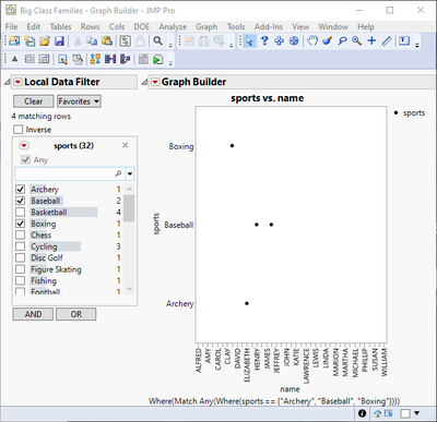
If a user applies a data filter to exclude rows, the Graph Builder Plot restricts the axes (and Group X/Y areas) accordingly.
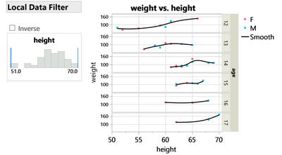
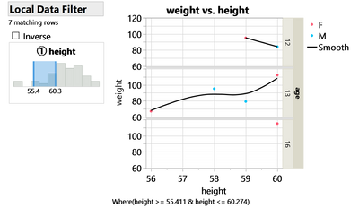
... but not always:
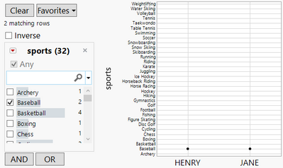
For columns with modeling type multiple response, Jmp (17.1) displays all existing values on the axis (and Group X/Y areas)
- even if the data is restricted by a global data filter and a local data filter.
Is there a setting to change this behavior?
workaround (for the case with the global data filter):
generate a subset and plot from there.
dt = Open( "$SAMPLE_DATA/Big Class Families.jmp" );
dt << Data Filter(
	Location( {88, 88} ),
	Mode( Select( 0 ), Include( 1 ) ),
	Add Filter(
		columns( :sports ),
		Match Any( Where( :sports == "Baseball" ) ),
		Display( :sports, Find( Set Text( "" ) ) )
	)
);
dt << Graph Builder(
	Size( 353, 453 ),
	Show Control Panel( 0 ),
	Summary Statistic( "Median" ),
	Variables( X( :name ), Y( :sports ) ),
	Elements( Points( X, Y, Legend( 4 ) ) ),
	Local Data Filter(
		Add Filter(
			columns( :sports ),
			Match Any( Where( :sports == "Baseball" ) ),
			Display( :sports, Find( Set Text( "" ) ) )
		)
	)
)Accepted Solutions


- Mark as New
- Bookmark
- Subscribe
- Mute
- Subscribe to RSS Feed
- Get Direct Link
- Report Inappropriate Content
Re: Graph Builder: adjust the axes to the filtered data
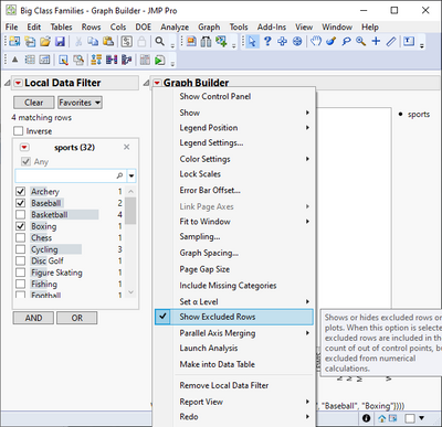
Seems to be somehow bugged or working inversed with multiple response columns. You could enable Show Excluded Rows (hold shift while pressing red triangle to access Show Excluded Rows).
- Mark as New
- Bookmark
- Subscribe
- Mute
- Subscribe to RSS Feed
- Get Direct Link
- Report Inappropriate Content
Re: Graph Builder: adjust the axes to the filtered data
Seems to be somehow bugged or working inversed with multiple response columns. You could enable Show Excluded Rows (hold shift while pressing red triangle to access Show Excluded Rows).
- Mark as New
- Bookmark
- Subscribe
- Mute
- Subscribe to RSS Feed
- Get Direct Link
- Report Inappropriate Content
Re: Graph Builder: adjust the axes to the filtered data
cool, thanks @jthi !
works for global and local data filter.
"
So it can be used as a workaround till the issue is fixed :)
- Mark as New
- Bookmark
- Subscribe
- Mute
- Subscribe to RSS Feed
- Get Direct Link
- Report Inappropriate Content
Re: Graph Builder: adjust the axes to the filtered data
I sent Jmp support a link to this post: TS-00044559
- Mark as New
- Bookmark
- Subscribe
- Mute
- Subscribe to RSS Feed
- Get Direct Link
- Report Inappropriate Content
Re: Graph Builder: adjust the axes to the filtered data
Will be fixed in JMP19.
Recommended Articles
- © 2026 JMP Statistical Discovery LLC. All Rights Reserved.
- Terms of Use
- Privacy Statement
- Contact Us