cancel
Showing results for 
Show  only  | Search instead for 
Did you mean: 
  • New to JMP? Join us Sept. 23-24 for the Early User Edition of Discovery Summit, tailor-made for new users. Register now for free!
  • Use World Cup data to build models, explore spatial relationships, and create informative visualizations in JMP. Register. July 17, 2 pm US Eastern Time.
  • Your voice matters! Tell us how you prefer to receive JMP updates, so we can tailor our communication to your needs. Take short survey.

Discussions

Solve problems, and share tips and tricks with other JMP users.
Choose Language Hide Translation Bar
anole73
Level I

Graph Builder Geographic Heat Map

Hello,

I need help. It is a very simple problem but I can't figure it out. I'd like to have a heat map showing the amount of phosphorus at three different geographic sites on a map. I have the coordinates laid out, the points on the map in their respective sizes and colors, but the points are just solid and do not fade over the area. Is there a way to make them look fuzzy as they span over the area? Don't know if I'm stating this problem properly...thanks.

Ian

1 REPLY 1

Re: Graph Builder Geographic Heat Map

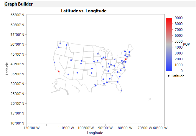
The default view for continuous X and Y data in Graph Builder will be the Points element:

 

GB-Elements.png


This will result in a graph something like:
 

Graph Builder Points.png


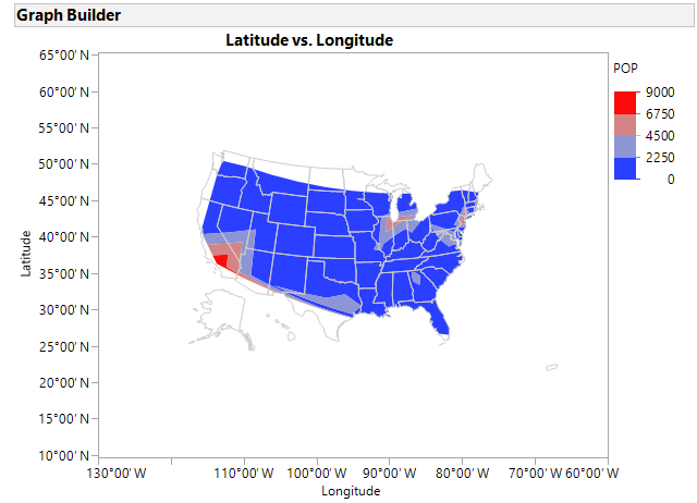
Changing to the Contour element will result in a graph like this:
 

Graph Builder Contour.png


In this case, I customized the graph further (Right click in frame > Customize) to:


  1. Clip the contours by the map shapes (JMP 14)
  2. Change the ordering to layer the contours under the map shapes


The Contour element will fill areas that are within the convex hull of the points using interpolation.


Recommended Articles