- New to JMP? Let the Data Analysis Director guide you through selecting an analysis task, an analysis goal, and a data type. Available now in the JMP Marketplace!
- See how to install JMP Marketplace extensions to customize and enhance JMP.
- Subscribe to RSS Feed
- Mark Topic as New
- Mark Topic as Read
- Float this Topic for Current User
- Bookmark
- Subscribe
- Mute
- Printer Friendly Page
Discussions
Solve problems, and share tips and tricks with other JMP users.- JMP User Community
- :
- Discussions
- :
- Re: Fit Y by X graphlet in response screening platform
- Mark as New
- Bookmark
- Subscribe
- Mute
- Subscribe to RSS Feed
- Get Direct Link
- Report Inappropriate Content
Fit Y by X graphlet in response screening platform
I'm trying to figure out how to add a hover graphlet in the response screening platform plots with data pulled from the original data table.
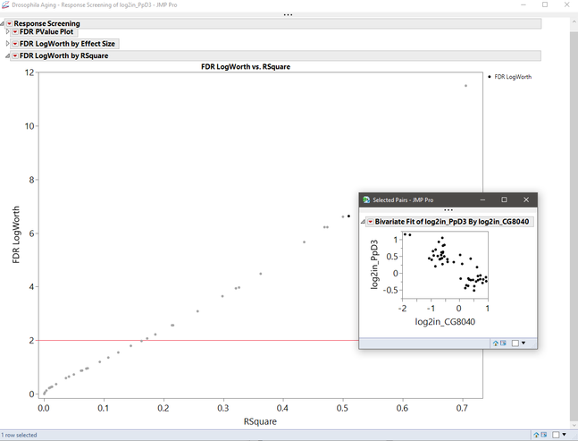
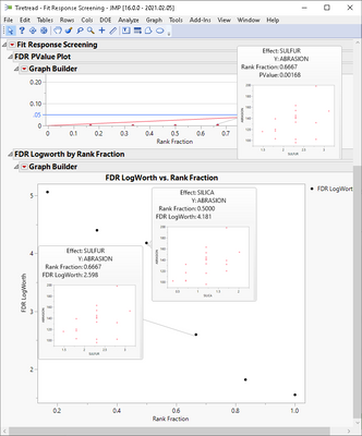
For example, in FDR LogWorth by RSquare plot, I'd like to see the y by x plot of the variables associated with each point when I hover over the point. Here's a mock-up:
The catch is that the x and y data is in a different table.
I see there is an auto-generated script "Fit Selected Items" in the pValues data table, but I can't seem to figure out how to modify the JSL to paste into the graphlet editor and have those plots come up as a graphlet. Any help would be appreciated (also might be a very nice default setting!)
Accepted Solutions
- Mark as New
- Bookmark
- Subscribe
- Mute
- Subscribe to RSS Feed
- Get Direct Link
- Report Inappropriate Content
Re: Fit Y by X graphlet in response screening platform
Hi @nter,
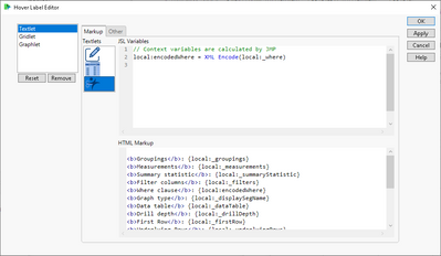
Thanks for the nice use case. You were on the right track by using an existing script of the graph you wanted to see as the starting point for your graphlet. The trick to get a dynamic graphlet - one that reflects the data in the visual element inspected with the mouse - is to use the the information that is available in the Hover Label Execution Context. I like to use the "Context" Textlet preset to get started. The image below shows where it is in the Hover Label Editor:
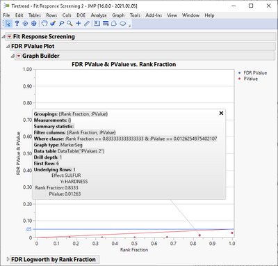
With that configured the Response Screening hover label should look like this:
We can see that it contains two bits of useful information: a reference to the current Data Table, created by the Platform to support this (baseline) visualization, and the column names we want to see in the final visualization: the values for the hover label entries "Effect" and "Y". What is missing is how to go from the current data table to the original data table where these columns are stored.
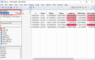
Lucky for us, the current data table has the name of the original data table stored in a table variable named "Original Data".
Now we have all the elements to go from the current hover label context to a dynamic graph to be displayed on the graphlet.
Here is the relevant JSL that should go into the Graphlet "Picture" attribute in the Hover Label Editor:
local:_parentDTName = local:_dataTable << Get Table Variable( "Original Data" );
local:_parentDT = Get Data Table( local:_parentDTName );
YName = local:_Y;
XName = local:_Effect;
Ycol = Column( local:_parentDT, YName );
Xcol = Column( local:_parentDT, XName );
local:_parentDT << Bivariate( Y( YCol ), X( XCol ) );
Things to note:
- Variable names that start with "_" are part of the HLEC;
- Use the Column() call to convert the column name to the object type required by the Bivariate Platform;
- Create the new visualization by sending a message to the original table (by default it would go to the current, derived one).
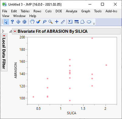
The end result is that hovering over points in the Response Screening Platform will display the y by x plot of the associated observations.
Note also that you can click on the graphlet thumbnails to launch them as independent visualizations - basically, implementing an analytical drill-down workflow.
Please see the attached script for a complete implementation using one of our Sample Data datasets.
Also, check this discussion which also looked into adding graphlets showing data from a related data table, in a different scenario.
Finally for the idea of making this a default setting for the Response Screening Platform, I agree it would be a good idea.
Please consider adding it to our JMP Wish List for tracking.
Cheers,
Nascif
- Mark as New
- Bookmark
- Subscribe
- Mute
- Subscribe to RSS Feed
- Get Direct Link
- Report Inappropriate Content
Re: Fit Y by X graphlet in response screening platform
Hey thanks Nascif!
Works just like I imagined, and thanks for the explanation of how to figure it out as well.
One quick note, when using the response screening platform instead of the response screening personality of the fit model, the Effect column is labeled differently for some reason.
XName = local:_Effect;to
XName = local:_X;That one I could figure out.
Makes me wish I could export this functionality in HTML5 to share with co-workers....
- Mark as New
- Bookmark
- Subscribe
- Mute
- Subscribe to RSS Feed
- Get Direct Link
- Report Inappropriate Content
Re: Fit Y by X graphlet in response screening platform
As for HTML5, I know. Another good suggestion to add to the Wish List.
Recommended Articles
- © 2026 JMP Statistical Discovery LLC. All Rights Reserved.
- Terms of Use
- Privacy Statement
- Contact Us
