Turn on suggestions
Auto-suggest helps you quickly narrow down your search results by suggesting possible matches as you type.
] />
- New to JMP? Let the Data Analysis Director guide you through selecting an analysis task, an analysis goal, and a data type. Available now in the JMP Marketplace!
- See how to install JMP Marketplace extensions to customize and enhance JMP.
Options
- Subscribe to RSS Feed
- Mark Topic as New
- Mark Topic as Read
- Float this Topic for Current User
- Bookmark
- Subscribe
- Mute
- Printer Friendly Page
Discussions
Solve problems, and share tips and tricks with other JMP users.- JMP User Community
- :
- Discussions
- :
- Filtering Pareto charts by column.
- Mark as New
- Bookmark
- Subscribe
- Mute
- Subscribe to RSS Feed
- Get Direct Link
- Report Inappropriate Content
Filtering Pareto charts by column.
Created:
Mar 15, 2021 12:06 PM
| Last Modified: Jun 11, 2023 4:12 AM
(2187 views)
I have a very large dataset of manufacturing defect bin data.
My columns are the manufacturing batch IDs (called lots), and then each column is a defect bin, with the numeric value for that particular defect bin for each lot.
- In JMP Pareto chart, the input needs all defect bins in one column. So, I have to make another table by stacking those defect bins using Table>Stack. This makes an even larger data table. Is there any workaround to this to create the Pareto chart from just the initial table?
- After creating this stacked table, I want to get the pareto chart for each lot. I would usually do that by adding lot to x grouping and then adding a filter by lot to the chart. But this still leaves all the empty graphs for other lots (see below screengrab). How can I cycle through the lots like I can do it in other charts made in graph builder?
2 REPLIES 2
- Mark as New
- Bookmark
- Subscribe
- Mute
- Subscribe to RSS Feed
- Get Direct Link
- Report Inappropriate Content
Re: Filtering Pareto charts by column.
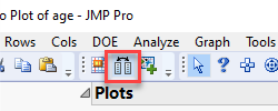
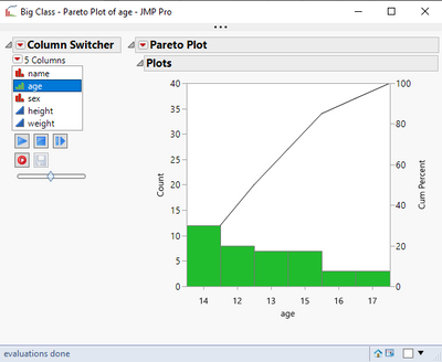
Does the column switcher do what you want? Here I created a pareto plot of a single variable in the big class sample data, then added the columns switcher using the icon indicated below to swap it out with any other column. Now clicking any column in the columns switcher list updates the plot.
- Mark as New
- Bookmark
- Subscribe
- Mute
- Subscribe to RSS Feed
- Get Direct Link
- Report Inappropriate Content
Re: Filtering Pareto charts by column.
For Item 2, I don't think you need to add the lot to the x grouping. You should be able to get what you want with just the data filter.
Recommended Articles
- © 2026 JMP Statistical Discovery LLC. All Rights Reserved.
- Terms of Use
- Privacy Statement
- Contact Us


