- Learn how to build custom Python data connectors and further customize JMP’s Data Connector Framework with the Python Data Connector Demo, available now in the JMP Marketplace!
- See how to use Accelerated Life Testing (ALT) to evaluate reliability. Register for June 5 webinar, 2pm US Eastern Time.
- Subscribe to RSS Feed
- Mark Topic as New
- Mark Topic as Read
- Float this Topic for Current User
- Bookmark
- Subscribe
- Mute
- Printer Friendly Page
Discussions
Solve problems, and share tips and tricks with other JMP users.- JMP User Community
- :
- Discussions
- :
- FREQ format in Life Distribution Event Plot

- Mark as New
- Bookmark
- Subscribe
- Mute
- Subscribe to RSS Feed
- Get Direct Link
- Report Inappropriate Content
FREQ format in Life Distribution Event Plot
Greetings all,
In Analyze > Reliability and Survival > Life Distribution, is it possible to change the format of the FREQ values that appear in the Event Plot? I see I can change the font size, color, etc., but how can I change it to, say, Scientific Notation with just a few digits? The reason I ask is because some of the right censored quantities I use are difficult to comprehend when used in presentations because of their lengths, and even more so when there are many rows.
Thanks in advance!
J Yakura

- Mark as New
- Bookmark
- Subscribe
- Mute
- Subscribe to RSS Feed
- Get Direct Link
- Report Inappropriate Content
Re: FREQ format in Life Distribution Event Plot
Is this what you are looking for?

If this is what you are looking for, just right click on the axis values and go into Axis Settings and set the format to use
- Mark as New
- Bookmark
- Subscribe
- Mute
- Subscribe to RSS Feed
- Get Direct Link
- Report Inappropriate Content
Re: FREQ format in Life Distribution Event Plot
Hi Jim,
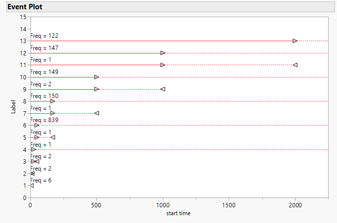
Sorry, I should have attached an example. In the attached plot from Microprocessor Data.jmp, where the right censored line at the top has 'Freq = 122'. Is there a way to have it plot as, for example, 'Freq = 1.2e02'?
My Time to Event data is actually coming from the Reliability Forecast > Dates Format platform. I know the date that a device failed, but I can only know that this failure is associated with several production dates. This seems to require me to assign a fractional failure to each of the associated production dates and quantities.
Many thanks!
J
- Mark as New
- Bookmark
- Subscribe
- Mute
- Subscribe to RSS Feed
- Get Direct Link
- Report Inappropriate Content
Re: FREQ format in Life Distribution Event Plot
More experienced Graph Segment Community Members may have a solution, but I do not.
Recommended Articles
- © 2026 JMP Statistical Discovery LLC. All Rights Reserved.
- Terms of Use
- Privacy Statement
- Contact Us