- Learn how to build custom Python data connectors and further customize JMP’s Data Connector Framework with the Python Data Connector Demo, available now in the JMP Marketplace!
- See how to use Accelerated Life Testing (ALT) to evaluate reliability. Register for June 5 webinar, 2pm US Eastern Time.
- Subscribe to RSS Feed
- Mark Topic as New
- Mark Topic as Read
- Float this Topic for Current User
- Bookmark
- Subscribe
- Mute
- Printer Friendly Page
Discussions
Solve problems, and share tips and tricks with other JMP users.- JMP User Community
- :
- Discussions
- :
- Explanation of Extra Fences on Quantile Box Plot?

- Mark as New
- Bookmark
- Subscribe
- Mute
- Subscribe to RSS Feed
- Get Direct Link
- Report Inappropriate Content
Explanation of Extra Fences on Quantile Box Plot?
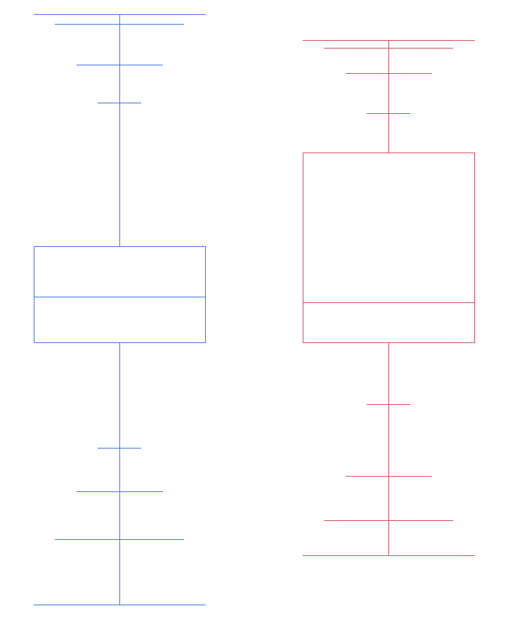
When I generate a Box Plot of Box Type "Quantile" in Graph Builder, I get a plot that has 4 fences on either side of the quartile box. But on the JMP web page for quantile box plots, there are only 3 fences on either side of the quartile box - 90th / 97.5th / max, or 10th / 2.5th / min. So - for these quantile box plots with 4 fences on either side, what quantiles do the fences represent?
Accepted Solutions

- Mark as New
- Bookmark
- Subscribe
- Mute
- Subscribe to RSS Feed
- Get Direct Link
- Report Inappropriate Content
Re: Explanation of Extra Fences on Quantile Box Plot?
The document does seem to be a bit out of date. By looking at the quantiles from the distribution platform it looks like you get minimum, 0.5, 2.5, 10 and 90, 97.5, 99.5, and max. These are the quantiles listed from the distribution platform and they match the graphs that I am getting from Graph Builder.
- Mark as New
- Bookmark
- Subscribe
- Mute
- Subscribe to RSS Feed
- Get Direct Link
- Report Inappropriate Content
Re: Explanation of Extra Fences on Quantile Box Plot?
Very clear, accurate and swift response - thank you Dan!

- Mark as New
- Bookmark
- Subscribe
- Mute
- Subscribe to RSS Feed
- Get Direct Link
- Report Inappropriate Content
Re: Explanation of Extra Fences on Quantile Box Plot?
Also if you hover over the boxplot you should get a bit more information

Same with Distribution platform


Recommended Articles
- © 2026 JMP Statistical Discovery LLC. All Rights Reserved.
- Terms of Use
- Privacy Statement
- Contact Us