- Don’t miss your chance to experience Discovery Summit Europe at our best available rate! Early bird registration through 31 Oct.
- Graph Builder Toolbar streamlines interactive graphing. Creates shortcuts on Report and GraphBuilder Helpers toolbars. Download and install the extension.
- Subscribe to RSS Feed
- Mark Topic as New
- Mark Topic as Read
- Float this Topic for Current User
- Bookmark
- Subscribe
- Mute
- Printer Friendly Page
Discussions
Solve problems, and share tips and tricks with other JMP users.- User Community
- :
- Discussions
- :
- Re: Dynamic chart creator

- Mark as New
- Bookmark
- Subscribe
- Mute
- Subscribe to RSS Feed
- Get Direct Link
- Report Inappropriate Content
Dynamic chart creator
Hi,
I would like to write a script that helps the user to create some required charts with less mouse clicks.
For example, typically when I'm making charts manually, I have to first create X-Y graph, then select legend, then click on Automatic recalc, Unselected faded, group by, and put splines. This turns out to be very tedious.
So basically what I want to write is a script that the user would only have to select Y columns, X columns, Legend column and Group By column. And the script would do the rest.
Clarification: Obviously I know how to script this for a given data table, where I know the columns names and the charts I want to create. What I want here is to enable the user to select the columns he wants in ANY given data table he is working on. I suppose the solution would require loops and variables.
I hope I explained myself clearly.
Any help and guidance would be appreciated.
Thanks!


- Mark as New
- Bookmark
- Subscribe
- Mute
- Subscribe to RSS Feed
- Get Direct Link
- Report Inappropriate Content
Re: Dynamic chart creator
File==>Preferences==>Platforms
- Mark as New
- Bookmark
- Subscribe
- Mute
- Subscribe to RSS Feed
- Get Direct Link
- Report Inappropriate Content
Re: Dynamic chart creator
Thanks!
I guess it could also be a solution. The question is whether I can pre define there everything I need.
So a follow up question - Where can I define the following:
1. Automatic recalc for X-Y plot & variability chart?
2. When I do fit spline -> other, is there a way that the Standardize X box would be checked by default?
I looked it up but couldn't find it.
Thanks
Bivariate(
	Y( :y_column),
	X( :x_column ),
	group by(:group_column),
	Automatic Recalc( 1 ),
	Fit spline (0.1, Standardized, {Report(0)}),
	SendToReport(
		Dispatch(
			{},
			"Bivar Plot",
			FrameBox,
			{Marker Selection Mode( "Unselected Faded" ),
			Row Legend(
				legend_column,
				Color( 1 ),
				Color Theme( "JMP Default" ),
				Marker( 0 ),
				Marker Theme( "" ),
				Continuous Scale( 0 ),
				Reverse Scale( 0 ),
				Excluded Rows( 0 )
			)}
		)
	)
)- Mark as New
- Bookmark
- Subscribe
- Mute
- Subscribe to RSS Feed
- Get Direct Link
- Report Inappropriate Content
Re: Dynamic chart creator
The Automatic Recalc preference is available for both the Bivariate and Variability Chart
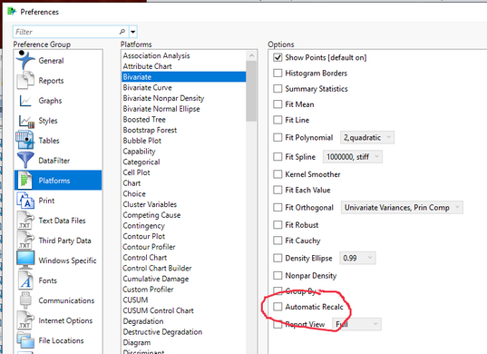
The ability to Fit a Spline is there, but it does not have the "Standardize" checkbox surfaced in the Preferences.
- Mark as New
- Bookmark
- Subscribe
- Mute
- Subscribe to RSS Feed
- Get Direct Link
- Report Inappropriate Content
Re: Dynamic chart creator
Turns out I was using JMP12, where the Automatic recalc option was not available in the preferences.
I switched to JMP14 and now I see it.
Thanks!


- Mark as New
- Bookmark
- Subscribe
- Mute
- Subscribe to RSS Feed
- Get Direct Link
- Report Inappropriate Content
Re: Dynamic chart creator
Find an example (data set), set up the plot exactly the way you want, save the script to a script window, then remove the Y() and X() role arguments. Run the script. It should present the default launch dialog where the user can enter the current variables into the appropriate role. Click OK and the other features should be active.
- Mark as New
- Bookmark
- Subscribe
- Mute
- Subscribe to RSS Feed
- Get Direct Link
- Report Inappropriate Content
Re: Dynamic chart creator
Thanks!
I tried it and it worked. Follow up question: Is there a way to also remove the group by and legend column specification, in order to enable the user to choose?
For example, in the script below. When I removed X and Y like you suggested, I did get the prompt to choose them.But can I get a prompt for group by and legend as well?
Bivariate(
	Y( :y_column),
	X( :x_column ),
	group by(:group_column),
	Automatic Recalc( 1 ),
	Fit spline (0.1, Standardized, {Report(0)}),
	SendToReport(
		Dispatch(
			{},
			"Bivar Plot",
			FrameBox,
			{Marker Selection Mode( "Unselected Faded" ),
			Row Legend(
				legend_column,
				Color( 1 ),
				Color Theme( "JMP Default" ),
				Marker( 0 ),
				Marker Theme( "" ),
				Continuous Scale( 0 ),
				Reverse Scale( 0 ),
				Excluded Rows( 0 )
			)}
		)
	)
)
Recommended Articles
- © 2026 JMP Statistical Discovery LLC. All Rights Reserved.
- Terms of Use
- Privacy Statement
- Contact Us