- New to JMP? Let the Data Analysis Director guide you through selecting an analysis task, an analysis goal, and a data type. Available now in the JMP Marketplace!
- See how to install JMP Marketplace extensions to customize and enhance JMP.
- Subscribe to RSS Feed
- Mark Topic as New
- Mark Topic as Read
- Float this Topic for Current User
- Bookmark
- Subscribe
- Mute
- Printer Friendly Page
Discussions
Solve problems, and share tips and tricks with other JMP users.- JMP User Community
- :
- Discussions
- :
- Re: Determine the correct sampling rate for SPC data
- Mark as New
- Bookmark
- Subscribe
- Mute
- Subscribe to RSS Feed
- Get Direct Link
- Report Inappropriate Content
Determine the correct sampling rate for SPC data
Hello,
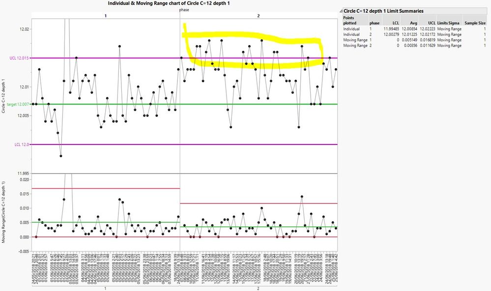
I have an SPC data with UCL = 12.015 and LCL = 12 (target is 120.007) - see attached.
My OOC (Out Of Control) values are too high and I want to check that my sampling rate is correct.
Current sample rate is 0.1 (1 out of 10 parts are measured) and we are missing OOC measurements (there are 2 groups of SPC values with same limits: "Measure Depth 7" and "Measure Depth 1").
I tried using the sample size and power, but not sure which option to choose in the dialog box.
Thanks, Yoni
- Mark as New
- Bookmark
- Subscribe
- Mute
- Subscribe to RSS Feed
- Get Direct Link
- Report Inappropriate Content
Re: Determine the correct sampling rate for SPC data
You are correct, the sample size calculators are not intended for control charts. They are intended for specific hypothesis tests (e.g., t-test). Control charts are based on rational sub-groups. Their size and frequency are determined by considering the nature of the special causes of an unnatural deviation in the process output. The sub-group size and composition should be devoid of special cause variation. The frequency should maximize the chance of a special cause.
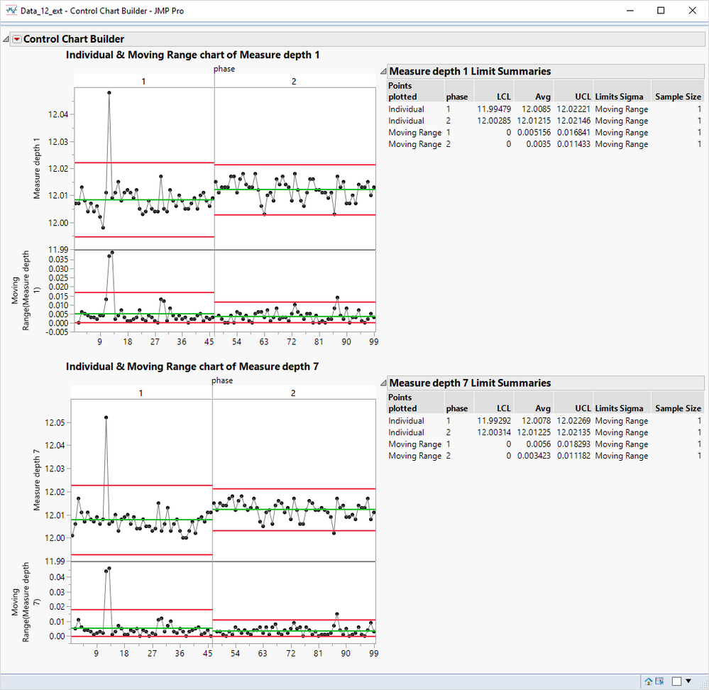
I used your sample of data. I converted the Time to numerical data with the continuous modeling type and then sorted the data table by Date and Time. I get these XmR charts for Measure depth 1 and Measure Depth 7. (The sorting surfaced a potential data problem where two observations later in history were assigned to phase = 1 instead of 2.)
Can you describe the problem you are having with these charts?
- Mark as New
- Bookmark
- Subscribe
- Mute
- Subscribe to RSS Feed
- Get Direct Link
- Report Inappropriate Content
Re: Determine the correct sampling rate for SPC data
Thanks a lot Mark!
I will clarify - phase 1 and 2 were manualy added by me to the data - I have a mistake in the points you mentioned - please disregard.
My main problem is the high OOC rate in the chart (see marked in yellow below). UCL can't be modified since it's part of the product requirements.
From every batch of parts there are 1 part out of 10 that is measured and recorded in the data base.
My main concern is that that the sampling rate (1 out of 10) is too low, so we are catching only a small portion of the OOC parts, while in fact there are much more OOC parts in the same batch.
Those OOC parts are catched only later in the production line (where Rework is more complex and might lower the parts quality).
Considering the population is normally distributed - how can I find what is the correct sampling rate that will ensure (in 90% power) we are catching all the OOC parts in the batch?
- Mark as New
- Bookmark
- Subscribe
- Mute
- Subscribe to RSS Feed
- Get Direct Link
- Report Inappropriate Content
Re: Determine the correct sampling rate for SPC data
I have two responses, perhaps other experts will add to this discussion. (Hint, hint)
First, your picture shows the same historical limits applied to both phases. Did you expect the process performance to remain the same in phase 2? What is the nature of the process change between the two phases? Was it for variance reduction or centering on target? It is apparent to me from your charts that the process mean has shifted upward in phase 2 and that is the reason for the abundance of OOC signals. It is not a matter of under-sampling or low sampling frequency.
Second, the determination of the sampling frequency has more to do with the nature of the special causes than it does with the model for the random errors (e.g., normal distribution). What are the special causes? Have you done a Root Cause Analysis or a Failure Modes and Effects Analysis? How big are the effects of the special causes? When can they occur? How often or frequently can they occur?
I can see from the legend that the LCL, Center, and UCL for the Individuals Chart are not exactly the same for both phases but I can't believe that the phase 2 limits were computed with this data. In fact, my previous charts show that phase 2 exhibits a variance reduction and a higher center.
- Mark as New
- Bookmark
- Subscribe
- Mute
- Subscribe to RSS Feed
- Get Direct Link
- Report Inappropriate Content
Re: Determine the correct sampling rate for SPC data
Thanks a lot Mark!
I will clarify - phase 1 and 2 were manualy added by me to the data - I have a mistake in the points you mentioned - please disregard.
My main problem is the high OOC rate in the chart (see marked in yellow in the file attached). UCL can't be modified since it's part of the product requirements.
From every batch of parts there are 1 part out of 10 that is measured and recorded in the data base.
My main concern is that that the sampling rate (1 out of 10) is too low, so we are catching only a small portion of the OOC parts, while in fact there are much more OOC parts in the same batch.
Those OOC parts are catched only later in the production line (where Rework is more complex and might lower the parts quality).
Considering the population is normally distributed - how can I find what is the correct sampling rate that will ensure (in 90% power) we are catching all the OOC parts in the batch?
Recommended Articles
- © 2026 JMP Statistical Discovery LLC. All Rights Reserved.
- Terms of Use
- Privacy Statement
- Contact Us


