- New to JMP? Let the Data Analysis Director guide you through selecting an analysis task, an analysis goal, and a data type. Available now in the JMP Marketplace!
- See how to install JMP Marketplace extensions to customize and enhance JMP.
- Subscribe to RSS Feed
- Mark Topic as New
- Mark Topic as Read
- Float this Topic for Current User
- Bookmark
- Subscribe
- Mute
- Printer Friendly Page
Discussions
Solve problems, and share tips and tricks with other JMP users.- JMP User Community
- :
- Discussions
- :
- Density contours in ternary diagrams
- Mark as New
- Bookmark
- Subscribe
- Mute
- Subscribe to RSS Feed
- Get Direct Link
- Report Inappropriate Content
Density contours in ternary diagrams
Hello,
Is there a way to plot density contours on a ternary diagram in JMP17?
If not, is there a way to do this by using a custom Contour Formula in the ternary plot platform? What would be this formula?
Thanks
- Mark as New
- Bookmark
- Subscribe
- Mute
- Subscribe to RSS Feed
- Get Direct Link
- Report Inappropriate Content
Re: Density contours in ternary diagrams
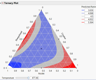
Contour Formulas for ternary plots are generally saved prediction formulas. Here's a walk-through of how to create.
Is this what you're looking for?
- Mark as New
- Bookmark
- Subscribe
- Mute
- Subscribe to RSS Feed
- Get Direct Link
- Report Inappropriate Content
Re: Density contours in ternary diagrams
Thank you Jed, but no, this is not what I am looking for. I need to plot density contours.
Unless you know a prediction formula that can lead to the density fonction?
- Mark as New
- Bookmark
- Subscribe
- Mute
- Subscribe to RSS Feed
- Get Direct Link
- Report Inappropriate Content
Re: Density contours in ternary diagrams
Ah, my bad. I'm not aware of a way to do density contours in a ternary plot. Hopefully someone else has a better answer.
- Mark as New
- Bookmark
- Subscribe
- Mute
- Subscribe to RSS Feed
- Get Direct Link
- Report Inappropriate Content
Re: Density contours in ternary diagrams
Hello, no one knows how to do that? :(
- Mark as New
- Bookmark
- Subscribe
- Mute
- Subscribe to RSS Feed
- Get Direct Link
- Report Inappropriate Content
Re: Density contours in ternary diagrams
Hi Damien @dp30,
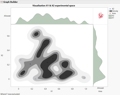
What I do for mixture Space-Filling designs (with few factors like 3) to see homogeneity of points distribution in experimental space is to use the Graph Builder and combine several informations on one graph, using 2 factors at the same time (X1 and X2 here) :
Using a dummy column you can plot histogram (kernel density style) next to a contour plot for X1 & X2.
I didn't spend time customizing the colors, but here is the script so you can try it :
Graph Builder(
	Size( 711, 588 ),
	Show Control Panel( 0 ),
	Variables( X( :X1 ), X( :Area ), Y( :Area ), Y( :X2 ) ),
	Relative Sizes( "X", [558 99] ),
	Relative Sizes( "Y", [112 411] ),
	Elements(
		Position( 1, 1 ),
		Histogram(
			X,
			Y,
			Legend( 19 ),
			Overlap( 0.6394 ),
			Histogram Style( "Kernel Density" ),
			Smoothness( -0.5229 )
		)
	),
	Elements(
		Position( 1, 2 ),
		Points( X, Y, Legend( 3 ) ),
		Contour( X, Y, Legend( 5 ), Number of Levels( 4 ) )
	),
	Elements( Position( 2, 1 ), Points( X, Y, Legend( 12 ) ) ),
	Elements(
		Position( 2, 2 ),
		Histogram(
			X,
			Y,
			Legend( 18 ),
			Overlap( 1.089 ),
			Histogram Style( "Kernel Density" ),
			Smoothness( -0.4128 )
		)
	),
	SendToReport(
		Dispatch(
			{},
			"graph title",
			TextEditBox,
			{Set Text( "Visualisation X1 & X2 experimental space" )}
		),
		Dispatch( {}, "Y title", TextEditBox, {Set Text( "" )} ),
		Dispatch(
			{},
			"400",
			LegendBox,
			{Legend Position( {19, [4], 3, [0], 5, [1], 12, [2], 18, [3]} )}
		)
	)
);
I can reproduce it on a toy sample dataset if you wnt to see in details how it is constructed with Graph Builder.
Best,
"It is not unusual for a well-designed experiment to analyze itself" (Box, Hunter and Hunter)
- Mark as New
- Bookmark
- Subscribe
- Mute
- Subscribe to RSS Feed
- Get Direct Link
- Report Inappropriate Content
Re: Density contours in ternary diagrams
Thank you Victor for your help, it would be great if this could work with ternary plots also. Here is a toy sample dataset in case you would like to play with it ;) Don't bother with the last column with the Mixture Density formula.
Thanks again
- Mark as New
- Bookmark
- Subscribe
- Mute
- Subscribe to RSS Feed
- Get Direct Link
- Report Inappropriate Content
Re: Density contours in ternary diagrams
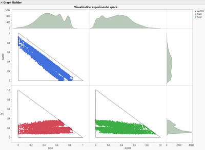
Unfortunately Graph Builder is not able to do Ternary plot, and the Ternary plot graph options doesn't seem to be fully customizable.
Here is an attempt at visualizing the experimental space in 2D :
You'll find attached in the datatable the script used to realize this graph.
Hope this may help you in the meantime,
"It is not unusual for a well-designed experiment to analyze itself" (Box, Hunter and Hunter)
- Mark as New
- Bookmark
- Subscribe
- Mute
- Subscribe to RSS Feed
- Get Direct Link
- Report Inappropriate Content
Re: Density contours in ternary diagrams
Nice ! Thank you Victor.
Hopefully density contours in ternary plot will come with JMP 19 version ;)
Recommended Articles
- © 2026 JMP Statistical Discovery LLC. All Rights Reserved.
- Terms of Use
- Privacy Statement
- Contact Us


