- New to JMP? Let the Data Analysis Director guide you through selecting an analysis task, an analysis goal, and a data type. Available now in the JMP Marketplace!
- See how to install JMP Marketplace extensions to customize and enhance JMP.
- Subscribe to RSS Feed
- Mark Topic as New
- Mark Topic as Read
- Float this Topic for Current User
- Bookmark
- Subscribe
- Mute
- Printer Friendly Page
Discussions
Solve problems, and share tips and tricks with other JMP users.- JMP User Community
- :
- Discussions
- :
- Demonstrating Pareto's Law with JMP graph
- Mark as New
- Bookmark
- Subscribe
- Mute
- Subscribe to RSS Feed
- Get Direct Link
- Report Inappropriate Content
Demonstrating Pareto's Law with JMP graph
Hi everyone,
I will like to create a graph to show that 80% of the revenue comes from the top 20% of the customers in a store. My current data columns are:
1. CustomerID (around 4000+ data points)
2. Revenue
Would there be a way to build this graph in JMP? I've tried the Pareto Plot but have not been too successful.
Thank you! Cheers.
- Mark as New
- Bookmark
- Subscribe
- Mute
- Subscribe to RSS Feed
- Get Direct Link
- Report Inappropriate Content
Re: Demonstrating Pareto's Law with JMP graph
Hi,
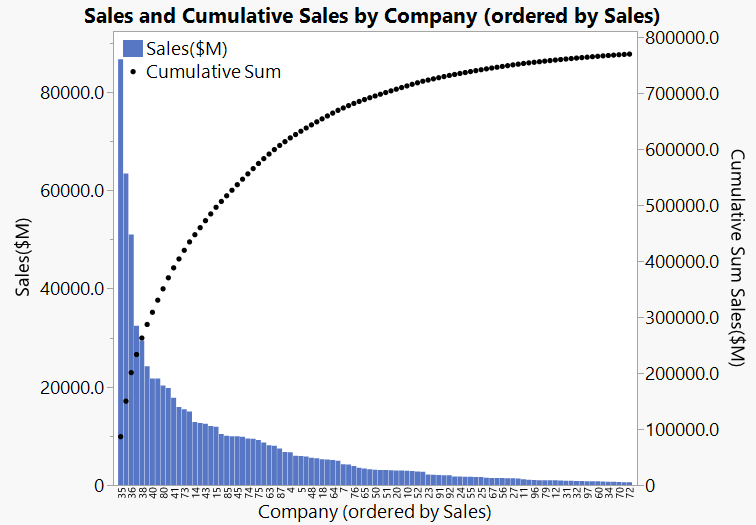
Would this kind of graph help?
Example data table attached.
Regards,
Phil
- Mark as New
- Bookmark
- Subscribe
- Mute
- Subscribe to RSS Feed
- Get Direct Link
- Report Inappropriate Content
Re: Demonstrating Pareto's Law with JMP graph
Thank you Phil!
Yes it helps greatly. I was wondering if you could share how you did the ordering, as well as how you obtained the cumulative sales line? In addition, would it be possible for the cumulative sales to be in % instead?
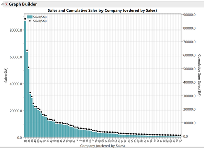
I opened the Graph Builder script and could only see this:
- Mark as New
- Bookmark
- Subscribe
- Mute
- Subscribe to RSS Feed
- Get Direct Link
- Report Inappropriate Content
Re: Demonstrating Pareto's Law with JMP graph
I am not sure why you graph looks so different when you run the Graph Builder script. I think it is partly due to preferences that you have set. But it should show the same cumulative sales curve.
There are a few clicks involved so I thought it would be best to record a short video demo.
Some key points to achieve the graph:
- We order the Company axis by Sales by dragging Sales to the drop zone above centre of the x-axis.
- We select order descending after right-click on the x-axis labels
- We add Sales on the y-axis then we add it again (drop in the zone to the centre-right of the y-axis)
- We right-click on the y-axis labels to move one of the instances of the Sales variable to the right
- We change the statistic of the right y-axis to Cumulative Sum
- We right-click on the white space in the plot to change between bar and point plots for the variables
Are you able to recreate the graph now?
Cheers,
Phil
Recommended Articles
- © 2026 JMP Statistical Discovery LLC. All Rights Reserved.
- Terms of Use
- Privacy Statement
- Contact Us


