- New to JMP? Let the Data Analysis Director guide you through selecting an analysis task, an analysis goal, and a data type. Available now in the JMP Marketplace!
- See how to install JMP Marketplace extensions to customize and enhance JMP.
- Subscribe to RSS Feed
- Mark Topic as New
- Mark Topic as Read
- Float this Topic for Current User
- Bookmark
- Subscribe
- Mute
- Printer Friendly Page
Discussions
Solve problems, and share tips and tricks with other JMP users.- JMP User Community
- :
- Discussions
- :
- Re: Customizing the title of a set of plots
- Mark as New
- Bookmark
- Subscribe
- Mute
- Subscribe to RSS Feed
- Get Direct Link
- Report Inappropriate Content
Customizing the title of a set of plots
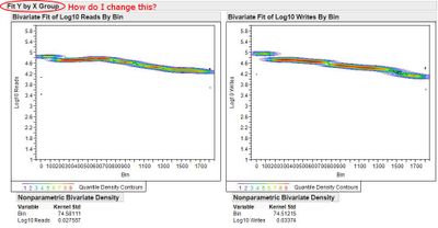
I currently have a script to produce the following plot. The call that finally produces it looks like this:
chart = Bivariate( Y( :Log10 Reads , :Log10 Writes ), X( :Bin ), Nonpar Density,
Send To Report(
Dispatch( {}, "Bivar Plot", Framebox, {Frame Size(plotWidth, plotHeight)}),
Dispatch({}, "1", ScaleBox, {Format("Best", 10), Min(xMin), Max(xMax), Inc(xInc),
Minor Ticks(1), Rotated Labels("Horizontal")}),
Dispatch({}, "2", ScaleBox, {Format("Best", 10), Min(yMin), Max(yMax), Inc(yInc),
Minor Ticks(1), Rotated Labels("Horizontal")})
)
);
My question is simply, how do I programmatically change the title of the grouping of bivariate plots (circled below) to something customized and more descriptive?
Accepted Solutions
- Mark as New
- Bookmark
- Subscribe
- Mute
- Subscribe to RSS Feed
- Get Direct Link
- Report Inappropriate Content
Re: Customizing the title of a set of plots
If the report is the top open report this should work:
Current Report()[Outline Box( 1 )] << set title( "my plots" )
- Mark as New
- Bookmark
- Subscribe
- Mute
- Subscribe to RSS Feed
- Get Direct Link
- Report Inappropriate Content
Re: Customizing the title of a set of plots
If the report is the top open report this should work:
Current Report()[Outline Box( 1 )] << set title( "my plots" )
Recommended Articles
- © 2026 JMP Statistical Discovery LLC. All Rights Reserved.
- Terms of Use
- Privacy Statement
- Contact Us
