- New to JMP? Let the Data Analysis Director guide you through selecting an analysis task, an analysis goal, and a data type. Available now in the JMP Marketplace!
- See how to install JMP Marketplace extensions to customize and enhance JMP.
- Subscribe to RSS Feed
- Mark Topic as New
- Mark Topic as Read
- Float this Topic for Current User
- Bookmark
- Subscribe
- Mute
- Printer Friendly Page
Discussions
Solve problems, and share tips and tricks with other JMP users.- JMP User Community
- :
- Discussions
- :
- Creating categorized line graphs from scatter plot
- Mark as New
- Bookmark
- Subscribe
- Mute
- Subscribe to RSS Feed
- Get Direct Link
- Report Inappropriate Content
Creating categorized line graphs from scatter plot
Hi all,
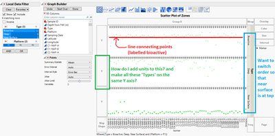
I am trying to create a line connecting different points within a scatter plot. For my example, I am trying to create a visual that compares the profile of a subset of variables, "isomers", and I want to create a fingerprint by connecting the points in the scatter plot.
The first problem I am encountering (green in visual):
I want to have the 3 different 'types' (near surface, bioactive and deep) on the same y-axis so that I can compare the magnitude of each different profile. The scatter plot is also not adding units in the y-axis.
The second problem:
I want to connect the scatter plot points in with a line that is labelled by the 'type'.
The third problem:
I want to remove the y grouping and simply change that to a labelled line.
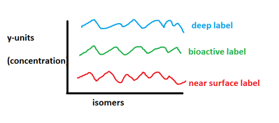
Sorry for the rough drawing, but I would like the graph to look something like this below:
This would be similar to the plots you would get from running a MANOVA.
Thanks ahead of time for any help!
- Mark as New
- Bookmark
- Subscribe
- Mute
- Subscribe to RSS Feed
- Get Direct Link
- Report Inappropriate Content
Re: Creating categorized line graphs from scatter plot
I am not sure if I understand what you want so this answer might be 'way off the mark.'
You data table should be 'tall.' One column each for Concentration, Isomer, and Type. Drag Concentration to the Y drop zone. Drag Isomer to the X drop zone and drag Type to the Overlay drop zone. You can customize the resulting legend. A single scale will result so you can compare the plots of each Type.
- Mark as New
- Bookmark
- Subscribe
- Mute
- Subscribe to RSS Feed
- Get Direct Link
- Report Inappropriate Content
Re: Creating categorized line graphs from scatter plot
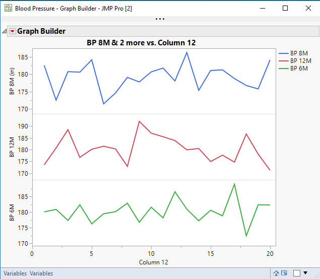
Is this the type of graph you want? As @Mark_Bailey also indicated, I am having a bit of an issue with exactly what you want
This graph is created by dragging in 3 separate columns. It allows for the axes for each to be independent. Also, if you note on the top (blue line graph), the Units column property is being displayed, (in).
Recommended Articles
- © 2026 JMP Statistical Discovery LLC. All Rights Reserved.
- Terms of Use
- Privacy Statement
- Contact Us


