- New to JMP? Let the Data Analysis Director guide you through selecting an analysis task, an analysis goal, and a data type. Available now in the JMP Marketplace!
- See how to install JMP Marketplace extensions to customize and enhance JMP.
- Subscribe to RSS Feed
- Mark Topic as New
- Mark Topic as Read
- Float this Topic for Current User
- Bookmark
- Subscribe
- Mute
- Printer Friendly Page
Discussions
Solve problems, and share tips and tricks with other JMP users.- JMP User Community
- :
- Discussions
- :
- Re: Create pie chart images for each line of a data table
- Mark as New
- Bookmark
- Subscribe
- Mute
- Subscribe to RSS Feed
- Get Direct Link
- Report Inappropriate Content
Create pie chart images for each line of a data table
Hi all,
I have a data table with say 6 columns, one identifies the sample site, 2 are X and Y coordinates of that site and the last 3 are the relative abundance of say 3 different species at that location. I simply want a map where each site is shown as a pie chart describing the relative abundance of the 3 species. It seems like an easy problem but I can't quite figure out how to do it. I presume I need first to create an image column with the pie chart images in it and then use that column as markers?
Thanks in advance, Yves
- Tags:
- macOS
Accepted Solutions
- Mark as New
- Bookmark
- Subscribe
- Mute
- Subscribe to RSS Feed
- Get Direct Link
- Report Inappropriate Content
Re: Create pie chart images for each line of a data table
Even that is possible, @yvesprairie .
Steps you can achieve this are:
1. Create a Column of Graphs
2. Create the Graph
3. Select the Graph Column as the Symbols
Here's a way:
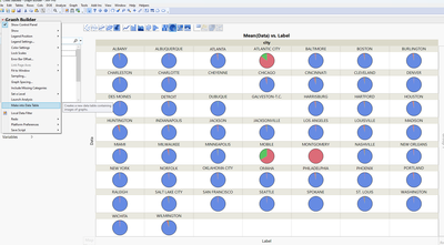
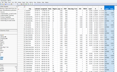
1. You can make a Graph into a Data Table. Here, I created the Pie Chart and used the Wrap field to have one per City:
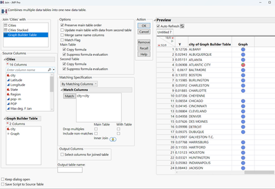
2. The Table is just containing the label and the graph in two columns. So you need to join it with your inital table (Table > Join)
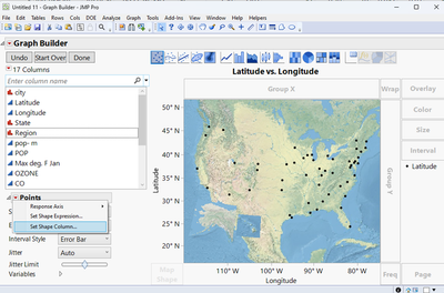
3. Create the Graph and select the Graph Column as Symbols
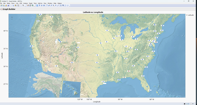
Result:
In my example here the graphs are a bit small as Icons, so you might need to adjust the graphs size a bit.
Best
Florian
- Mark as New
- Bookmark
- Subscribe
- Mute
- Subscribe to RSS Feed
- Get Direct Link
- Report Inappropriate Content
Re: Create pie chart images for each line of a data table
Hi @yvesprairie ,
not too complicated I'd say.
What you need is:
1. Create the Pie Chart (without any filtering)
2. Create the Geographic Map Chart
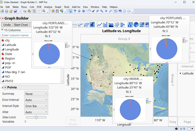
3. Right Click a data point in the Geographic Map Chart and add a Hover Label
The Result is a Map with Labels showing the relative abundance of your variable (species) per location (Sweet benefit is that these Hover Labels are actual Graphs themselves, so you can drill down into a specific location by clicking on it):
How to do this:
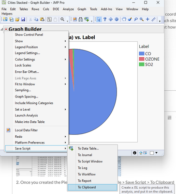
1. Create Pie Chart in Graph Builder. You might need to stack you data first:
2. Once you created the Pie Chart, go to the Red Triangle > Save Script > To Clipboard
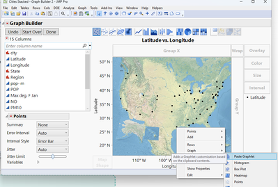
3. Create the Map Graph, right-click a data point and add the Hover Label via 'Hover Label' > 'Paste Graphlet'
Note: 'Paste Graphlet' only appears if you have copied a script to the clipboard before.
Hope that helps.
Best
Florian
- Mark as New
- Bookmark
- Subscribe
- Mute
- Subscribe to RSS Feed
- Get Direct Link
- Report Inappropriate Content
Re: Create pie chart images for each line of a data table
Fantastic, thank you very much Florian. How difficult would it be to now have the "pies" as markers instead of having them popup when one hovers over a point? This would be nice to produce a static map with all the information.
Thanks again, Yves
- Mark as New
- Bookmark
- Subscribe
- Mute
- Subscribe to RSS Feed
- Get Direct Link
- Report Inappropriate Content
Re: Create pie chart images for each line of a data table
Even that is possible, @yvesprairie .
Steps you can achieve this are:
1. Create a Column of Graphs
2. Create the Graph
3. Select the Graph Column as the Symbols
Here's a way:
1. You can make a Graph into a Data Table. Here, I created the Pie Chart and used the Wrap field to have one per City:
2. The Table is just containing the label and the graph in two columns. So you need to join it with your inital table (Table > Join)
3. Create the Graph and select the Graph Column as Symbols
Result:
In my example here the graphs are a bit small as Icons, so you might need to adjust the graphs size a bit.
Best
Florian
- Mark as New
- Bookmark
- Subscribe
- Mute
- Subscribe to RSS Feed
- Get Direct Link
- Report Inappropriate Content
Re: Create pie chart images for each line of a data table
Thank you again Florian. No wonder I love JMP! Yves
Recommended Articles
- © 2026 JMP Statistical Discovery LLC. All Rights Reserved.
- Terms of Use
- Privacy Statement
- Contact Us


