- JMP will suspend normal business operations for our Winter Holiday beginning on Wednesday, Dec. 24, 2025, at 5:00 p.m. ET (2:00 p.m. ET for JMP Accounts Receivable).
Regular business hours will resume at 9:00 a.m. EST on Friday, Jan. 2, 2026. - We’re retiring the File Exchange at the end of this year. The JMP Marketplace is now your destination for add-ins and extensions.
- Subscribe to RSS Feed
- Mark Topic as New
- Mark Topic as Read
- Float this Topic for Current User
- Bookmark
- Subscribe
- Mute
- Printer Friendly Page
Discussions
Solve problems, and share tips and tricks with other JMP users.- JMP User Community
- :
- Discussions
- :
- Converting date categories to a continual date axis
- Mark as New
- Bookmark
- Subscribe
- Mute
- Subscribe to RSS Feed
- Get Direct Link
- Report Inappropriate Content
Converting date categories to a continual date axis
Hi all,
I measured the growth of a group of animals roughly once a month for three months, and then let two months go by before I measured them a final time. I would like to graph the average growth over time. To do this, I will need to include a gap along the x-axis to represent the two month period when I didn't record growth. In other words, my x coordinates are January 9, 10, 11; February 11, 12, 13; March 29, 30; April 11, 12; and July 9, 10. (It took me several days to measure all the individuals in the population each time, so each "monthly" measurement actually consists of two or three days.) How do I get the program to recognize these as dates and space them accordingly along the x-axis when I construct a graph? Alternatively, how do I change the dates to Julian day? I'd rather display the actual dates with tick marks representing every day, or every 10 days or whatever, that provide the correct spacing in between the dates.
Thanks very much for your help.
Accepted Solutions
- Mark as New
- Bookmark
- Subscribe
- Mute
- Subscribe to RSS Feed
- Get Direct Link
- Report Inappropriate Content
Re: Converting date categories to a continual date axis
Hi rrimler,
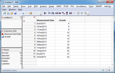
Suppose your data looks like this. Notice that the Measurement Date column is of text type, and the dates are in the form ddMonYYYY.
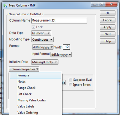
Right click on the empty column header next to the word "Growth" and select "New Column". Call this column Measurement Dt.
Set the format of the data to Date > ddMonYYYY
Click on Column Properties > Formula.
Click on the Edit Formula button
Double click inside the red box that says no formula and enter the following text: informat(:Measurement Date, "ddMonYYYY")
Click OK and the OK again.
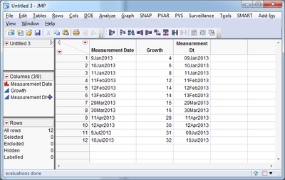
Now your dataset has a numeric column that shows the date you entered in the first column.
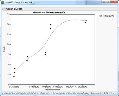
Click on Graph > Graph Builder. Drag Measurement Dt to the X axis, and Growth to the Y axis.
- Mark as New
- Bookmark
- Subscribe
- Mute
- Subscribe to RSS Feed
- Get Direct Link
- Report Inappropriate Content
Re: Converting date categories to a continual date axis
hi
Proc SGPLOT supports time axis, see sample code below.
infile cards dlm=",";
input
date : date9.
;
format date date9.;
population = ceil( rand("uniform") * 25) + 20;
cards;
09jan2013
10jan2013
11jan2013
11feb2013
12feb2013
13feb2013
29mar2013
30mar2013
11apr2013
12apr2013
09jul2013
10jul2013
;
proc sgplot data=have;
series x=date y=population / markers;
yaxis min=0;
xaxis type=time interval=week grid;
run;
- Mark as New
- Bookmark
- Subscribe
- Mute
- Subscribe to RSS Feed
- Get Direct Link
- Report Inappropriate Content
Re: Converting date categories to a continual date axis
Assuming you use JMP, you need to use a continuous, date-formatted column as x-variable.
One way to convert your date strings into date-values is to use a column formula. In the jsl example below the strings are found in column "x" and the formula in column "Date" turn "x" into the corresponding date (here based on the first day of the measurement interval).
dt = New Table( "example",
Add Rows( 4 ),
New Column( "x",
Character,
Nominal,
Set Values( {"January 9, 10, 11", "February 11, 12, 13", "April 11, 12", "July 9, 10"} )
)
);
dt << New Column( "Date",
Numeric,
Continuous,
Format( "ddMonyyyy", 12 ),
Input Format( "ddMonyyyy" ),
formula( Parse Date( Words( :x, ", " )[2] || Left( :x, 3 ) || "2013", "ddMonyyyy" ) )
);
- Mark as New
- Bookmark
- Subscribe
- Mute
- Subscribe to RSS Feed
- Get Direct Link
- Report Inappropriate Content
Re: Converting date categories to a continual date axis
Thank you both for your replies. I am new to JMP and don't have experience with programming language. Could you walk me through these formulas? I guess my first question is (and I'm a little embarrassed to ask)-- where do I write all this stuff? Under column formula? Also, what does dt mean?
- Mark as New
- Bookmark
- Subscribe
- Mute
- Subscribe to RSS Feed
- Get Direct Link
- Report Inappropriate Content
Re: Converting date categories to a continual date axis
Hi rrimler,
Suppose your data looks like this. Notice that the Measurement Date column is of text type, and the dates are in the form ddMonYYYY.
Right click on the empty column header next to the word "Growth" and select "New Column". Call this column Measurement Dt.
Set the format of the data to Date > ddMonYYYY
Click on Column Properties > Formula.
Click on the Edit Formula button
Double click inside the red box that says no formula and enter the following text: informat(:Measurement Date, "ddMonYYYY")
Click OK and the OK again.
Now your dataset has a numeric column that shows the date you entered in the first column.
Click on Graph > Graph Builder. Drag Measurement Dt to the X axis, and Growth to the Y axis.
- Mark as New
- Bookmark
- Subscribe
- Mute
- Subscribe to RSS Feed
- Get Direct Link
- Report Inappropriate Content
Re: Converting date categories to a continual date axis
Thank you! It worked. Although when I try to make a chart instead of using graph builder, it doesn't work (it graphs the dates as categories instead of as a continuous variable.) If you have any advice about how to fix the problem in "chart", I'd appreciate it. However it works great in graph builder and that is a huge step forward for me!
- Mark as New
- Bookmark
- Subscribe
- Mute
- Subscribe to RSS Feed
- Get Direct Link
- Report Inappropriate Content
Re: Converting date categories to a continual date axis
Have you tried Overlay Plot?
- Mark as New
- Bookmark
- Subscribe
- Mute
- Subscribe to RSS Feed
- Get Direct Link
- Report Inappropriate Content
Re: Converting date categories to a continual date axis
Well, the thing is that I want to graph the mean growth including error bars, and as far as I can figure out the only way to do that is select Graph--> Chart. That dialogue box gives the option of running the "statistic" of the column. "Graph Builder" and "Overlay Plot" don't give you the option of running a statistic. Is there something I'm missing?
- Mark as New
- Bookmark
- Subscribe
- Mute
- Subscribe to RSS Feed
- Get Direct Link
- Report Inappropriate Content
Re: Converting date categories to a continual date axis
Yes, a column formula is added by adding the property Formula to a column, as PMroz shows nicely. In my example, the formula is just the expression within Formula(). You do not need to understand the rest of the code. The entire code was for demonstration only, and was supposed to make an example table and add a column with that particular formula. Try it! Copy the code to a JMP script window and hit run. You can copy the formula from the example table to your own data table if it seems to work the way you want.
Regarding dt, it is just a variable for for the data table.
Bruno's code is for SAS and will not work in JMP.
- Mark as New
- Bookmark
- Subscribe
- Mute
- Subscribe to RSS Feed
- Get Direct Link
- Report Inappropriate Content
Re: Converting date categories to a continual date axis
Thanks very much. Very helpful!
Recommended Articles
- © 2026 JMP Statistical Discovery LLC. All Rights Reserved.
- Terms of Use
- Privacy Statement
- Contact Us


