- New to JMP? Let the Data Analysis Director guide you through selecting an analysis task, an analysis goal, and a data type. Available now in the JMP Marketplace!
- See how to install JMP Marketplace extensions to customize and enhance JMP.
- Subscribe to RSS Feed
- Mark Topic as New
- Mark Topic as Read
- Float this Topic for Current User
- Bookmark
- Subscribe
- Mute
- Printer Friendly Page
Discussions
Solve problems, and share tips and tricks with other JMP users.- JMP User Community
- :
- Discussions
- :
- Control display of box plot / points in grouped chart based on data label
- Mark as New
- Bookmark
- Subscribe
- Mute
- Subscribe to RSS Feed
- Get Direct Link
- Report Inappropriate Content
Control display of box plot / points in grouped chart based on data label
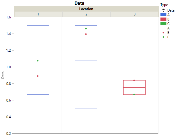
I have some data that I want to display in a specific way with some box plots and can't figure out how to get the result I'm looking for. I have measurements of a parameter at four locations, let's say Location 1, Location 2, and Location 3. The measurements are done on three different types of parts, let's say A, B, C. I have a huge population of data from parts of Type A at Location 1 and Location 2. I have a very small amount of data for parts of Type B and C (one of each), at all three locations 1, 2, 3. Here is what I want to do:
- Show only boxes for Type A at Location 1 and Location 2
- Show only points for Type B and C, at all Locations
So in JMP, I have three columns: Data, Location, and Type. Using Graph Builder, I set Data to Y, Location to X grouping, and Type to Color. I enabled points and box plot, and set the transparency of the points for Type A to 0. This has me 99% of the way there. Now I'm just stuck on how to remove the box at Location 3.
Bonus points: In this case it's not a big deal, but ideally I would like the boxes to not be calculated using the B and C data. The only way I can think to do that is to split A off into its own column but then it overall seems more cumbersome.
Accepted Solutions
- Mark as New
- Bookmark
- Subscribe
- Mute
- Subscribe to RSS Feed
- Get Direct Link
- Report Inappropriate Content
Re: Control display of box plot / points in grouped chart based on data label
Use Transparency = 0 to hide the red box plot(s) *)
*) it will also remove the red box plots from Location 1&2:
Red box plots @ location 1&2?
Actually there should be some - and they appear when you use Type as overlay.
If you use Type as color, the single box plot will include all kinds of types (!): A,B C.
And to align the points and the box plots:
use Box placement: aligned
- Mark as New
- Bookmark
- Subscribe
- Mute
- Subscribe to RSS Feed
- Get Direct Link
- Report Inappropriate Content
Re: Control display of box plot / points in grouped chart based on data label
My suggestion is to split your data for each of the locations into separate columns, and then drag the 3 columns on to the graph, rather than using an X Grouping.
- Mark as New
- Bookmark
- Subscribe
- Mute
- Subscribe to RSS Feed
- Get Direct Link
- Report Inappropriate Content
Re: Control display of box plot / points in grouped chart based on data label
Use Transparency = 0 to hide the red box plot(s) *)
*) it will also remove the red box plots from Location 1&2:
Red box plots @ location 1&2?
Actually there should be some - and they appear when you use Type as overlay.
If you use Type as color, the single box plot will include all kinds of types (!): A,B C.
And to align the points and the box plots:
use Box placement: aligned
- Mark as New
- Bookmark
- Subscribe
- Mute
- Subscribe to RSS Feed
- Get Direct Link
- Report Inappropriate Content
Re: Control display of box plot / points in grouped chart based on data label
When I use Type as Overlay, the transparency of the box and point is linked (selecting either the box or the points of the Type automatically selects the other). Did you have to do anything to change their transparencies independently?
Edit: Right clicking without left clicking first seems to do the trick. Let me double check this ends up working correctly and then I'll accept the answer.
Recommended Articles
- © 2026 JMP Statistical Discovery LLC. All Rights Reserved.
- Terms of Use
- Privacy Statement
- Contact Us


