- New to JMP? Let the Data Analysis Director guide you through selecting an analysis task, an analysis goal, and a data type. Available now in the JMP Marketplace!
- See how to install JMP Marketplace extensions to customize and enhance JMP.
- Subscribe to RSS Feed
- Mark Topic as New
- Mark Topic as Read
- Float this Topic for Current User
- Bookmark
- Subscribe
- Mute
- Printer Friendly Page
Discussions
Solve problems, and share tips and tricks with other JMP users.- JMP User Community
- :
- Discussions
- :
- Re: Control charts: Charts plotting incline or decline
- Mark as New
- Bookmark
- Subscribe
- Mute
- Subscribe to RSS Feed
- Get Direct Link
- Report Inappropriate Content
Control charts: Charts plotting incline or decline
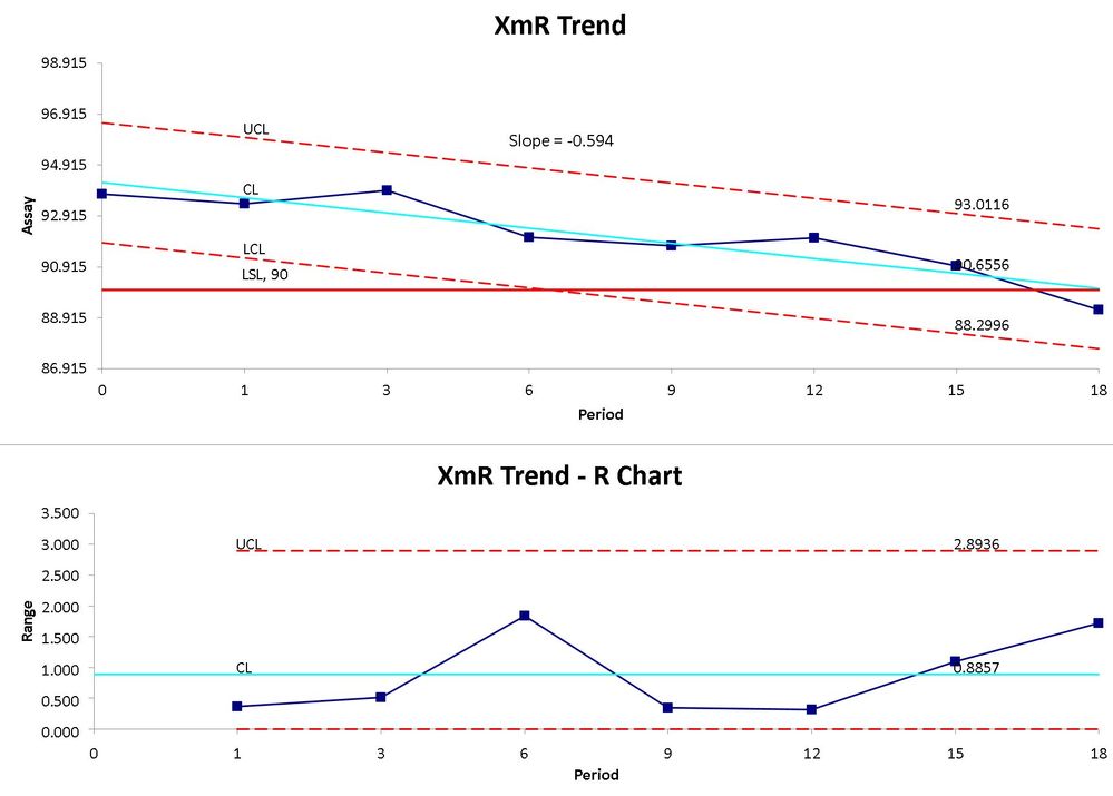
Hi, I would like to plot +/- 3 sigma and apply pattern rules to data inclining and declining data. Cannot seem to find the possibility to do so in JMP, but I see it in other software programs
Regards
Ian
Accepted Solutions
- Mark as New
- Bookmark
- Subscribe
- Mute
- Subscribe to RSS Feed
- Get Direct Link
- Report Inappropriate Content
Re: Control charts: Charts plotting incline or decline
First, heed @statman words.
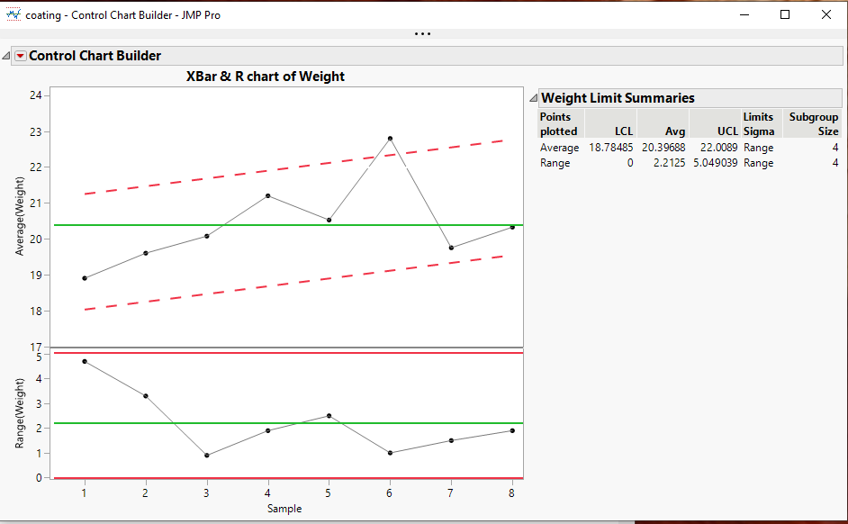
Second, JMP does not have a builtin option for drawing such lines in Control Chart Builder, however, JMP does have the ability to modify the graphic output using JSL. Below is a sample output and below that, the fairly simple script that modifies the chart.
names default to here(1);
dt=open("$SAMPLE_DATA\Quality Control\coating.jmp");

cc = dt << Control Chart Builder(
	Show Control Panel( 0 ),
	Show Capability( 0 ),
	Variables( Subgroup( :Sample ), Y( :Weight ) ),
	SendToReport(
		Dispatch(
			{},
			"Weight",
			ScaleBox,
			{Format( "Best", 10 ), Min( 16.9881233437177 ), Max( 24.2481694370065 ),
			Inc( 1 ), Minor Ticks( 0 )}
		),
		Dispatch(
			{},
			"Control Chart Builder",
			FrameBox,
			{DispatchSeg( Line Seg( 3 ), {Line Color( "White" )} ),
			DispatchSeg( Line Seg( 4 ), {Line Color( "White" )} )}
		)
	)
);


Report( cc )[FrameBox( 1 )] << add graphics script(
	yMat = dt:weight << get values;
	xMat = dt:sample << get values;
	{Estimates, Std_Error, Diagnostics} = Linear Regression( yMat, xMat );
	sigma = ((Report( cc )["Weight Limit Summaries"][Number Col Box( 3 )] << get)[1] -
	(Report( cc )["Weight Limit Summaries"][Number Col Box( 1 )] << get)[1]) / 2;
	Pen Color( "red" );
	Pen Size( 2 );
	line style( "Dashed" );
	List1 = {};
	List1[1] = col minimum(:sample);
	List1[2] = sigma + estimates[1] + Estimates[2] * mean(:sample[dt<<get rows where(:sample == col minimum(:sample))]);
	List2 = {};
	List2[1] = col Maximum(:Sample);
	List2[2] = sigma + estimates[1] + Estimates[2] * mean(:sample[dt<<get rows where(:sample == col maximum(:sample))]);
	Line(list1,list2);
	List1[2] = List1[2] - 2 * sigma;
	List2[2] = List2[2] - 2 * sigma;
	Line(list1,list2)
)
- Mark as New
- Bookmark
- Subscribe
- Mute
- Subscribe to RSS Feed
- Get Direct Link
- Report Inappropriate Content
Re: Control charts: Charts plotting incline or decline
I don't know your specific application, but I have some thoughts. First the MR chart will work fine for detecting special/assignable cause variation in the short-term (as a function of the variables changing between consecutive "measures"). The limits on the X-chart are based on the variation captured on the MR chart. The X-chart is meant to provide some insight into variation over longer-term (due to variables changing over longer periods of time). It answers the question: Is the variation over long-term greater than the variation in consecutive measure? So if there is a trend or shift in the data over time, the X-chart should detect this (as it does).
If you expect this to happen, you could regress on the Y (Analyze>Fit Model). Save the predicted values (red triangle>Save Columns>Predicted Values). Create a new column (Y2) with a formula: Predicted Y- Y. This will remove the trend in the data. You could then run the IR charts on the new Y2. You need to understand what this is detecting for you and decide if this is what you want.
If you attach the data table I can give it a look.
- Mark as New
- Bookmark
- Subscribe
- Mute
- Subscribe to RSS Feed
- Get Direct Link
- Report Inappropriate Content
Re: Control charts: Charts plotting incline or decline
First, heed @statman words.
Second, JMP does not have a builtin option for drawing such lines in Control Chart Builder, however, JMP does have the ability to modify the graphic output using JSL. Below is a sample output and below that, the fairly simple script that modifies the chart.
names default to here(1);
dt=open("$SAMPLE_DATA\Quality Control\coating.jmp");

cc = dt << Control Chart Builder(
	Show Control Panel( 0 ),
	Show Capability( 0 ),
	Variables( Subgroup( :Sample ), Y( :Weight ) ),
	SendToReport(
		Dispatch(
			{},
			"Weight",
			ScaleBox,
			{Format( "Best", 10 ), Min( 16.9881233437177 ), Max( 24.2481694370065 ),
			Inc( 1 ), Minor Ticks( 0 )}
		),
		Dispatch(
			{},
			"Control Chart Builder",
			FrameBox,
			{DispatchSeg( Line Seg( 3 ), {Line Color( "White" )} ),
			DispatchSeg( Line Seg( 4 ), {Line Color( "White" )} )}
		)
	)
);


Report( cc )[FrameBox( 1 )] << add graphics script(
	yMat = dt:weight << get values;
	xMat = dt:sample << get values;
	{Estimates, Std_Error, Diagnostics} = Linear Regression( yMat, xMat );
	sigma = ((Report( cc )["Weight Limit Summaries"][Number Col Box( 3 )] << get)[1] -
	(Report( cc )["Weight Limit Summaries"][Number Col Box( 1 )] << get)[1]) / 2;
	Pen Color( "red" );
	Pen Size( 2 );
	line style( "Dashed" );
	List1 = {};
	List1[1] = col minimum(:sample);
	List1[2] = sigma + estimates[1] + Estimates[2] * mean(:sample[dt<<get rows where(:sample == col minimum(:sample))]);
	List2 = {};
	List2[1] = col Maximum(:Sample);
	List2[2] = sigma + estimates[1] + Estimates[2] * mean(:sample[dt<<get rows where(:sample == col maximum(:sample))]);
	Line(list1,list2);
	List1[2] = List1[2] - 2 * sigma;
	List2[2] = List2[2] - 2 * sigma;
	Line(list1,list2)
)
- Mark as New
- Bookmark
- Subscribe
- Mute
- Subscribe to RSS Feed
- Get Direct Link
- Report Inappropriate Content
Re: Control charts: Charts plotting incline or decline
Thanks Jim for this, this is the closest to the solution for me, I guess I need to invest some time to understand JLS, if this is a simply script!!! I need to to learn this language. Appreciate yours and @statman support cheers Ian
- Mark as New
- Bookmark
- Subscribe
- Mute
- Subscribe to RSS Feed
- Get Direct Link
- Report Inappropriate Content
Re: Control charts: Charts plotting incline or decline
Thanks for the response, my application is assessing processes where there is an expectation of and incline or deline in a process, such as degradation of a substance over time, or even the contamination rate of Covid 19, its useful to assess if the increase or decrease is consistent or not. The Rule sets for normal control charts work fine in detecting a change, but I wanted to see if the change was consistent. I think the second solution shown is the best course for me, but thank you for responding
Regards Ian
Recommended Articles
- © 2026 JMP Statistical Discovery LLC. All Rights Reserved.
- Terms of Use
- Privacy Statement
- Contact Us


