- JMP will suspend normal business operations for our Winter Holiday beginning on Wednesday, Dec. 24, 2025, at 5:00 p.m. ET (2:00 p.m. ET for JMP Accounts Receivable).
Regular business hours will resume at 9:00 a.m. EST on Friday, Jan. 2, 2026. - We’re retiring the File Exchange at the end of this year. The JMP Marketplace is now your destination for add-ins and extensions.
- Subscribe to RSS Feed
- Mark Topic as New
- Mark Topic as Read
- Float this Topic for Current User
- Bookmark
- Subscribe
- Mute
- Printer Friendly Page
Discussions
Solve problems, and share tips and tricks with other JMP users.- JMP User Community
- :
- Discussions
- :
- Control Chart - JMP 15
- Mark as New
- Bookmark
- Subscribe
- Mute
- Subscribe to RSS Feed
- Get Direct Link
- Report Inappropriate Content
Control Chart - JMP 15
I just updated JMP to 15 version.
I do not know how to create the time line on Individual and Moving Range Control Chart.
Also my table have category data that I can create Individual chart for each in one chart as I can do in JMP 14. I do not know how to do this in JMP 15.
Any helps will be much appreciated and thanks.
Canh
Accepted Solutions
- Mark as New
- Bookmark
- Subscribe
- Mute
- Subscribe to RSS Feed
- Get Direct Link
- Report Inappropriate Content
Re: Control Chart - JMP 15
The legacy control charts are still available but deprecated. The newer Control Chart Builder is the preferred platform for making control charts now.
- Mark as New
- Bookmark
- Subscribe
- Mute
- Subscribe to RSS Feed
- Get Direct Link
- Report Inappropriate Content
Re: Control Chart - JMP 15
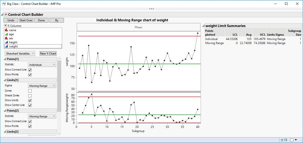
I recommend that you begin to use Control Chart Builder. As an example, I opened Big Class, selected Analyze > Quality > Control Chart Builder. I simply drag the measurement to the Y axis or inside the plot frame to get the XmR chart:
You can select another column with categories and click By. Click Done when you have finished making your charts.
- Mark as New
- Bookmark
- Subscribe
- Mute
- Subscribe to RSS Feed
- Get Direct Link
- Report Inappropriate Content
Re: Control Chart - JMP 15
Thanks Mark for a very quick response.
For the control chart, I like to see the time line on x-axis to see the process behaves over-time.
Just a short note: using JMP is one of the best part of my job here. Go JMP!
- Mark as New
- Bookmark
- Subscribe
- Mute
- Subscribe to RSS Feed
- Get Direct Link
- Report Inappropriate Content
Re: Control Chart - JMP 15
Sorry, I forgot that point. Simply drag the time data column to the subgroup axis (horizontal axis).
- Mark as New
- Bookmark
- Subscribe
- Mute
- Subscribe to RSS Feed
- Get Direct Link
- Report Inappropriate Content
Re: Control Chart - JMP 15
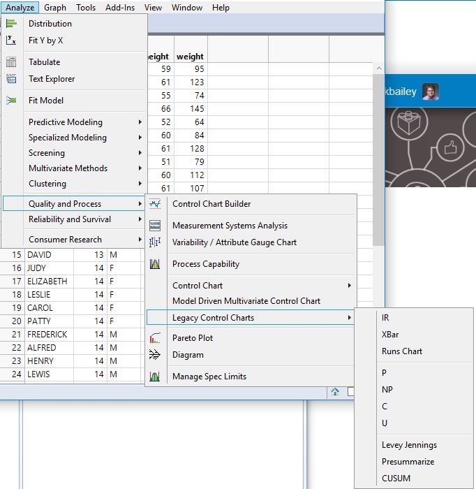
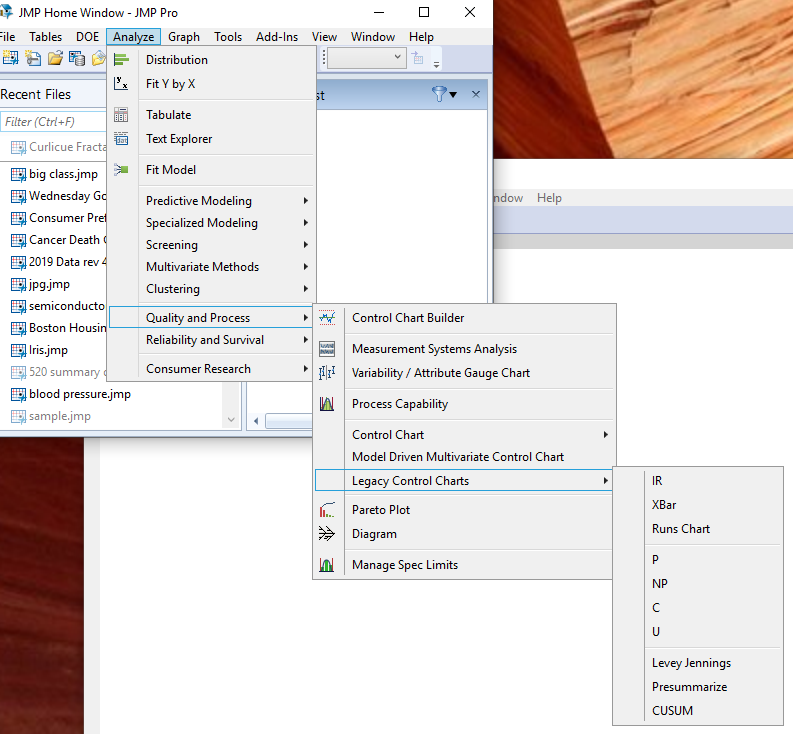
It sounds like the issue you are having is that when you click on the control chart that you were used to seeing in JMP 14, the Chart Builder version of that chart is popping up. You can still get to the older (legacy) version of the charts by selecting
- Mark as New
- Bookmark
- Subscribe
- Mute
- Subscribe to RSS Feed
- Get Direct Link
- Report Inappropriate Content
Re: Control Chart - JMP 15 problem
I have a data table the has 1 column with the date and another with data (the dates span from 1/1/2019 to 1/3/2020. In JMP14 IR chart when I phase the data by date it looks as I think it should. To the left are dates like 1/1/2019 and the right most date is 1/3/2020.
But in JMP 15.1 when I do the same thing in the legacy IR chart the dates are sorted. So that the right most is 12/31/2019 and the left most is 1/3/2020.
- Mark as New
- Bookmark
- Subscribe
- Mute
- Subscribe to RSS Feed
- Get Direct Link
- Report Inappropriate Content
Re: Control Chart - JMP 15 problem
Check the date data column properties. Is it using Value Order?
- Mark as New
- Bookmark
- Subscribe
- Mute
- Subscribe to RSS Feed
- Get Direct Link
- Report Inappropriate Content
Re: Control Chart - JMP 15 problem
yes making it use Row order levels now makes the IR chart look as expected. Would I have to change this on the date column on every table that I use the legacy IR or can I change this in preferences?
- Mark as New
- Bookmark
- Subscribe
- Mute
- Subscribe to RSS Feed
- Get Direct Link
- Report Inappropriate Content
Re: Control Chart - JMP 15 problem
Recommended Articles
- © 2026 JMP Statistical Discovery LLC. All Rights Reserved.
- Terms of Use
- Privacy Statement
- Contact Us


