- New to JMP? Let the Data Analysis Director guide you through selecting an analysis task, an analysis goal, and a data type. Available now in the JMP Marketplace!
- See how to install JMP Marketplace extensions to customize and enhance JMP.
- Subscribe to RSS Feed
- Mark Topic as New
- Mark Topic as Read
- Float this Topic for Current User
- Bookmark
- Subscribe
- Mute
- Printer Friendly Page
Discussions
Solve problems, and share tips and tricks with other JMP users.- JMP User Community
- :
- Discussions
- :
- Control Chart Builder

- Mark as New
- Bookmark
- Subscribe
- Mute
- Subscribe to RSS Feed
- Get Direct Link
- Report Inappropriate Content
Control Chart Builder
Hi all,
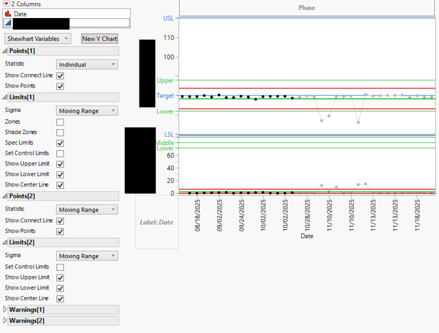
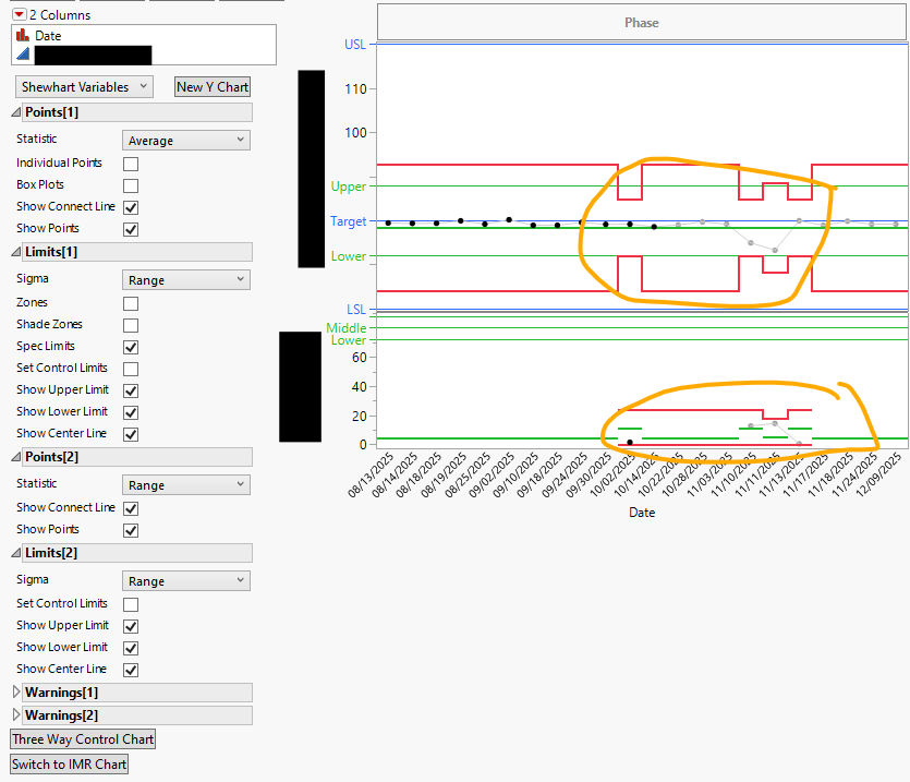
Attached are two control charts but the second one is changing point 1 statistic to average instead of individual when i try to graph it. the data is identical a date and a numerical value. what is even weirder is that i got it to work for one data set but not for another. both data sets are a date and numerical value does anyone have a solution for this?

- Mark as New
- Bookmark
- Subscribe
- Mute
- Subscribe to RSS Feed
- Get Direct Link
- Report Inappropriate Content
Re: Control Chart Builder
I have my doubts about your data being identical. If you have groups in your data (multiple values on same date in your case) JMP will use aggregation with control chart builder.
All values unique for Column 7

One "duplicate" value


- Mark as New
- Bookmark
- Subscribe
- Mute
- Subscribe to RSS Feed
- Get Direct Link
- Report Inappropriate Content
Re: Control Chart Builder
The first chart is an "IMR" chart, and the second is an "XBar&R" chart. See: Shewhart Control Charts for Variables.
JMP will default to the XBar type if there is more than one measurement per date, as @jthi pointed out. The rows where Range is nonzero would be an interesting place to spot-check whether the data tables are identical.
Here is a nice explanation of the different types of Control Charts, when to use them, and how JMP decides which format to use: SPC, MSA and Process Capability Training | JMP
Recommended Articles
- © 2026 JMP Statistical Discovery LLC. All Rights Reserved.
- Terms of Use
- Privacy Statement
- Contact Us