- New to JMP? Let the Data Analysis Director guide you through selecting an analysis task, an analysis goal, and a data type. Available now in the JMP Marketplace!
- See how to install JMP Marketplace extensions to customize and enhance JMP.
- Subscribe to RSS Feed
- Mark Topic as New
- Mark Topic as Read
- Float this Topic for Current User
- Bookmark
- Subscribe
- Mute
- Printer Friendly Page
Discussions
Solve problems, and share tips and tricks with other JMP users.- JMP User Community
- :
- Discussions
- :
- Re: Confusion matrix colour and count based on different variables
- Mark as New
- Bookmark
- Subscribe
- Mute
- Subscribe to RSS Feed
- Get Direct Link
- Report Inappropriate Content
Confusion matrix colour and count based on different variables
Hi,
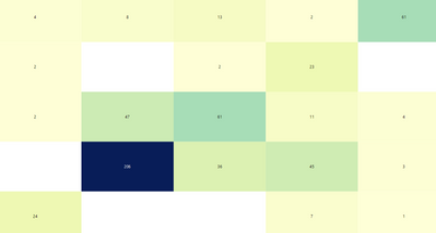
I'm working on a confusion matrix using the graph builder. I have 2 columns one is Known class (y-axis) an the other Predicted class (x-axis). I want the numbers inside the boxes to show the number of samples in each box. As shown in picture below.
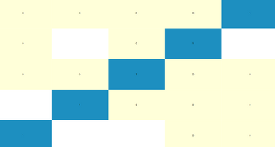
However, instead of the colour gradient map, I would like to have the main diagonal (True Positives) be one colour and the rest of the boxes a different colour. I have a column that is either 1 or 0 depending on whether the sample is a True Positive or not, however when I add this column to the colour option in Graph Builder this happens:
Is there a way I can have the colours as in the second picture, but the labels of the first picture?
Thank you!
Accepted Solutions
- Mark as New
- Bookmark
- Subscribe
- Mute
- Subscribe to RSS Feed
- Get Direct Link
- Report Inappropriate Content
Re: Confusion matrix colour and count based on different variables
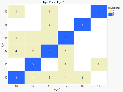
Sorry about that, I missed saving that step. Again here I summarized the table first and then drew the graph using row labels instead of the counts, but this time I actually defined row labels:
Names Default To Here( 1 );

dt = Open( "$Sample_data/big class.jmp" );

random reset(2);
dt << New Column("Age 2", Numeric, "Ordinal", Format("Fixed Dec", 5, 0), Formula(:age[Col Shuffle()]));
dt << Run Formulas;
dt:age << Set Name("Age 1");
dtSum = (sum = dt << Tabulate(
	Add Table(
		Column Table( Statistics( N ) ),
		Row Table( Grouping Columns( :"Age 2"n, :"Age 1"n ) )
	)
)) << Make Into Data Table;

dtSum << New Column("Is Diagonal", Numeric, "Nominal", Format("Best", 12), Formula(:Age 1 == :Age 2));

dtSum:N << Label( 1 );

gb = dtSum << Graph Builder(
	Size( 525, 450 ),
	Show Control Panel( 0 ),
	Variables( X( :Age 1 ), Y( :Age 2 ), Color( :Is Diagonal ) ),
	Elements( Heatmap( X, Y, Legend( 5 ), Label( "Label by Row" ) ) ),
	SendToReport(
		Dispatch(
			{},
			"400",
			ScaleBox,
			{Legend Model(
				5,
				Properties( 0, {Fill Color( -15790017 )}, Item ID( "0", 1 ) ),
				Properties( 1, {Fill Color( 5 )}, Item ID( "1", 1 ) )
			)}
		)
	)
);
- Mark as New
- Bookmark
- Subscribe
- Mute
- Subscribe to RSS Feed
- Get Direct Link
- Report Inappropriate Content
Re: Confusion matrix colour and count based on different variables
You could summarize the table first and then draw your graph using row labels instead of the counts:
Names Default To Here( 1 );

dt = Open( "$Sample_data/big class.jmp" );

random reset(2);
dt << New Column("Age 2", Numeric, "Ordinal", Format("Fixed Dec", 5, 0), Formula(:age[Col Shuffle()]));
dt:age << Set Name("Age 1");
dtSum = (dt << Tabulate(
	Add Table(
		Column Table( Statistics( N ) ),
		Row Table( Grouping Columns( :"Age 2"n, :"Age 1"n ) )
	)
)) << Make Into Data Table;

dtSum << New Column("Is Diagonal", Numeric, "Nominal", Format("Best", 12), Formula(:Age 1 == :Age 2));

dtSum << Graph Builder(
	Size( 525, 450 ),
	Show Control Panel( 0 ),
	Variables( X( :Age 1 ), Y( :Age 2 ), Color( :Is Diagonal ) ),
	Elements( Heatmap( X, Y, Legend( 5 ), Label( "Label by Row" ) ) ),
	SendToReport(
		Dispatch(
			{},
			"400",
			ScaleBox,
			{Legend Model(
				5,
				Properties( 0, {Fill Color( -15790017 )}, Item ID( "0", 1 ) ),
				Properties( 1, {Fill Color( 5 )}, Item ID( "1", 1 ) )
			)}
		)
	)
);
- Mark as New
- Bookmark
- Subscribe
- Mute
- Subscribe to RSS Feed
- Get Direct Link
- Report Inappropriate Content
Re: Confusion matrix colour and count based on different variables
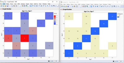
Thank you for your answer but I don't think this gives the right solution, see below:
Left shows the actual values that should be displayed, right is what the script provided results in.
- Mark as New
- Bookmark
- Subscribe
- Mute
- Subscribe to RSS Feed
- Get Direct Link
- Report Inappropriate Content
Re: Confusion matrix colour and count based on different variables
Sorry about that, I missed saving that step. Again here I summarized the table first and then drew the graph using row labels instead of the counts, but this time I actually defined row labels:
Names Default To Here( 1 );

dt = Open( "$Sample_data/big class.jmp" );

random reset(2);
dt << New Column("Age 2", Numeric, "Ordinal", Format("Fixed Dec", 5, 0), Formula(:age[Col Shuffle()]));
dt << Run Formulas;
dt:age << Set Name("Age 1");
dtSum = (sum = dt << Tabulate(
	Add Table(
		Column Table( Statistics( N ) ),
		Row Table( Grouping Columns( :"Age 2"n, :"Age 1"n ) )
	)
)) << Make Into Data Table;

dtSum << New Column("Is Diagonal", Numeric, "Nominal", Format("Best", 12), Formula(:Age 1 == :Age 2));

dtSum:N << Label( 1 );

gb = dtSum << Graph Builder(
	Size( 525, 450 ),
	Show Control Panel( 0 ),
	Variables( X( :Age 1 ), Y( :Age 2 ), Color( :Is Diagonal ) ),
	Elements( Heatmap( X, Y, Legend( 5 ), Label( "Label by Row" ) ) ),
	SendToReport(
		Dispatch(
			{},
			"400",
			ScaleBox,
			{Legend Model(
				5,
				Properties( 0, {Fill Color( -15790017 )}, Item ID( "0", 1 ) ),
				Properties( 1, {Fill Color( 5 )}, Item ID( "1", 1 ) )
			)}
		)
	)
);
Recommended Articles
- © 2026 JMP Statistical Discovery LLC. All Rights Reserved.
- Terms of Use
- Privacy Statement
- Contact Us


