- New to JMP? Let the Data Analysis Director guide you through selecting an analysis task, an analysis goal, and a data type. Available now in the JMP Marketplace!
- See how to install JMP Marketplace extensions to customize and enhance JMP.
- Subscribe to RSS Feed
- Mark Topic as New
- Mark Topic as Read
- Float this Topic for Current User
- Bookmark
- Subscribe
- Mute
- Printer Friendly Page
Discussions
Solve problems, and share tips and tricks with other JMP users.- JMP User Community
- :
- Discussions
- :
- Column Switcher - Dynamically Add/Remove Reference Lines
- Mark as New
- Bookmark
- Subscribe
- Mute
- Subscribe to RSS Feed
- Get Direct Link
- Report Inappropriate Content
Column Switcher - Dynamically Add/Remove Reference Lines
Hello,
I have a Distribution platform using a column switcher being populated with columns from a list variable. Each of these columns represents a different quality parameter and thus has different limits which are gathered from an SQL query.
Is there a way to dynamically add reference lines to the Distribution platform as the column switcher changes columns? Right now, I have a SendToReport running in a loop for each item, but it ends up with the reference lines for all columns added at once, rather than just the two needed for each column.
An easy way to do this would be if the column switcher supported an "on column change" script - I could then remove the previous ref lines and add the new ones every time it changes. I couldn't find any scripting index info for if something like this is supported.
JMP version: 14
	has_limits = {"item 1", "item 2", "item 3"};

	dist = dt << Distribution(
		Continuous Distribution( Column( "item 1" ), Horizontal Layout( 1 ), Always use column properties( 1 ), Vertical( 0 ), Outlier Box Plot( 0 ) ),
		Column Switcher( "item 1", has_limits )
	);

	For( n = 1, n <= N Items( has_limits ), n++,

		tempUCL = Col Max( Column( dt, has_limits[n] || "_UCL" ) );
		tempLCL = Col Max( Column( dt, has_limits[n] || "_LCL" ) );

		Eval(
			Eval Expr(
				dist << SendToReport(
					Dispatch(
						{Expr( has_limits[n] )},
						"1",
						ScaleBox,
						{Add Ref Line( Expr( tempUCL ), "Dashed", "Medium Dark Red", "UCL", 1 ), Add Ref Line(
							Expr( tempLCL ),
							"Dashed",
							"Medium Dark Red",
							"LCL",
							1
						)}
					)
				)
			)
		);

);- Mark as New
- Bookmark
- Subscribe
- Mute
- Subscribe to RSS Feed
- Get Direct Link
- Report Inappropriate Content
Re: Column Switcher - Dynamically Add/Remove Reference Lines
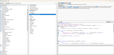
Looks like the column switch handler was not added until JMP 16.
- Mark as New
- Bookmark
- Subscribe
- Mute
- Subscribe to RSS Feed
- Get Direct Link
- Report Inappropriate Content
Re: Column Switcher - Dynamically Add/Remove Reference Lines
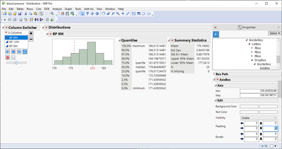
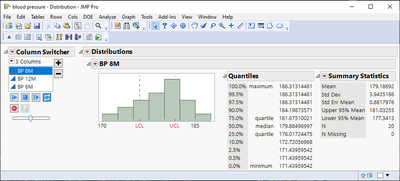
Here is a script that gets you partially there. For some reason, it removes the Axis values, but if you can try it on your data, you might be able to figure out how to get it to work correctly. The code was developed using JMP 14
names default to here(1);
dt = open("$SAMPLE_DATA/blood pressure.jmp");

has_limits = {"bp 8m", "bp 12m", "bp 6m"};

for(i=1,i<=nitems(has_limits),i++,
	new column(has_limits[i] || "_UCL", values(matrix(quantile(.75,column(has_limits[i])<<get values))));
	new column(has_limits[i] || "_LCL", values(matrix(quantile(.25,column(has_limits[i])<<get values))));
);

dist = dt << Distribution(
	Continuous Distribution(
		Column( "bp 8m" ),
		Horizontal Layout( 1 ),
		Always use column properties( 1 ),
		Vertical( 0 ),
		Outlier Box Plot( 0 )
	),
	Column Switcher( "item 1", has_limits )
);
report(dist)[framebox(1)]<<add graphics script(
	try(report(dist)[axisbox(1)] << remove Ref Line( tempUCL));
	tempUCL = column(report(dist)["Distributions",OutlineBox(2)] << get title || "_UCL")[1];
	report(dist)[axisbox(1)] << Add Ref Line( tempUCL, "Dashed", "Medium Dark Red", "UCL", 1 );
	try(report(dist)[axisbox(1)] << remove Ref Line( tempLCL));
	tempLCL = column(report(dist)["Distributions",OutlineBox(2)] << get title || "_LCL")[1];
	report(dist)[axisbox(1)] << Add Ref Line( tempLCL, "Dashed", "Medium Dark Red", "LCL", 1 );
);- Mark as New
- Bookmark
- Subscribe
- Mute
- Subscribe to RSS Feed
- Get Direct Link
- Report Inappropriate Content
Re: Column Switcher - Dynamically Add/Remove Reference Lines
Thanks for this. I haven't figured out the missing axis values yet, it's very strange (also shows a "loading" cursor) but it's at least a step in the right direction.
- Mark as New
- Bookmark
- Subscribe
- Mute
- Subscribe to RSS Feed
- Get Direct Link
- Report Inappropriate Content
Re: Column Switcher - Dynamically Add/Remove Reference Lines
A work around might be to run your JSL, and then go to the Red Triangle in the report output window, and select Save Script. Save it to a script window and then run the script. My testing shows that the code that JMP creates has the missing X Azis Labels.
I have submitted the bug to JMP Support.
- Mark as New
- Bookmark
- Subscribe
- Mute
- Subscribe to RSS Feed
- Get Direct Link
- Report Inappropriate Content
Re: Column Switcher - Dynamically Add/Remove Reference Lines
Other workaround that seems to work is to add padding (maybe something is being pushed on top of axisbox?)
or enable Tick Marks inside Graph Frame from axis settings, though this makes the graph a bit weird looking and I think you might want to also enable grid lines
Recommended Articles
- © 2026 JMP Statistical Discovery LLC. All Rights Reserved.
- Terms of Use
- Privacy Statement
- Contact Us


