- New to JMP? Let the Data Analysis Director guide you through selecting an analysis task, an analysis goal, and a data type. Available now in the JMP Marketplace!
- See how to install JMP Marketplace extensions to customize and enhance JMP.
- Subscribe to RSS Feed
- Mark Topic as New
- Mark Topic as Read
- Float this Topic for Current User
- Bookmark
- Subscribe
- Mute
- Printer Friendly Page
Discussions
Solve problems, and share tips and tricks with other JMP users.- JMP User Community
- :
- Discussions
- :
- Re: Chapter 12: Tests of Association: Correlation
- Mark as New
- Bookmark
- Subscribe
- Mute
- Subscribe to RSS Feed
- Get Direct Link
- Report Inappropriate Content
Chapter 12: Tests of Association: Correlation
How do I understand this concept of statistics? Maybe my statistics is not enough :))))
Accepted Solutions
- Mark as New
- Bookmark
- Subscribe
- Mute
- Subscribe to RSS Feed
- Get Direct Link
- Report Inappropriate Content
Re: Chapter 12: Tests of Association: Correlation
Hi @thiennguyen,
Please find explanations of the different elements of this plot in the JMP Help related to Effect Leverage Plots.
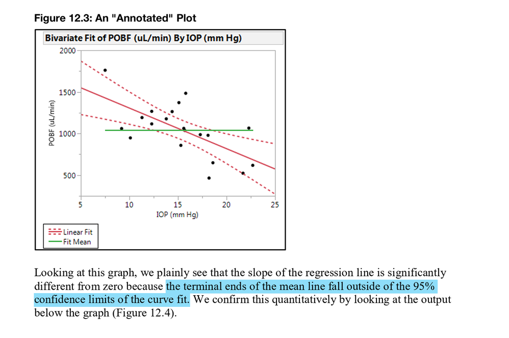
In the bivariate plot you show, the fit linear line (red) has a slope significantly different from the mean line (green), as the confidence curves crosse the mean/horizontal line. So the effect of the related X variable (here IOP) is significantly different from 0 (null hypothesis, represented by mean line (green)).
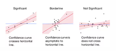
From the JMP help section about leverage plot :
I hope this will help your understanding,
"It is not unusual for a well-designed experiment to analyze itself" (Box, Hunter and Hunter)
- Mark as New
- Bookmark
- Subscribe
- Mute
- Subscribe to RSS Feed
- Get Direct Link
- Report Inappropriate Content
Re: Chapter 12: Tests of Association: Correlation
Hello @thiennguyen , please find bellow my understanding:
For the a given result of quantity x1, represented on the x-axis, there is a correspondent result of quantity x2, represented on the y-axis values.
The pictures shows that could be a trend, when the x1 value increases there might be a reduction on the x2 values, picturing a potential negative correlation (solid red line).
However, in some cases this negative trend might be not so strong, which drives uncertainty on the slope calculation. This uncertanty is represented by the confidence intervals (dashed red lines). Given the uncertainty, i.e. if new data is acquired, there are chances that the slope of the red line could assume any angle inside the confidence interval bounds and if the slope angle can assumes the value 0, the correlaction might not exist.
Graphically this can be seen in the picture if the green line (which is a line with slope angle of 0) is inside the confidence interval envelope.
Hope it helps,
Emmanuel
========================
Keep It Simple and Sequential
- Mark as New
- Bookmark
- Subscribe
- Mute
- Subscribe to RSS Feed
- Get Direct Link
- Report Inappropriate Content
Re: Chapter 12: Tests of Association: Correlation
Hi @thiennguyen,
Please find explanations of the different elements of this plot in the JMP Help related to Effect Leverage Plots.
In the bivariate plot you show, the fit linear line (red) has a slope significantly different from the mean line (green), as the confidence curves crosse the mean/horizontal line. So the effect of the related X variable (here IOP) is significantly different from 0 (null hypothesis, represented by mean line (green)).
From the JMP help section about leverage plot :
I hope this will help your understanding,
"It is not unusual for a well-designed experiment to analyze itself" (Box, Hunter and Hunter)
Recommended Articles
- © 2026 JMP Statistical Discovery LLC. All Rights Reserved.
- Terms of Use
- Privacy Statement
- Contact Us


