- New to JMP? Let the Data Analysis Director guide you through selecting an analysis task, an analysis goal, and a data type. Available now in the JMP Marketplace!
- See how to install JMP Marketplace extensions to customize and enhance JMP.
- Subscribe to RSS Feed
- Mark Topic as New
- Mark Topic as Read
- Float this Topic for Current User
- Bookmark
- Subscribe
- Mute
- Printer Friendly Page
Discussions
Solve problems, and share tips and tricks with other JMP users.- JMP User Community
- :
- Discussions
- :
- Re: Can JMP produce a graph to visually represent an experiment design?
- Mark as New
- Bookmark
- Subscribe
- Mute
- Subscribe to RSS Feed
- Get Direct Link
- Report Inappropriate Content
Can JMP produce a graph to visually represent an experiment design?
Is there any way JMP is able to produce a visual representation of a DoE?
- Mark as New
- Bookmark
- Subscribe
- Mute
- Subscribe to RSS Feed
- Get Direct Link
- Report Inappropriate Content
Re: Can JMP produce a graph to visually represent an experiment design?
Hi @sanch1 ,
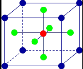
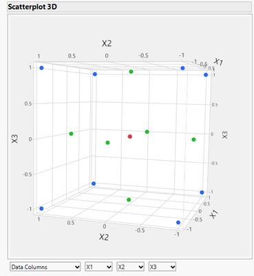
Yes, JMP can do this using the Graph > Scatterplot 3D platform. Below is an example with only three factors on a face-centered CCD design, where the rows have been colored in a similar way as your example. Now, if you want to draw the box and lines on top of this, it's a little more complicated (you could do it manually or do it via JSL). If you're only showing it as an example of what the DOE space looks like, I wouldn't bother and just show your example, as often times it's not that important to show exact numbers, conveying the concept of the DOE design is frequently more important.
Does this answer your question?
DS
- Mark as New
- Bookmark
- Subscribe
- Mute
- Subscribe to RSS Feed
- Get Direct Link
- Report Inappropriate Content
Re: Can JMP produce a graph to visually represent an experiment design?
Hi @sanch1 ,
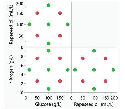
To add on to @SDF1 's comments, I always like to show the 'faces' of the design using the 2D scatterplots too, sometimes people can struggle with understanding the design in 3D space, so having both of these can help. Here's an example using the Scatterplot (Graph>Scatterplot), just put X1,X2 in 'X', X2,X3 in 'Y' and then select the X2*X2 scatterplot and 'Hide' using the Properties option.
Cheers,
Ben
- Mark as New
- Bookmark
- Subscribe
- Mute
- Subscribe to RSS Feed
- Get Direct Link
- Report Inappropriate Content
Re: Can JMP produce a graph to visually represent an experiment design?
Hi @sanch1 ,
I fully agree with what @Ben_BarrIngh said about representing more complex DOEs in 2D (imagine if you had 6 or 20+ factors to deal with!). 3D is nice and all, and can sometimes be a fancy graphic to add, but it can also distract from the real message that's trying to be conveyed. Something that I would say should always be near the top of the list (if maybe not #1) is effectively getting the message across. Making sure your audience fully understands the message is critical, and doing that with the simplest graphics as possible is often better. Complex graphics can look cool, but can also have too much going on, resulting in the audience not really grasping the message you're trying to deliver.
Good luck!,
DS
Recommended Articles
- © 2026 JMP Statistical Discovery LLC. All Rights Reserved.
- Terms of Use
- Privacy Statement
- Contact Us


