- New to JMP? Let the Data Analysis Director guide you through selecting an analysis task, an analysis goal, and a data type. Available now in the JMP Marketplace!
- See how to install JMP Marketplace extensions to customize and enhance JMP.
- Subscribe to RSS Feed
- Mark Topic as New
- Mark Topic as Read
- Float this Topic for Current User
- Bookmark
- Subscribe
- Mute
- Printer Friendly Page
Discussions
Solve problems, and share tips and tricks with other JMP users.- JMP User Community
- :
- Discussions
- :
- Re: Bug with GraphBuilder? Plot Y vs X
- Mark as New
- Bookmark
- Subscribe
- Mute
- Subscribe to RSS Feed
- Get Direct Link
- Report Inappropriate Content
Bug with GraphBuilder? Plot Y vs X
I have JMP16 and JMP17.
There appears to be something wrong with Graph builder in both versions.
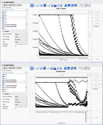
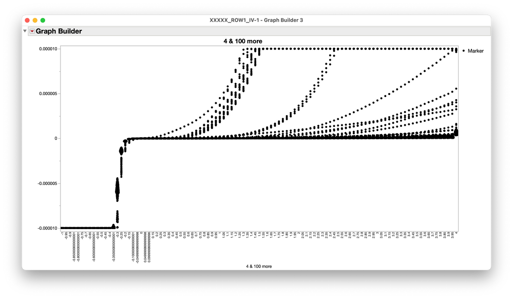
This is a simple plot X vs Y that appears to fail after a certain X value is added to plot.
Difference in two JMP plots is just additional X category. Note how previous data is garbled.
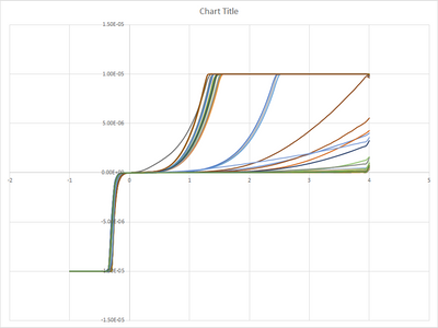
This is the plot of the data in EXCEL
- Tags:
- windows
- Mark as New
- Bookmark
- Subscribe
- Mute
- Subscribe to RSS Feed
- Get Direct Link
- Report Inappropriate Content
Re: Bug with GraphBuilder? Plot Y vs X
Thanx Mark.
While changing the naming of headers did fix the JSL errors, it did not fix the plotting beyond 78 bins using graph builder.
-Chet
- Mark as New
- Bookmark
- Subscribe
- Mute
- Subscribe to RSS Feed
- Get Direct Link
- Report Inappropriate Content
Re: Bug with GraphBuilder? Plot Y vs X
Hi @ChesterKnurek,
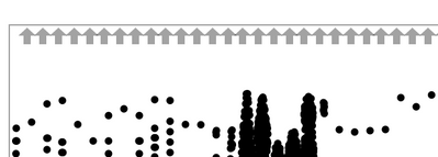
The reason the graph is switching on you after a certain number of X Axis variables has to do with JMP making an inference about the way to combine the scales of the multiple X variables. You'll see in your second graph that you have the switching arrows, which allow you to flip the scale of these independently scaled bins. That's an indication that JMP switched how it's representing the scales of these x variables.
You have those because JMP is guessing, with this many bins and sufficiently different scales, that you want to treat these are parallel independent scales (i.e., as a parallel coordinate plot).
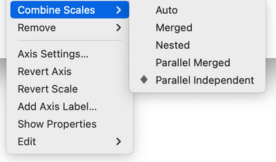
You can confirm this by right clicking the X Axis > Combine Scales, and change "Auto" to "Parallel Independent." Nothing will change -- that's what "Auto" has picked for you with that many X variables.
The fix is easy. Select Parallel Merged. That's what "Auto" will select for you with fewer X variables. I also reversed the scale for the X Axis here to match your target plot.
(Separately, I agree with others that stacking your data and approaching this plot in a more standard way for JMP will probably allow you to do more with the data)
I hope this helps!
- « Previous
-
- 1
- 2
- Next »
Recommended Articles
- © 2026 JMP Statistical Discovery LLC. All Rights Reserved.
- Terms of Use
- Privacy Statement
- Contact Us
