- New to JMP? Let the Data Analysis Director guide you through selecting an analysis task, an analysis goal, and a data type. Available now in the JMP Marketplace!
- See how to install JMP Marketplace extensions to customize and enhance JMP.
- Subscribe to RSS Feed
- Mark Topic as New
- Mark Topic as Read
- Float this Topic for Current User
- Bookmark
- Subscribe
- Mute
- Printer Friendly Page
Discussions
Solve problems, and share tips and tricks with other JMP users.- JMP User Community
- :
- Discussions
- :
- Re: Box-plot with points aligned in box plus violin plot
- Mark as New
- Bookmark
- Subscribe
- Mute
- Subscribe to RSS Feed
- Get Direct Link
- Report Inappropriate Content
Box-plot with points aligned in box plus violin plot
Good afternoon all,
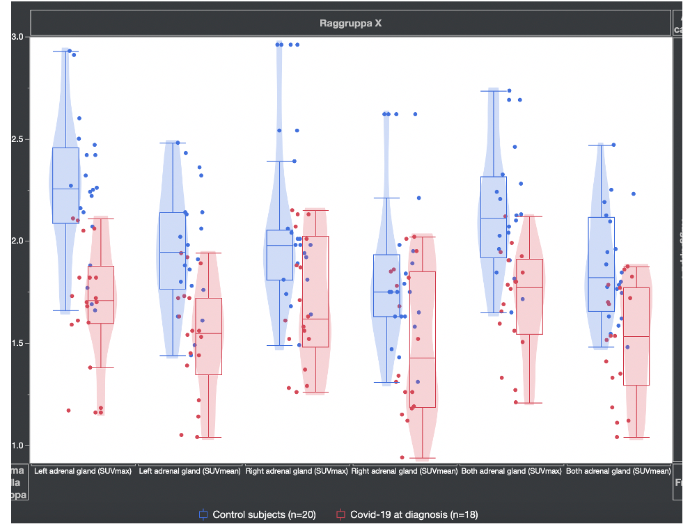
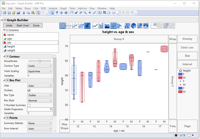
I wanted to create a graph in which the points fell exactly within each box-plot and the related violin plot.
Using the graph builder, I realized that the points don't line up inside the box.
Anyone have any idea how to fix this?
I attach photos.
Accepted Solutions
- Mark as New
- Bookmark
- Subscribe
- Mute
- Subscribe to RSS Feed
- Get Direct Link
- Report Inappropriate Content
Re: Box-plot with points aligned in box plus violin plot
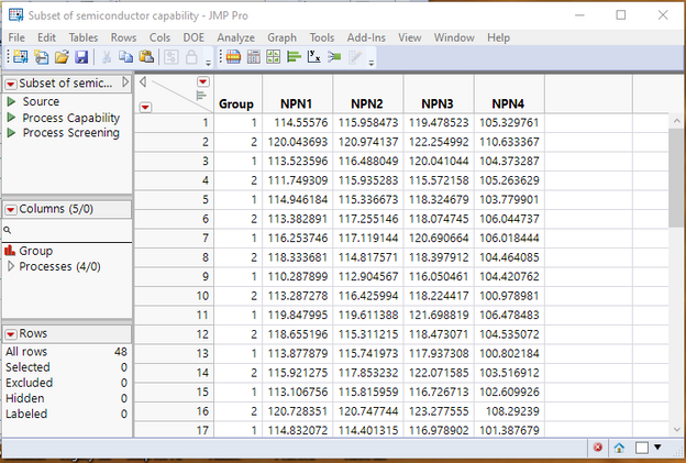
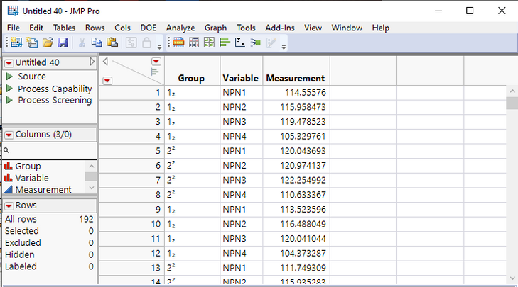
All that has to be done to take the data table as you describe it, and pass it to Graph Builder to create the display you want it to stack the data and then run the Graph Builder. To illustrate, given the following table with 4 continuous variables(it could have as many continuous variables as needed),
One just uses
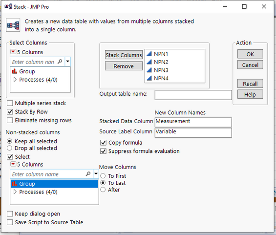
Tables=>Stack
and stacks all of the continuous columns, and also makes sure the Group column is also carried along
I have also renamed the Stacked Data Column to Measurement and the Source Label Column to Variable
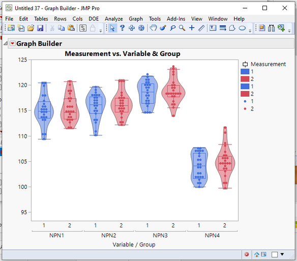
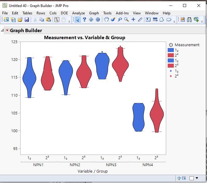
Now the resulting data can be used by Graph Builder to create the desired graph
Below is a script that first creates the sample data table from one of the sample data tables supplied by JMP, then it stacks the data, and finally it uses Graph Builder to create the above chart
Names default to here(1);

// Create a sample data table that has multiple continuous variables with 2 groups

// Open Data Table: semiconductor capability.jmp
// → Data Table( "semiconductor capability" )
dt = Open( "$SAMPLE_DATA/semiconductor capability.jmp" );

dt:Site << set name("Group");
dt << select where( :Group<=2 & :lot_id == "lot01" );
dt << invert row selection;
dt << delete rows;

dtSub = dt << Subset(
	All rows,
	columns( :Group, :NPN1, :NPN2, :NPN3, :NPN4 )
);
close(dt, nosave);
Wait(5);  // Wait 5 seconds so one can see the initial data table

// Now just modify the data shape to set it up for Graph Builder to display the
// data as required
// First Stack all of the continuous variables into one column, and create a second
// column that indicates what column each row's value came from
dtStack = dtSub <<
Stack(
	columns( :NPN1, :NPN2, :NPN3, :NPN4 ),
	Source Label Column( "Variable" ),
	Stacked Data Column( "Measurement" )
);

// Now graph the data placing the Variable and Group columns on the X axis and the
// Measurement column on the Y axis
// Also, remove the label from the Y axis
Graph Builder(
	Size( 528, 458 ),
	Show Control Panel( 0 ),
	Variables(
		X( :Variable ),
		X( :Group, Position( 1 ) ),
		Y( :Measurement ),
		Color( :Group )
	),
	Elements(
		Contour( X( 1 ), X( 2 ), Y, Legend( 14 ) ),
		Box Plot( X( 1 ), X( 2 ), Y, Legend( 13 ) ),
		Points( X( 1 ), X( 2 ), Y, Legend( 15 ) )
	),
	SendToReport(
		Dispatch( {}, "Y title", TextEditBox, {Set Text( "" )} ),
		Dispatch(
			{},
			"Graph Builder",
			FrameBox,
			{DispatchSeg( Poly Seg( "Violin (NPN1>>1)" ), {Transparency( 0.5 )} ),
			DispatchSeg( Poly Seg( "Violin (NPN1>>2)" ), {Transparency( 0.5 )} ),
			DispatchSeg( Poly Seg( "Violin (NPN2>>1)" ), {Transparency( 0.5 )} ),
			DispatchSeg( Poly Seg( "Violin (NPN2>>2)" ), {Transparency( 0.5 )} ),
			DispatchSeg( Poly Seg( "Violin (NPN3>>1)" ), {Transparency( 0.5 )} ),
			DispatchSeg( Poly Seg( "Violin (NPN3>>2)" ), {Transparency( 0.5 )} ),
			DispatchSeg( Poly Seg( "Violin (NPN4>>1)" ), {Transparency( 0.5 )} ),
			DispatchSeg( Poly Seg( "Violin (NPN4>>2)" ), {Transparency( 0.5 )} )}
		),
		Dispatch(
			{},
			"400",
			LegendBox,
			{Legend Position( {14, [3, 4], 13, [0, 1, 2, -3], 15, [5, 6]} )}
		)
	)
);
- Mark as New
- Bookmark
- Subscribe
- Mute
- Subscribe to RSS Feed
- Get Direct Link
- Report Inappropriate Content
Re: Box-plot with points aligned in box plus violin plot
Drag both the the X column and the Overlay column to the X axis, and then take the Overlay column and move it to the Color drop area.
- Mark as New
- Bookmark
- Subscribe
- Mute
- Subscribe to RSS Feed
- Get Direct Link
- Report Inappropriate Content
Re: Box-plot with points aligned in box plus violin plot
Thank you very much,
I tried the procedure, but it doesn't work.
I want to put several continuous variables on the x-axis at the same time and each of them is divided by 2 groups. On the y-axis I don't have any variables.
The aim is to show all the variables together and compare each of them with two groups.
If I did as you advised me I can only put only one variable at a time on the y-axis because if I put all the variables together, the problem would arise again that the points do not align in the box-plots; while I want several variables at the same time.
Giuseppe
- Mark as New
- Bookmark
- Subscribe
- Mute
- Subscribe to RSS Feed
- Get Direct Link
- Report Inappropriate Content
Re: Box-plot with points aligned in box plus violin plot
All that has to be done to take the data table as you describe it, and pass it to Graph Builder to create the display you want it to stack the data and then run the Graph Builder. To illustrate, given the following table with 4 continuous variables(it could have as many continuous variables as needed),
One just uses
Tables=>Stack
and stacks all of the continuous columns, and also makes sure the Group column is also carried along
I have also renamed the Stacked Data Column to Measurement and the Source Label Column to Variable
Now the resulting data can be used by Graph Builder to create the desired graph
Below is a script that first creates the sample data table from one of the sample data tables supplied by JMP, then it stacks the data, and finally it uses Graph Builder to create the above chart
Names default to here(1);

// Create a sample data table that has multiple continuous variables with 2 groups

// Open Data Table: semiconductor capability.jmp
// → Data Table( "semiconductor capability" )
dt = Open( "$SAMPLE_DATA/semiconductor capability.jmp" );

dt:Site << set name("Group");
dt << select where( :Group<=2 & :lot_id == "lot01" );
dt << invert row selection;
dt << delete rows;

dtSub = dt << Subset(
	All rows,
	columns( :Group, :NPN1, :NPN2, :NPN3, :NPN4 )
);
close(dt, nosave);
Wait(5);  // Wait 5 seconds so one can see the initial data table

// Now just modify the data shape to set it up for Graph Builder to display the
// data as required
// First Stack all of the continuous variables into one column, and create a second
// column that indicates what column each row's value came from
dtStack = dtSub <<
Stack(
	columns( :NPN1, :NPN2, :NPN3, :NPN4 ),
	Source Label Column( "Variable" ),
	Stacked Data Column( "Measurement" )
);

// Now graph the data placing the Variable and Group columns on the X axis and the
// Measurement column on the Y axis
// Also, remove the label from the Y axis
Graph Builder(
	Size( 528, 458 ),
	Show Control Panel( 0 ),
	Variables(
		X( :Variable ),
		X( :Group, Position( 1 ) ),
		Y( :Measurement ),
		Color( :Group )
	),
	Elements(
		Contour( X( 1 ), X( 2 ), Y, Legend( 14 ) ),
		Box Plot( X( 1 ), X( 2 ), Y, Legend( 13 ) ),
		Points( X( 1 ), X( 2 ), Y, Legend( 15 ) )
	),
	SendToReport(
		Dispatch( {}, "Y title", TextEditBox, {Set Text( "" )} ),
		Dispatch(
			{},
			"Graph Builder",
			FrameBox,
			{DispatchSeg( Poly Seg( "Violin (NPN1>>1)" ), {Transparency( 0.5 )} ),
			DispatchSeg( Poly Seg( "Violin (NPN1>>2)" ), {Transparency( 0.5 )} ),
			DispatchSeg( Poly Seg( "Violin (NPN2>>1)" ), {Transparency( 0.5 )} ),
			DispatchSeg( Poly Seg( "Violin (NPN2>>2)" ), {Transparency( 0.5 )} ),
			DispatchSeg( Poly Seg( "Violin (NPN3>>1)" ), {Transparency( 0.5 )} ),
			DispatchSeg( Poly Seg( "Violin (NPN3>>2)" ), {Transparency( 0.5 )} ),
			DispatchSeg( Poly Seg( "Violin (NPN4>>1)" ), {Transparency( 0.5 )} ),
			DispatchSeg( Poly Seg( "Violin (NPN4>>2)" ), {Transparency( 0.5 )} )}
		),
		Dispatch(
			{},
			"400",
			LegendBox,
			{Legend Position( {14, [3, 4], 13, [0, 1, 2, -3], 15, [5, 6]} )}
		)
	)
);
- Mark as New
- Bookmark
- Subscribe
- Mute
- Subscribe to RSS Feed
- Get Direct Link
- Report Inappropriate Content
Re: Box-plot with points aligned in box plus violin plot
THANKS YOU VERY MUCH,
thanks to your valuable advice I finally reached the goal.
In retrospect, the solution was simple, but a priori I hadn't thought about what you written. I ask you a curiosity: do you know how to put the superscripts and subscripts to the labels of the variables on the x-axis or ordinates?
I notice that JMP lacks this simple yet common possibility.
This shortcoming is rather anomalous given the importance of JMP.
Best wishes
Giuseppe
- Mark as New
- Bookmark
- Subscribe
- Mute
- Subscribe to RSS Feed
- Get Direct Link
- Report Inappropriate Content
Re: Box-plot with points aligned in box plus violin plot
JMP uses the Unicode character set, which supports special
characters such as é and ½. It saves files without special Unicode
characters as plain text automatically. This option is selected by
default.
In other words, If you place such special Unicode characters in your data table, they are displayed
- Mark as New
- Bookmark
- Subscribe
- Mute
- Subscribe to RSS Feed
- Get Direct Link
- Report Inappropriate Content
Re: Box-plot with points aligned in box plus violin plot
Thanks for your suggestions.
I'd like to know how to display for example group squared or 2 as subscripts.
Or in the previous example display height squared.
So in general how to display the axis labels with superscripts or subscripts.
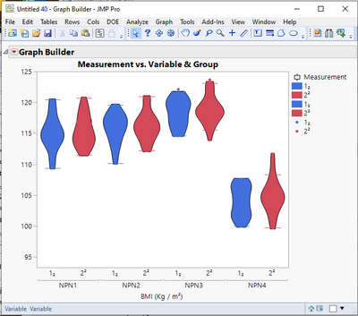
For example if I wrote BMI (Kg / m ^ 2) on the ordinate axis how do I tell JMP that "^ 2" is squared avoiding the ^ symbol?
Best wishes
- Mark as New
- Bookmark
- Subscribe
- Mute
- Subscribe to RSS Feed
- Get Direct Link
- Report Inappropriate Content
Re: Box-plot with points aligned in box plus violin plot
JMP supports both UTF-8 and UTF-16 Unicode standards. See the Scripting Guide for more details. It allows one to embed these special characters without special handling.
JMP can also print such characters using the escape string, "\!" followed by the Unicode string. So to include what you specified as a label, I would open a script window and place the following print command in the window
print("BMI (Kg / m\!U00B2)");After to run this line, the following will be in the log, which you can then cut and paste into the label
"BMI (Kg / m²)"
I wish there was a more direct path, but I am not aware of one. Details on the full Unicode character set can be found in the Scripting Guide
- Mark as New
- Bookmark
- Subscribe
- Mute
- Subscribe to RSS Feed
- Get Direct Link
- Report Inappropriate Content
Re: Box-plot with points aligned in box plus violin plot
It would be nice to have a more direct way to enter special characters. For the time being, I keep a script with commented strings for the symbols I use a lot. It saves a bit of effort.
- Mark as New
- Bookmark
- Subscribe
- Mute
- Subscribe to RSS Feed
- Get Direct Link
- Report Inappropriate Content
Re: Box-plot with points aligned in box plus violin plot
Dear Mark,
A shame that in software like JMP there are these time-wasting problems.
Publishing some articles that allow you to reduce the time would be a great solution.
Giuseppe
Recommended Articles
- © 2026 JMP Statistical Discovery LLC. All Rights Reserved.
- Terms of Use
- Privacy Statement
- Contact Us
