- New to JMP? Let the Data Analysis Director guide you through selecting an analysis task, an analysis goal, and a data type. Available now in the JMP Marketplace!
- See how to install JMP Marketplace extensions to customize and enhance JMP.
- Subscribe to RSS Feed
- Mark Topic as New
- Mark Topic as Read
- Float this Topic for Current User
- Bookmark
- Subscribe
- Mute
- Printer Friendly Page
Discussions
Solve problems, and share tips and tricks with other JMP users.- JMP User Community
- :
- Discussions
- :
- Re: Box-plot + dot plot + half violin plot
- Mark as New
- Bookmark
- Subscribe
- Mute
- Subscribe to RSS Feed
- Get Direct Link
- Report Inappropriate Content
Box-plot + dot plot + half violin plot
Dear all,
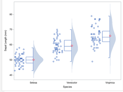
does anyone know if with JMP it is possible to create a graph showing the box-plots with the points inside each box and showing half of a violin plot.
In practice, a graph similar to the one attached, but with the points inside each box-plot.
Thanks
Giuseppe
Accepted Solutions
- Mark as New
- Bookmark
- Subscribe
- Mute
- Subscribe to RSS Feed
- Get Direct Link
- Report Inappropriate Content
Re: Box-plot + dot plot + half violin plot
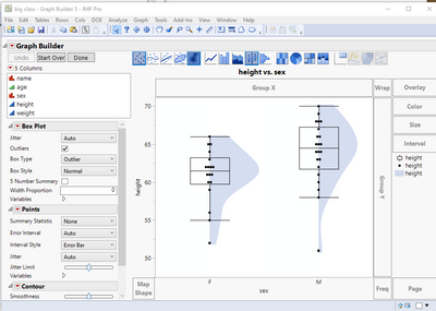
I don't know a direct way of getting Graph Builder to do the half Violin chart, except to add a rectangle to hide half of it. But here is an example
Names Default To Here( 1 );
// Open Data Table: big class.jmp
// → Data Table( "big class" )
dt = Open( "$SAMPLE_DATA/big class.jmp" );

gb = Graph Builder(
	Size( 570, 510 ),
	Variables( X( :sex ), Y( :height ) ),
	Elements(
		Box Plot( X, Y, Legend( 6 ) ),
		Points( X, Y, Legend( 7 ) ),
		Contour( X, Y, Legend( 8 ), Adapt to Axis Scale( 0 ) )
	)
);
Report( gb )[FrameBox( 1 )] << Add Graphics Script(
	5,
	Description( "" ),
	Pen Color( "white" );
	Pen Size( 2 );
	Fill Color( "white" );
	Rect( -.5, 75, 0, 40, 1 );

);
Report( gb )[FrameBox( 1 )] << Add Graphics Script(
	6,
	Description( "" ),
	Pen Color( "white" );
	Pen Size( 2 );
	Fill Color( "white" );
	Rect( .5, 75, 1, 40, 1 );
);
Report( gb )[FrameBox( 1 )] << Reorder Segs( {1, 2, 10, 11, 5, 6} );
- Mark as New
- Bookmark
- Subscribe
- Mute
- Subscribe to RSS Feed
- Get Direct Link
- Report Inappropriate Content
Re: Box-plot + dot plot + half violin plot
Yes, it is possible. Graph Builder is the tool in JMP for this visualization. Have you read the Essential Graphing guide in JMP Hlep?
- Mark as New
- Bookmark
- Subscribe
- Mute
- Subscribe to RSS Feed
- Get Direct Link
- Report Inappropriate Content
Re: Box-plot + dot plot + half violin plot
Thanks for the reply,
I have seen the documents present in the Essential Graphing, but there is nothing that comes close to my goal.
The only way is to write an ad-hoc program.
Giuseppe
- Mark as New
- Bookmark
- Subscribe
- Mute
- Subscribe to RSS Feed
- Get Direct Link
- Report Inappropriate Content
Re: Box-plot + dot plot + half violin plot
I don't know a direct way of getting Graph Builder to do the half Violin chart, except to add a rectangle to hide half of it. But here is an example
Names Default To Here( 1 );
// Open Data Table: big class.jmp
// → Data Table( "big class" )
dt = Open( "$SAMPLE_DATA/big class.jmp" );

gb = Graph Builder(
	Size( 570, 510 ),
	Variables( X( :sex ), Y( :height ) ),
	Elements(
		Box Plot( X, Y, Legend( 6 ) ),
		Points( X, Y, Legend( 7 ) ),
		Contour( X, Y, Legend( 8 ), Adapt to Axis Scale( 0 ) )
	)
);
Report( gb )[FrameBox( 1 )] << Add Graphics Script(
	5,
	Description( "" ),
	Pen Color( "white" );
	Pen Size( 2 );
	Fill Color( "white" );
	Rect( -.5, 75, 0, 40, 1 );

);
Report( gb )[FrameBox( 1 )] << Add Graphics Script(
	6,
	Description( "" ),
	Pen Color( "white" );
	Pen Size( 2 );
	Fill Color( "white" );
	Rect( .5, 75, 1, 40, 1 );
);
Report( gb )[FrameBox( 1 )] << Reorder Segs( {1, 2, 10, 11, 5, 6} );
- Mark as New
- Bookmark
- Subscribe
- Mute
- Subscribe to RSS Feed
- Get Direct Link
- Report Inappropriate Content
Re: Box-plot + dot plot + half violin plot
Thank you so much.
I tried to run the program on my data, but I realized that I have to change the values in "rect", because using your data I don't get the half violin.
What do the 5 values present in "rect" represent?
If I wanted to load external data for example in excel format, what should I write in "open"?
I can program a little in SAS, but I don't know the JMP language which I use because it helps me to make graphics without going crazy writing long programs that SAS requires.
Giuseppe
- Mark as New
- Bookmark
- Subscribe
- Mute
- Subscribe to RSS Feed
- Get Direct Link
- Report Inappropriate Content
Re: Box-plot + dot plot + half violin plot
The Essential Graphing document covers the usage of Graph Builder. For the adding of a graphics script, that documentation is in the Scripting Guide, with the functions detailed with examples in the Scripting Index. All of these are available under the Help pull down menu.
The Add Graphis Scripts that I added to the base Graph Builder simply places a white rectangle over half of the violin plot, using a rect() function. Rect() draws a rectangle. This is detailed in the Scripting Index. The values are (left, top, right, bottom, and should the rectangle be a filled or empty rectangle). Since the X variable is a nominal(character) variable the x coordinates for each of the values in X start at 0 and are incremented by 1. This determines the Left and Right values for the rectangle. Typically the top and bottom values are set by the Col Min() and Col Max() values for the Y column.
There will have to be 1 Add Graphics Script section for each of the values of the X variable.
The Reorder Segs sets the order the various components of the chart and which front to back order they should have. One needs to have the rectangle object in front of the violin, but behind the box plot.
- Mark as New
- Bookmark
- Subscribe
- Mute
- Subscribe to RSS Feed
- Get Direct Link
- Report Inappropriate Content
Re: Box-plot + dot plot + half violin plot
Dear Txnelson,
THANKS YOU SO MUCH,
always valuable advice and above all problem solved.
Giuseppe
- Mark as New
- Bookmark
- Subscribe
- Mute
- Subscribe to RSS Feed
- Get Direct Link
- Report Inappropriate Content
Re: Box-plot + dot plot + half violin plot
Dear Jim,
I tried to reapply your procedure on other data, but I can't see the graph.
I changed the data in the "rect" statement by putting the values of min, max, 25 ° and 75 ° of the box-plot, but nothing.
I have read what is indicated in the Scripting Index, but the result is a failure.
Could I ask you for help?
I guess a direct way to overcome this problem doesn't exist, does it?
Thank you very much for your help.
Giuseppe
- Mark as New
- Bookmark
- Subscribe
- Mute
- Subscribe to RSS Feed
- Get Direct Link
- Report Inappropriate Content
Re: Box-plot + dot plot + half violin plot
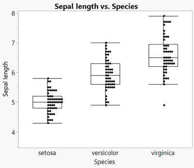
Another option: Use "Positive Grid" jittering for the points. Data and script attached.
- Mark as New
- Bookmark
- Subscribe
- Mute
- Subscribe to RSS Feed
- Get Direct Link
- Report Inappropriate Content
Re: Box-plot + dot plot + half violin plot
Thanks for the reply,
however my goal is to show half violin which gives me the idea of how the data are distributed.
The dots alone don't help me much.
Giuseppe
Recommended Articles
- © 2026 JMP Statistical Discovery LLC. All Rights Reserved.
- Terms of Use
- Privacy Statement
- Contact Us


