- Subscribe to RSS Feed
- Mark Topic as New
- Mark Topic as Read
- Float this Topic for Current User
- Bookmark
- Subscribe
- Mute
- Printer Friendly Page
Discussions
Solve problems, and share tips and tricks with other JMP users.- JMP User Community
- :
- Discussions
- :
- Box Plot and Scatter Plot on same graph
- Mark as New
- Bookmark
- Subscribe
- Mute
- Subscribe to RSS Feed
- Get Direct Link
- Report Inappropriate Content
Box Plot and Scatter Plot on same graph
Hi all,
I've been perusing the forums and havent found any answer yet. I am looking to plot both a box plot to show a historical perspective of a single data parameter. And then also have a scatter plot of an experiment on the same plot for comparison sake. Currently I've just been making two plots, but it would be much more convenient if could script them into a single plot.
- Mark as New
- Bookmark
- Subscribe
- Mute
- Subscribe to RSS Feed
- Get Direct Link
- Report Inappropriate Content
Re: Box Plot and Scatter Plot on same graph
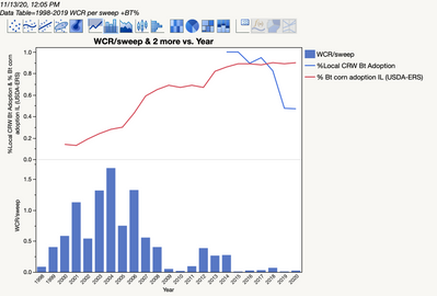
I have a similar question (?) about overlaying line graphs on top of a bar chart. I can create them separately in different panels of a graph builder window, but don't know how to overlay them and create a Y-axis scaled to the line graphs.
- Mark as New
- Bookmark
- Subscribe
- Mute
- Subscribe to RSS Feed
- Get Direct Link
- Report Inappropriate Content
Re: Box Plot and Scatter Plot on same graph
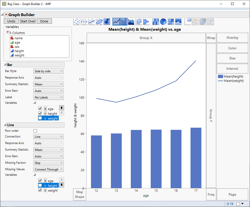
If the scales are similar you can drag both y variables to the Y axis. Then click on the line chart, and shift click on the bar chart. After that select the variables to plot for the line and bar sections. If the scales are different you could use a second Y axis.
- Mark as New
- Bookmark
- Subscribe
- Mute
- Subscribe to RSS Feed
- Get Direct Link
- Report Inappropriate Content
Re: Box Plot and Scatter Plot on same graph
Hi @careyph,
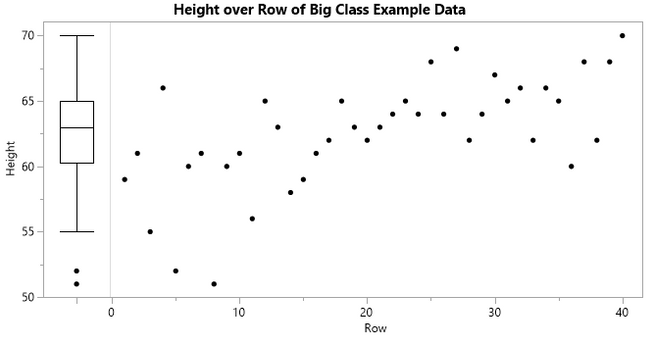
Is this what you were looking for?
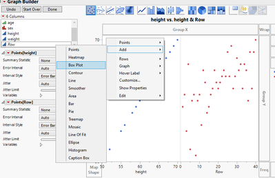
Below is a script to create this in graph builder, admittedly setting it up interactively is a little tricky. I started with two scatterplots and added a box plot to the left one. Note that the left graph shows the same column (height) on both the x and y axis:
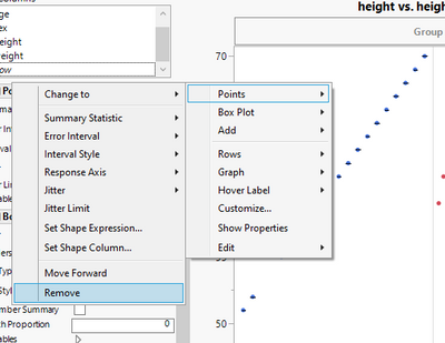
Then I removed the points from the left graph:
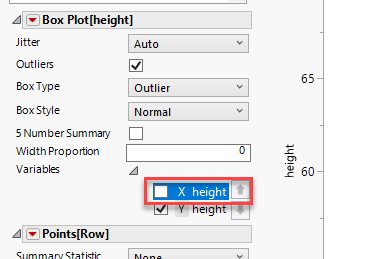
And then remove the x axis from the box plot:
Then it was just a matter of resizing the two graphs to get the chart above.
This should recreate the example chart:
Names default to here(1);
dt = Open("$Sample_data/big class.jmp");
dt << Graph Builder(
	Size( 666, 345 ),
	Show Control Panel( 0 ),
	Variables(
		X( :height ),
		X( Transform Column( "Row", Formula( Row() ) ) ),
		Y( :height )
	),
	Relative Sizes( "X", [79 542] ),
	Elements( Position( 1, 1 ), Box Plot( Y, Legend( 15 ) ) ),
	Elements( Position( 2, 1 ), Points( X, Y, Legend( 13 ) ) ),
	SendToReport(
		Dispatch( {}, "height", ScaleBox,
			{Min( -0.5 ), Max( 0.5 ), Inc( 1 ), Minor Ticks( 0 ),
			Label Row( Show Major Labels( 0 ) )} ),
		Dispatch( {}, "400", LegendBox,
			{Legend Position( {15, [1, -3], 13, [0]} )} )
	)
);- Mark as New
- Bookmark
- Subscribe
- Mute
- Subscribe to RSS Feed
- Get Direct Link
- Report Inappropriate Content
Re: Box Plot and Scatter Plot on same graph
One thought for you...and I know it's not both elements in the same plot...but I think it has some attractive capabilities, would be to set up a JMP dashboard with a side by side layout. Then you could retain all the hot spot interactivity of BOTH graphs and they would appear visually as almost on a single visualization. This entire workflow can be scripted as well in the data table so all you'd need to do is create it once...save the script and you can replicate/duplicate to your hearts content.
One other thought relative my earlier post...and maybe somebody with a bit more JMP capability knowledge can chime in? @Bill_Worley or @Jeff_Perkinson ?, the dashboard can be output to JMP interactive HTML, which opens up a large array of other JMP sharing capabilities to consumers of the chart if publishing/sharing is valuable. JMP Public, JMP Live, etc. Not sure if a hybrid type graph as others have suggested would carry along the capability richness you'd get from creating the original content in the JMP dashboard?
Recommended Articles
- © 2026 JMP Statistical Discovery LLC. All Rights Reserved.
- Terms of Use
- Privacy Statement
- Contact Us

