- New to JMP? Let the Data Analysis Director guide you through selecting an analysis task, an analysis goal, and a data type. Available now in the JMP Marketplace!
- See how to install JMP Marketplace extensions to customize and enhance JMP.
- Subscribe to RSS Feed
- Mark Topic as New
- Mark Topic as Read
- Float this Topic for Current User
- Bookmark
- Subscribe
- Mute
- Printer Friendly Page
Discussions
Solve problems, and share tips and tricks with other JMP users.- JMP User Community
- :
- Discussions
- :
- Re: Bivariate Histogram
- Mark as New
- Bookmark
- Subscribe
- Mute
- Subscribe to RSS Feed
- Get Direct Link
- Report Inappropriate Content
Bivariate Histogram
Can JMP create a bivariate histogram of 2 data columns from a data set? I am thinking of something that creates graphs similar to those one can make in Matlab using the "hist3" command?
http://www.mathworks.com/help/stats/hist3.html
(see bottom figure in this link as an example of what I'm visualizing)
I don't necessarily need the fancy aspect viewpoint like shown in the figures from the Mathworks website. Having a top view with "counts" represented with color scale for the vertical dimension would be great.
Thanks
- Mark as New
- Bookmark
- Subscribe
- Mute
- Subscribe to RSS Feed
- Get Direct Link
- Report Inappropriate Content
Re: Bivariate Histogram
hi joe.schaar@gmail.com,
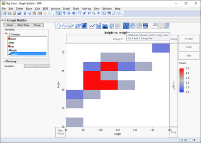
if you just need a 2D version try heat map until someone gives the more comprehensive solution.
in graph builder put the two variables on the x and y axis and click the heat map button from the top menu.
best,
ron
- Mark as New
- Bookmark
- Subscribe
- Mute
- Subscribe to RSS Feed
- Get Direct Link
- Report Inappropriate Content
Re: Bivariate Histogram
Thanks Ron. That is exactly what I was looking for!
An add-on question here...once I select a bin(s) from the heat map I see that the corresponding rows are selected within the originating data table as expected. Is there a way, separate from the obvious copy/paste approach, to a have only the selected data (both columns) populate a new data table?
-Joe
- Mark as New
- Bookmark
- Subscribe
- Mute
- Subscribe to RSS Feed
- Get Direct Link
- Report Inappropriate Content
Re: Bivariate Histogram
Concerning your addon question:
If you go to the pulldown menu
Tables==>Subset
The platform comes up with the option defaulted to subset only the selected rows
- Mark as New
- Bookmark
- Subscribe
- Mute
- Subscribe to RSS Feed
- Get Direct Link
- Report Inappropriate Content
Re: Bivariate Histogram
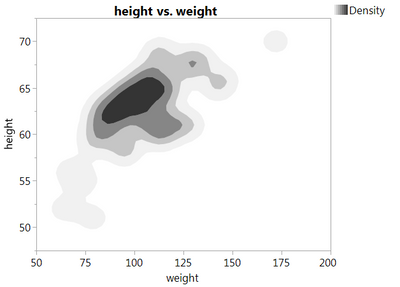
I think Ron's suggestion is great. You could also use the density plot option in Graph Builder if more definition would be helpful.
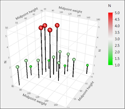
You could create something like this with the 3D scatterplot:
You need to first bin the variables and then create a table where you have frequency or N for each of the 2D bins. I did this by saving midpoints from the Distribution platform and then Table > Summary. There is probably a quicker way.
However, I can't see what this 3D plot gives you. Or the 3D plots in the link that you shared - in fact they are even worse because you can't see what is happening behind a peak. 3D plots only really work when you can spin them. Best not to add the 3rd dimension unless you have a really good reason. The colour in the above graph is probably not adding anything either!
- Mark as New
- Bookmark
- Subscribe
- Mute
- Subscribe to RSS Feed
- Get Direct Link
- Report Inappropriate Content
Re: Bivariate Histogram
Phil,
Those are great suggestions, and I like the visuals. Thank you very much!
-Joe
Recommended Articles
- © 2026 JMP Statistical Discovery LLC. All Rights Reserved.
- Terms of Use
- Privacy Statement
- Contact Us


