- New to JMP? Let the Data Analysis Director guide you through selecting an analysis task, an analysis goal, and a data type. Available now in the JMP Marketplace!
- See how to install JMP Marketplace extensions to customize and enhance JMP.
- Subscribe to RSS Feed
- Mark Topic as New
- Mark Topic as Read
- Float this Topic for Current User
- Bookmark
- Subscribe
- Mute
- Printer Friendly Page
Discussions
Solve problems, and share tips and tricks with other JMP users.- JMP User Community
- :
- Discussions
- :
- Re: Analyzing the Statistical Significance of Percentage Data
- Mark as New
- Bookmark
- Subscribe
- Mute
- Subscribe to RSS Feed
- Get Direct Link
- Report Inappropriate Content
Analyzing the Statistical Significance of Percentage Data
Looking for some insight on how to property analyze the data set attached to this post. The company has been tracking the amount of scrap in pieces each week and the total number pieces produced to get a % scrap for each week. The first 26 weeks are the baseline data, before any improvement actions were taken. Weeks 27 through 31 represent the weeks after some improvement actions were taken.
It would be a mistake to use the overall average of the % scrap values in the Before and After group because the denominators in each row of the calculated percentages are different so I've used Summary to calculate the overall % scrap of the Before group and the After group as shown here:
The % scrap values for both groups are close so it doesn't look promising for us to detect a significant difference between the two groups. My specific question is what is the best way to calculate that (lack of) significance?
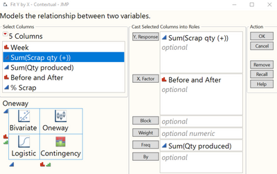
I'm also wondering if I should treat Qty Produced as a frequency column since each weeks that produced hundreds of parts should contribute more to the data set than weeks that only had 2 parts produced. Without incorporating frequency when we run 2 parts and have 0 scrap that is treated the same as a week where we run 142 parts and have 0 scrap. If I use the fit Y by X platform and put qty produced in Freq I get a significant result, with the Before group showing more instances of scrap on average than the After group.
Accepted Solutions
- Mark as New
- Bookmark
- Subscribe
- Mute
- Subscribe to RSS Feed
- Get Direct Link
- Report Inappropriate Content
Re: Analyzing the Statistical Significance of Percentage Data
Hi @Josh1,
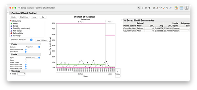
As @P_Bartell mentioned, it is probably best to start with a U-chart to see a shift in % scrap over time. WK as X, % Scrap as Y and Before and After as Phase in control chart builder. IF you think you have enough weeks data collected for after and seen a shift downwards, then there is probably a positive change in the process.
A naive statistical test you can use is a contingency analysis to see if there is an association between before and after change like you have have started to try. WARNING: This is not the best test for your data since there is time dependency in the first few weeks of the change (adaptation to new process) so I would be careful of interpret the results. There could be a statical difference, but the first few weeks will likely throw it off. After collecting some more weeks of data, you may come back to this test with the caveat of removing the first two to three weeks of data.
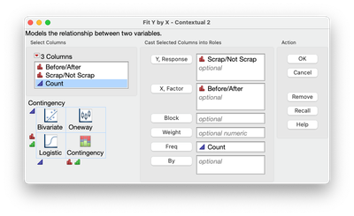
You are on the right path for using fit Y by X for contingency analysis. The data entered is not quite correct. You need a stacked table. X would be Before/After and Y would be Scrap/Not Scrap and the frequency would be count.
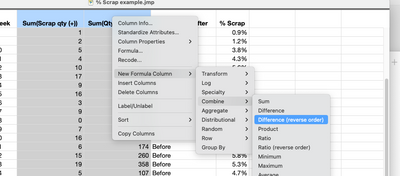
To do this, you would first subtract Scrap qty from Qty Produced to get Not Scrap count. This can be done by selecting both columns the using a right click and choosing New Column Formula>Combine>Difference (reversed order)
I renamed the columns to Before/After, Scrap and Not Scrap.
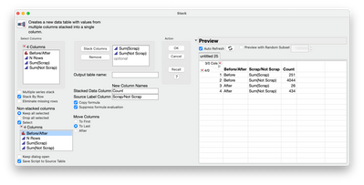
Next is to summarize Scrap and Not Scarp using Sum within Summary under tables and using Before/After as Group (this is similar to what you have done before). Then stack Sum(Scrap) and Sum(Not Scrap) so you now have 3 columns (using Stack under Tables menu)
Now you can use the new table for Fit Y by X like you did before.
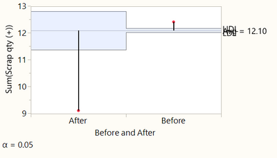
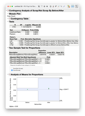
If you then use Two Sample Test for Proportions and also look at analysis of means for proportions, it will look like there is no difference, but the after decisions limits are quite wide due to the sample size and the first two weeks being higher than the next three weeks (a trend in the data).
I would not trust this result due to the trend in the data as seen in the U-chart above (as @P_Bartell mentioned is the first step). But I think the U-chart is telling that something is beginning to happen with the change in process and is worth showing if some evidence is needed for preliminary validation of the process change is having an affect.
Hope this helps at least how one might go about it in JMP. I think more weeks of data is needed or use another type of statistical test that can accommodated trends in data. I cannot advise which tests but I am sure others here can.
Best,
Data Scientist, Life Sciences - Global Technical Enablement
JMP Statistical Discovery, LLC. - Denver, CO
Tel: +1-919-531-9927 ▪ Mobile: +1-303-378-7419 ▪ E-mail: chris.kirchberg@jmp.com
www.jmp.com
- Mark as New
- Bookmark
- Subscribe
- Mute
- Subscribe to RSS Feed
- Get Direct Link
- Report Inappropriate Content
Re: Analyzing the Statistical Significance of Percentage Data
If you have access to the weekly data I suggest a p chart control chart approach since you know the point in time when the process changed. And to be absolutely clear...if 'statistical significance' is of paramount importance to you...a control chart is not a statistical inference method. But if you have the weekly data...that's where I'd start. Stare at the chart for no more than 3 seconds. If you don't see a shift in the line...it's not there. Otherwise you'll start talking yourself into to supporting whatever your prevailing/hoped for point of view.
- Mark as New
- Bookmark
- Subscribe
- Mute
- Subscribe to RSS Feed
- Get Direct Link
- Report Inappropriate Content
Re: Analyzing the Statistical Significance of Percentage Data
You are seeing one of the many issues with this type of data. Scrap is an aggregate of potentially many failure mechanisms. It is typically not useful (not very efficient) for assessing improvements made as it lacks discrimination. You could completely solve one problem that reduces scrap and another problem surfaces that increase scrap (net 0 or worse). My suggestions are:
1. Find a better, more continuous measurement. Answer: What is it being scrapped for? Perhaps a dimension, weight, some other physical attribute that can be measured.
2. Do the necessary work to understand causal structure. Develop hypotheses and use directed sampling or design experiments to understand the process better.
- Mark as New
- Bookmark
- Subscribe
- Mute
- Subscribe to RSS Feed
- Get Direct Link
- Report Inappropriate Content
Re: Analyzing the Statistical Significance of Percentage Data
Appreciate the reply. The defect reason is broken glass.
- Mark as New
- Bookmark
- Subscribe
- Mute
- Subscribe to RSS Feed
- Get Direct Link
- Report Inappropriate Content
Re: Analyzing the Statistical Significance of Percentage Data
Not really enough information to go on. This, unfortunately, is an issue with open forums. Food for thought:
What is the product? Are you making glass or is glass one of the components of the product? What are the failure modes (e.g., fatigue, overload, impact...)? Is the broken glass due to handling? Are there "gradations" of the amount broken? Would keeping track of location of breakage be helpful? Can you measure the force required to break the glass? You probably have hypotheses as to what may be causing the broken glass. Have you tested those hypotheses with experimentation?
- Mark as New
- Bookmark
- Subscribe
- Mute
- Subscribe to RSS Feed
- Get Direct Link
- Report Inappropriate Content
Re: Analyzing the Statistical Significance of Percentage Data
The improvement actions we took are based on questions similar to the questions you are asking. We have process maps, fishbones, SIPOC, etc. etc. Since there is no gradient to the response (the glass is either broken or not) I'm don't think there is a way to track it as a continuous value. We could measure the time elapsed between instances of broken glass, but that would be a hassle at this point.
Analyzing the scrap quantities and treating the production quantity as a frequency column as I shared above might be an acceptable route but I'm not sure. If a row has a frequency f = 100 unit production run, then the computed results are identical to those for a data table containing f copies of that row, each having a frequency of one. So if row 1 shows 100 units were produced and 1 unit was scrapped, treating units produced as the frequency would be the same as recording 1 piece scrapped 100 times. If the production quantity was 10 pieces and 1 was scrapped, the result would be computed as if 1 piece was scrapped 10 times. That seems like a logical way to analyze the scrap rate while considering the size of each production run.
- Mark as New
- Bookmark
- Subscribe
- Mute
- Subscribe to RSS Feed
- Get Direct Link
- Report Inappropriate Content
Re: Analyzing the Statistical Significance of Percentage Data
I still have no idea what you are making, but the response is a challenge. The response is a defective (not a defect). Normalizing the data as percentage (#defective/#produced x 100) is necessary, but you will always be in the reactive mode. P/NP charts may be useful, but you are still reacting. You have to get creative to understand why it is breaking and what factors affect breakage. I don't think the answer is in any particular statistical technique or analysis. BTW, I don't see any data set attached to your first post?
- Mark as New
- Bookmark
- Subscribe
- Mute
- Subscribe to RSS Feed
- Get Direct Link
- Report Inappropriate Content
Re: Analyzing the Statistical Significance of Percentage Data
We make windows. We believe we are already improving the process by preventing the issue. My question is specifically around how I demonstrate that improvement with data. I've attached the data set here.
- Mark as New
- Bookmark
- Subscribe
- Mute
- Subscribe to RSS Feed
- Get Direct Link
- Report Inappropriate Content
Re: Analyzing the Statistical Significance of Percentage Data
Hi @Josh1,
As @P_Bartell mentioned, it is probably best to start with a U-chart to see a shift in % scrap over time. WK as X, % Scrap as Y and Before and After as Phase in control chart builder. IF you think you have enough weeks data collected for after and seen a shift downwards, then there is probably a positive change in the process.
A naive statistical test you can use is a contingency analysis to see if there is an association between before and after change like you have have started to try. WARNING: This is not the best test for your data since there is time dependency in the first few weeks of the change (adaptation to new process) so I would be careful of interpret the results. There could be a statical difference, but the first few weeks will likely throw it off. After collecting some more weeks of data, you may come back to this test with the caveat of removing the first two to three weeks of data.
You are on the right path for using fit Y by X for contingency analysis. The data entered is not quite correct. You need a stacked table. X would be Before/After and Y would be Scrap/Not Scrap and the frequency would be count.
To do this, you would first subtract Scrap qty from Qty Produced to get Not Scrap count. This can be done by selecting both columns the using a right click and choosing New Column Formula>Combine>Difference (reversed order)
I renamed the columns to Before/After, Scrap and Not Scrap.
Next is to summarize Scrap and Not Scarp using Sum within Summary under tables and using Before/After as Group (this is similar to what you have done before). Then stack Sum(Scrap) and Sum(Not Scrap) so you now have 3 columns (using Stack under Tables menu)
Now you can use the new table for Fit Y by X like you did before.
If you then use Two Sample Test for Proportions and also look at analysis of means for proportions, it will look like there is no difference, but the after decisions limits are quite wide due to the sample size and the first two weeks being higher than the next three weeks (a trend in the data).
I would not trust this result due to the trend in the data as seen in the U-chart above (as @P_Bartell mentioned is the first step). But I think the U-chart is telling that something is beginning to happen with the change in process and is worth showing if some evidence is needed for preliminary validation of the process change is having an affect.
Hope this helps at least how one might go about it in JMP. I think more weeks of data is needed or use another type of statistical test that can accommodated trends in data. I cannot advise which tests but I am sure others here can.
Best,
Data Scientist, Life Sciences - Global Technical Enablement
JMP Statistical Discovery, LLC. - Denver, CO
Tel: +1-919-531-9927 ▪ Mobile: +1-303-378-7419 ▪ E-mail: chris.kirchberg@jmp.com
www.jmp.com
- Mark as New
- Bookmark
- Subscribe
- Mute
- Subscribe to RSS Feed
- Get Direct Link
- Report Inappropriate Content
Re: Analyzing the Statistical Significance of Percentage Data
Just a clarification, the charts you should be using are P and NP charts. These are charts for Defectives (there can be only one per unit). C and U charts are for defects (there can be more than one defect per unit).
Always look at the data graphically before calculating statistics.
I have re-attached your data set with 2 simple platforms scripted (just click on the green arrows).
It sounds like you are doing the right things. You likely need to be patient for the "shift" in quality to be perceived.
Recommended Articles
- © 2026 JMP Statistical Discovery LLC. All Rights Reserved.
- Terms of Use
- Privacy Statement
- Contact Us

