- New to JMP? Let the Data Analysis Director guide you through selecting an analysis task, an analysis goal, and a data type. Available now in the JMP Marketplace!
- See how to install JMP Marketplace extensions to customize and enhance JMP.
- Subscribe to RSS Feed
- Mark Topic as New
- Mark Topic as Read
- Float this Topic for Current User
- Bookmark
- Subscribe
- Mute
- Printer Friendly Page
Discussions
Solve problems, and share tips and tricks with other JMP users.- JMP User Community
- :
- Discussions
- :
- Re: Adding specific data points with labels to a contour plot
- Mark as New
- Bookmark
- Subscribe
- Mute
- Subscribe to RSS Feed
- Get Direct Link
- Report Inappropriate Content
Adding specific data points with labels to a contour plot
Hello Community,
I am relatively new to jmp and have a contour plot question.
I have performed 20 experiments whose design was central composite. I fitted a response surface model to my data.
I then used the model to generate predictions over my entire deisgn space. I then did a contour plot of the predictions.
Is there a way I could add my experimental data points, say marked with an x, to the contour plot. Is there also a way I could label these data points with the value of the dependent variable I found in my experiments?
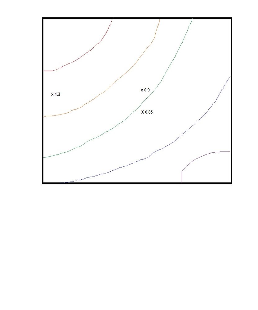
Attached is an image I drew in paint to illustrate what I want to do. I do not know how to program so a reply with menu selections and/or screen shoots would be most helpful. Thank you very much
Accepted Solutions
- Mark as New
- Bookmark
- Subscribe
- Mute
- Subscribe to RSS Feed
- Get Direct Link
- Report Inappropriate Content
Re: Adding specific data points with labels to a contour plot
Hi @AlexandruS,
Welcome to the community! This one is a bit of doozy for a new JMP user because we're going to have to do lots of JMP scripting, but here we go:
I assume you're viewing the contour profiler in Fit Model and not in a separate custom profiler. Either way, the same general steps apply. I'm using the Custom RSM sample data set from the sample data library.
Start by opening a new script and create a variable reference to your data table. Here, I'm just opening the Custom RSM table.
dt = Open("$Sample_Data\Design Experiment\Custom RSM.jmp");You need to get the script for the report that contains your profiler. If it's from Fit Model, the script will be something like Fit Model(Y(:Y), Effects(...),...); We need to get a reference to the report window so we can customize the contents of the profiler. Here's how I did it with the Custom RSM example:
rpt = (
	dt << Fit Model(
		Y( :Y ),
		Effects(
			:X1 & RS,
			:X2 & RS,
			:X3 & RS,
			:X1 * :X1,
			:X1 * :X2,
			:X2 * :X2,
			:X1 * :X3,
			:X2 * :X3,
			:X3 * :X3
		),
		Personality( "Standard Least Squares" ),
		Emphasis( "Effect Screening" ),
		Run(
			Contour Profiler(
				1,
				Term Value(
					X1( 0, Lock( 0 ), Show( 1 ) ),
					X2( 0, Lock( 0 ), Show( 1 ) ),
					X3( 0, Lock( 0 ), Show( 1 ) )
				),
				Contour Value( Y( 62.703, Min( 52.5 ), Max( 75 ) ) ),
				Grid Density( "40 x 40" ),
				Contour Grid( 50, 80, 5, Y ),
				Horizontal Factor( :X1 ),
				Vertical Factor( :X2 ),
				Y Colors( 21 ),
				Up Dots( 0 )
			),
			:Y << {Summary of Fit( 1 ), Analysis of Variance( 1 ),
			Parameter Estimates( 1 ), Effect Details( 0 ), Sorted Estimates( 0 ),
			Scaled Estimates( 0 ), Plot Actual by Predicted( 1 ), Plot Regression( 0 ),
			Plot Residual by Predicted( 1 ), Plot Residual by Row( 1 ),
			Plot Studentized Residuals( 0 ), Plot Effect Leverage( 0 ),
			Box Cox Y Transformation( 1 ), Show VIF( 1 )}
		)
	)
) << Report;
Notice I preceded the Fit Model script with "rpt = (dt <<" and then put this on the back-end: ") << Report;". The variable "rpt" now contains a reference to the report window for Fit Model.
Next, we need to get the values of the variables you are plotting in the Contour Profiler. In my example, the 2 variables are x1 and x2. I also need the Y values for my point labels.
//plotted points
x1_vals = :x1 << Get Values;
x2_vals = :x2 << Get Values;

//values used in labels
y_vals = :y << Get Values;
Now, I can add a graphics script to plot the points and text inside the profiler like so:
rpt["Contour Profiler"][FrameBox(1)] << Add Graphics Script(
	Marker(x1_vals, x2_vals);
	for(i=1,i<=N Row(dt),i++,
		text(eval list({x1_vals[i],x2_vals[i]+0.05}),char(y_vals[i]));
	)
);
The stuff in brackets help me navigate down the display tree to get to the framebox that contains the plot. I use Marker() to add the points. I use the loop to add the labels.
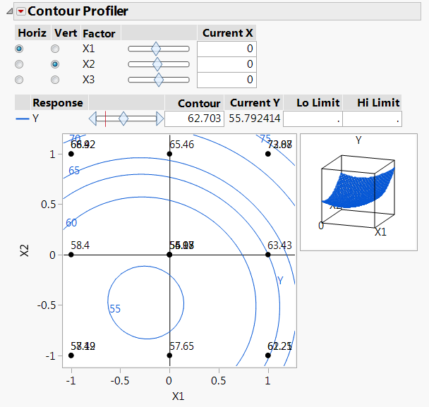
The final result looks like this:
Notice that I have a few points and labels plotted on top of each other because I have a third factor, X3. We could further customize this to prevent the labels from being on top of each other, but you'd probably also want to add the value for x3 to all these labels as well. Basically, this solution doesn't scale very well for more than 2 factors, but if you only have 2, this should work really well.
- Mark as New
- Bookmark
- Subscribe
- Mute
- Subscribe to RSS Feed
- Get Direct Link
- Report Inappropriate Content
Re: Adding specific data points with labels to a contour plot
Thank you for your reply. I wasn't not able to understand the scripting. But I did figure out a way to do it. I created my contour plots with contour plot from the graph menu. I also created scatter plots of my independent variables. I copied the frame contents from the scatter plot into the contor plots. Then I manually labelled the points with text annotations.
- Mark as New
- Bookmark
- Subscribe
- Mute
- Subscribe to RSS Feed
- Get Direct Link
- Report Inappropriate Content
Re: Adding specific data points with labels to a contour plot
Hi @AlexandruS,
Welcome to the community! This one is a bit of doozy for a new JMP user because we're going to have to do lots of JMP scripting, but here we go:
I assume you're viewing the contour profiler in Fit Model and not in a separate custom profiler. Either way, the same general steps apply. I'm using the Custom RSM sample data set from the sample data library.
Start by opening a new script and create a variable reference to your data table. Here, I'm just opening the Custom RSM table.
dt = Open("$Sample_Data\Design Experiment\Custom RSM.jmp");You need to get the script for the report that contains your profiler. If it's from Fit Model, the script will be something like Fit Model(Y(:Y), Effects(...),...); We need to get a reference to the report window so we can customize the contents of the profiler. Here's how I did it with the Custom RSM example:
rpt = (
	dt << Fit Model(
		Y( :Y ),
		Effects(
			:X1 & RS,
			:X2 & RS,
			:X3 & RS,
			:X1 * :X1,
			:X1 * :X2,
			:X2 * :X2,
			:X1 * :X3,
			:X2 * :X3,
			:X3 * :X3
		),
		Personality( "Standard Least Squares" ),
		Emphasis( "Effect Screening" ),
		Run(
			Contour Profiler(
				1,
				Term Value(
					X1( 0, Lock( 0 ), Show( 1 ) ),
					X2( 0, Lock( 0 ), Show( 1 ) ),
					X3( 0, Lock( 0 ), Show( 1 ) )
				),
				Contour Value( Y( 62.703, Min( 52.5 ), Max( 75 ) ) ),
				Grid Density( "40 x 40" ),
				Contour Grid( 50, 80, 5, Y ),
				Horizontal Factor( :X1 ),
				Vertical Factor( :X2 ),
				Y Colors( 21 ),
				Up Dots( 0 )
			),
			:Y << {Summary of Fit( 1 ), Analysis of Variance( 1 ),
			Parameter Estimates( 1 ), Effect Details( 0 ), Sorted Estimates( 0 ),
			Scaled Estimates( 0 ), Plot Actual by Predicted( 1 ), Plot Regression( 0 ),
			Plot Residual by Predicted( 1 ), Plot Residual by Row( 1 ),
			Plot Studentized Residuals( 0 ), Plot Effect Leverage( 0 ),
			Box Cox Y Transformation( 1 ), Show VIF( 1 )}
		)
	)
) << Report;
Notice I preceded the Fit Model script with "rpt = (dt <<" and then put this on the back-end: ") << Report;". The variable "rpt" now contains a reference to the report window for Fit Model.
Next, we need to get the values of the variables you are plotting in the Contour Profiler. In my example, the 2 variables are x1 and x2. I also need the Y values for my point labels.
//plotted points
x1_vals = :x1 << Get Values;
x2_vals = :x2 << Get Values;

//values used in labels
y_vals = :y << Get Values;
Now, I can add a graphics script to plot the points and text inside the profiler like so:
rpt["Contour Profiler"][FrameBox(1)] << Add Graphics Script(
	Marker(x1_vals, x2_vals);
	for(i=1,i<=N Row(dt),i++,
		text(eval list({x1_vals[i],x2_vals[i]+0.05}),char(y_vals[i]));
	)
);
The stuff in brackets help me navigate down the display tree to get to the framebox that contains the plot. I use Marker() to add the points. I use the loop to add the labels.
The final result looks like this:
Notice that I have a few points and labels plotted on top of each other because I have a third factor, X3. We could further customize this to prevent the labels from being on top of each other, but you'd probably also want to add the value for x3 to all these labels as well. Basically, this solution doesn't scale very well for more than 2 factors, but if you only have 2, this should work really well.
- Mark as New
- Bookmark
- Subscribe
- Mute
- Subscribe to RSS Feed
- Get Direct Link
- Report Inappropriate Content
Re: Adding specific data points with labels to a contour plot
Thank you for your reply. I wasn't not able to understand the scripting. But I did figure out a way to do it. I created my contour plots with contour plot from the graph menu. I also created scatter plots of my independent variables. I copied the frame contents from the scatter plot into the contor plots. Then I manually labelled the points with text annotations.
Recommended Articles
- © 2026 JMP Statistical Discovery LLC. All Rights Reserved.
- Terms of Use
- Privacy Statement
- Contact Us


