- New to JMP? Let the Data Analysis Director guide you through selecting an analysis task, an analysis goal, and a data type. Available now in the JMP Marketplace!
- See how to install JMP Marketplace extensions to customize and enhance JMP.
- Subscribe to RSS Feed
- Mark Topic as New
- Mark Topic as Read
- Float this Topic for Current User
- Bookmark
- Subscribe
- Mute
- Printer Friendly Page
Discussions
Solve problems, and share tips and tricks with other JMP users.- JMP User Community
- :
- Discussions
- :
- Adding a graph in hover label
- Mark as New
- Bookmark
- Subscribe
- Mute
- Subscribe to RSS Feed
- Get Direct Link
- Report Inappropriate Content
Adding a graph in hover label
Hello,
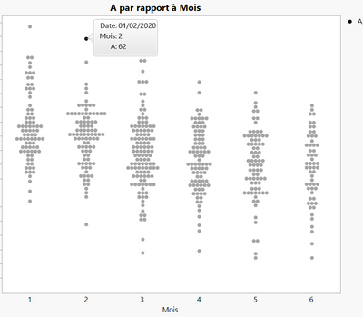
I have a database, I made a script to create a chart: A in Y and months in X
I would like to add in the hover label a pie chart referring to another column, and which also changes depending on the month (without creating a column with the pie chart images)
Thanks for your help !
Accepted Solutions
- Mark as New
- Bookmark
- Subscribe
- Mute
- Subscribe to RSS Feed
- Get Direct Link
- Report Inappropriate Content
Re: Adding a graph in hover label
Hello again, @Emma1,
This sounds like a perfect use case for graphlets, and for the Pie Chart preset in particular. I am going to use the "Big Class Families" sample data table in this example, and "Age" as if it was the "Month" category in your scenario.
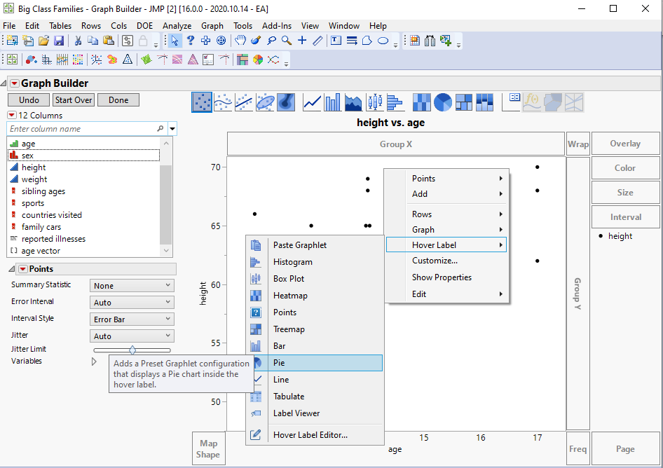
Please try clicking on the background of your graph with the right mouse button (RMB) and navigate to the preset option in the "Hover Label" menu, like so:
By default, the pie chart created by this preset will:
* be filtered by both the X and Y values (as the baseline is a scatter plot, the marker is defined by both columns);
* use the next categorical column not yet used in your table for the pie chart X role;
* reuse the column assigned to the baseline graph for the Y role in the pie chart.
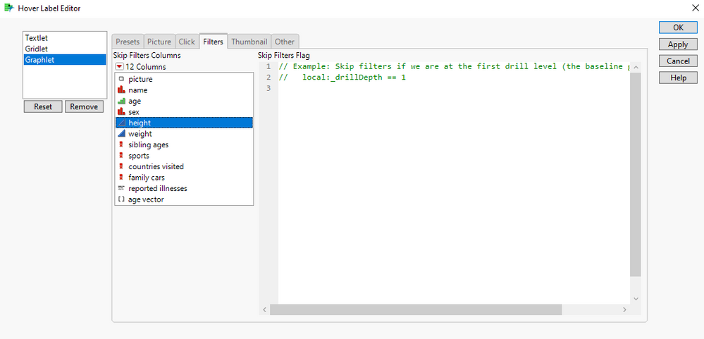
You likely don't want the pie chart filtered by the Y value of the scatter plot, as that would give you the values for a single point (it would be OK if this was a bar chart, which is filtered only by the X value by default). You can control which columns are used to filter the graphlet through the Hover Label Editor, at the bottom of that menu we just talked about. Go to the "filters" tab in the editor and select the columns you want to skip:
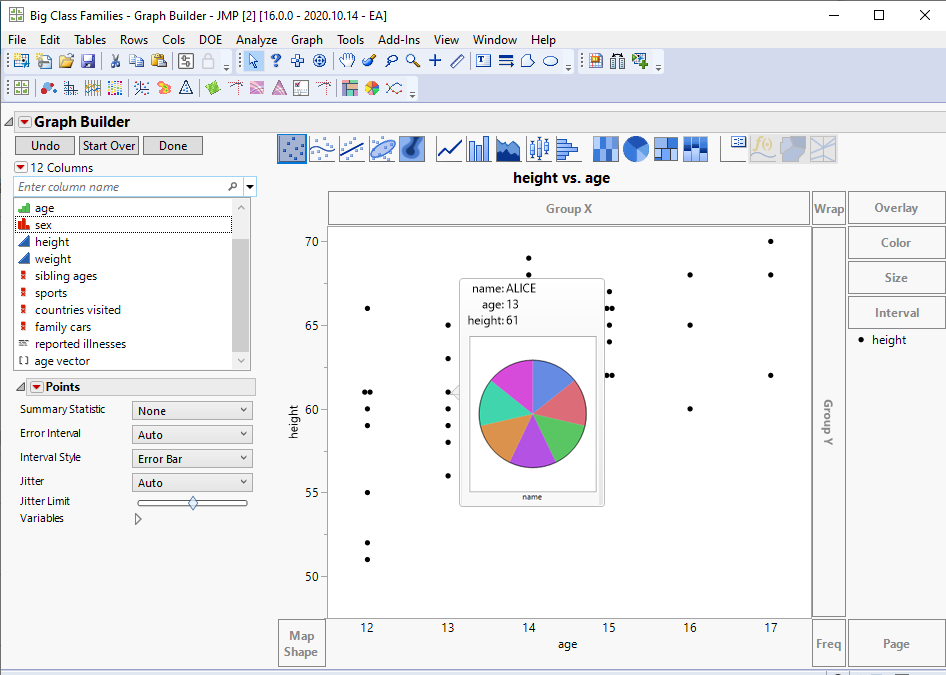
We now have an interesting looking pie chart in our hover label:
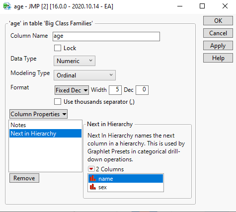
If you want to also change the X assignment of the pie chart, you can go back to the data table and set the "Next in Hierarchy" column property of the current X column (Month) to indicate what is the desired column to use. This will also work for future graphs.
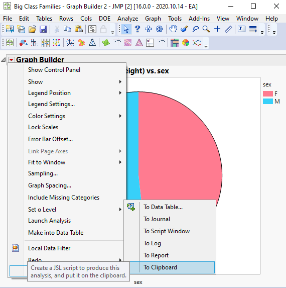
If you want to change both the X and Y assignments of the hover label pie chart, your best bet is to create the pie chart you want in a separate Graph Builder window and save its definition to the clipboard using the "Save script" > "To Clipboard" Little Red Triangle menu option:
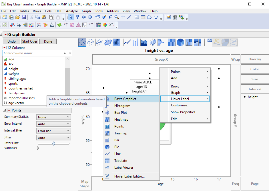
Now go back to your scatter plot and set this new graph as a graphlet using the "Paste Graphlet" option in the RMB hover label menu:
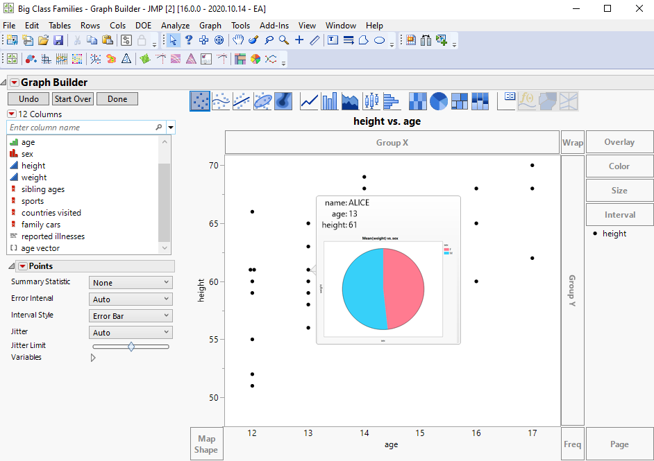
And now the hover label will use your custom pie chart as a template:
I hope this helps!
Cheers,
Nascif
- Mark as New
- Bookmark
- Subscribe
- Mute
- Subscribe to RSS Feed
- Get Direct Link
- Report Inappropriate Content
Re: Adding a graph in hover label
everything works !!
- Mark as New
- Bookmark
- Subscribe
- Mute
- Subscribe to RSS Feed
- Get Direct Link
- Report Inappropriate Content
Re: Adding a graph in hover label
- Mark as New
- Bookmark
- Subscribe
- Mute
- Subscribe to RSS Feed
- Get Direct Link
- Report Inappropriate Content
Re: Adding a graph in hover label
Is it possible to adjust the image size with thumbnail in the hover label? (JMP16 version)
Is it possible to do the same thing but with JMP 15.2 ? (without thumbnail)
- Mark as New
- Bookmark
- Subscribe
- Mute
- Subscribe to RSS Feed
- Get Direct Link
- Report Inappropriate Content
Re: Adding a graph in hover label
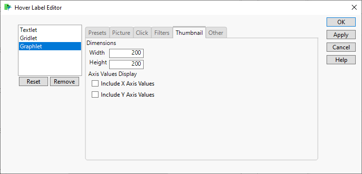
For 16, you can use the Hover Label Editor new Thumbnail size controls, as we discussed in a previous thread:
For 15.2, assuming you have used Paste Graphlet to define the graphlet, you can make a small change to the JSL, and use the Hover Label Environment Context "_mode" local variable to decide on the appropriate size for the graph.
Set Graphlet(
  Picture(
    local:sz = if (local:_mode == "Picture",
      100, 500
    );
    Graph Builder(
      Size( local:sz, local:sz ),
See attached for a full script.
- Mark as New
- Bookmark
- Subscribe
- Mute
- Subscribe to RSS Feed
- Get Direct Link
- Report Inappropriate Content
Re: Adding a graph in hover label
@Emma1 by the way, we covered presets and paste graphlet in our Discovery Presentation, make sure to check it out:
Recommended Articles
- © 2026 JMP Statistical Discovery LLC. All Rights Reserved.
- Terms of Use
- Privacy Statement
- Contact Us
