- New to JMP? Let the Data Analysis Director guide you through selecting an analysis task, an analysis goal, and a data type. Available now in the JMP Marketplace!
- See how to install JMP Marketplace extensions to customize and enhance JMP.
- Subscribe to RSS Feed
- Mark Topic as New
- Mark Topic as Read
- Float this Topic for Current User
- Bookmark
- Subscribe
- Mute
- Printer Friendly Page
Discussions
Solve problems, and share tips and tricks with other JMP users.- JMP User Community
- :
- Discussions
- :
- Re: Adding Spec limits in variability-attribute gauge chart
- Mark as New
- Bookmark
- Subscribe
- Mute
- Subscribe to RSS Feed
- Get Direct Link
- Report Inappropriate Content
Adding Spec limits in variability-attribute gauge chart
I have a table with 100 devices, and 300 test items tested. I have spec columns separately contains LSL, USL. I want to plot the variability-attribute gauge chart with the spec limits in it. Please show me how to do it or if there is any existing discussion in this topic, please point it to me. thanks.
Sample data table:
| Device | Test Name | Measurement | LSL | USL |
| 1 | Test1 | 230 | 200 | 240 |
| 1 | Test2 | 20 | 15 | 25 |
| 1 | Test3 | 30 | 25 | 35 |
| 2 | Test1 | 234 | 200 | 240 |
| 2 | Test2 | 22 | 15 | 25 |
| 2 | Test3 | 29 | 25 | 35 |
| 3 | Test1 | 229 | 200 | 240 |
| 3 | Test2 | 21 | 15 | 25 |
| 4 | Test1 | 230 | 200 | 240 |
| 4 | Test2 | 21 | 15 | 25 |
Accepted Solutions
- Mark as New
- Bookmark
- Subscribe
- Mute
- Subscribe to RSS Feed
- Get Direct Link
- Report Inappropriate Content
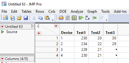
Re: Adding Spec limits in variability-attribute gauge chart
The main issue with what you want, is that your data are not in a proper form for running the Variability-Attribute Chart platform. The script below will transform a data table with the columns you have specified, into a data table that can be used to generate the charts you want.
Names Default To Here( 1 );
dt = Current Data Table();

// Make a list of the Tests
Summarize( dt, testList = by( :Test Name ) );

dtSplit = dt << Split(
	Split By( :Test Name ),
	Split( :Measurement, :LSL, :USL ),
	Group( :Device ),
	Sort by Column Property
);

// Rename the test columns and set the Spec Limits
For( i = 2, i <= N Items( testList ) + 1, i++,

	// Assign the new names
	Column( dtSplit, i ) << set name( Substr( Column( dtSplit, i ) << get Name, 13 ) );

	// Set the Spec Limits
	Eval(
		Substitute(
				Expr(
					Column( dtSplit, i ) << set property(
						"Spec Limits ",
						{LSL( __LSL__ ), USL( __USL__ ), Show Limits( 1 )}
					)
				),
			Expr( __LSL__ ), Col Mean( As Column( dtSplit, i + N Items( (testList) ) ) ),
			Expr( __USL__ ),
				Col Mean( As Column( dtSplit, i + 2 * N Items( (testList) ) ) )
		)
	);
);

// Delete unwanted limits columns
dtSplit << delete columns( Index( N Items( testList ) + 2, N Cols( dtSplit ) ) );
- Mark as New
- Bookmark
- Subscribe
- Mute
- Subscribe to RSS Feed
- Get Direct Link
- Report Inappropriate Content
Re: Adding Spec limits in variability-attribute gauge chart
@Vmuthu,
https://community.jmp.com/t5/Discussions/Adding-Control-spec-limits/m-p/7037#M7031
Have you checked the community for similar questions ?
Uday
- Mark as New
- Bookmark
- Subscribe
- Mute
- Subscribe to RSS Feed
- Get Direct Link
- Report Inappropriate Content
Re: Adding Spec limits in variability-attribute gauge chart
The main issue with what you want, is that your data are not in a proper form for running the Variability-Attribute Chart platform. The script below will transform a data table with the columns you have specified, into a data table that can be used to generate the charts you want.
Names Default To Here( 1 );
dt = Current Data Table();

// Make a list of the Tests
Summarize( dt, testList = by( :Test Name ) );

dtSplit = dt << Split(
	Split By( :Test Name ),
	Split( :Measurement, :LSL, :USL ),
	Group( :Device ),
	Sort by Column Property
);

// Rename the test columns and set the Spec Limits
For( i = 2, i <= N Items( testList ) + 1, i++,

	// Assign the new names
	Column( dtSplit, i ) << set name( Substr( Column( dtSplit, i ) << get Name, 13 ) );

	// Set the Spec Limits
	Eval(
		Substitute(
				Expr(
					Column( dtSplit, i ) << set property(
						"Spec Limits ",
						{LSL( __LSL__ ), USL( __USL__ ), Show Limits( 1 )}
					)
				),
			Expr( __LSL__ ), Col Mean( As Column( dtSplit, i + N Items( (testList) ) ) ),
			Expr( __USL__ ),
				Col Mean( As Column( dtSplit, i + 2 * N Items( (testList) ) ) )
		)
	);
);

// Delete unwanted limits columns
dtSplit << delete columns( Index( N Items( testList ) + 2, N Cols( dtSplit ) ) );
- Mark as New
- Bookmark
- Subscribe
- Mute
- Subscribe to RSS Feed
- Get Direct Link
- Report Inappropriate Content
Re: Adding Spec limits in variability-attribute gauge chart
Recommended Articles
- © 2026 JMP Statistical Discovery LLC. All Rights Reserved.
- Terms of Use
- Privacy Statement
- Contact Us

