- JMP User Community
- :
- Discussions
- :
- Re: Add mean to distribution histogram ?
- Subscribe to RSS Feed
- Mark Topic as New
- Mark Topic as Read
- Float this Topic for Current User
- Bookmark
- Subscribe
- Printer Friendly Page
- Mark as New
- Bookmark
- Subscribe
- Mute
- Subscribe to RSS Feed
- Get Direct Link
- Report Inappropriate Content
Add mean to distribution histogram ?
Hi Community,
As I'm a new user i struggle to get familiar with all the functions.
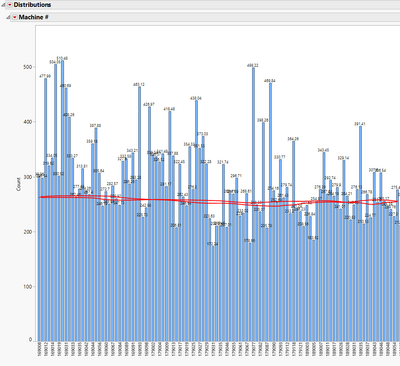
Is it possible to add a mean line calculated from JMP in a distribution histogram ?? (attached an illustration of what i would like)
Anyone that can help ??
Thanks
Accepted Solutions
- Mark as New
- Bookmark
- Subscribe
- Mute
- Subscribe to RSS Feed
- Get Direct Link
- Report Inappropriate Content
Re: Add mean to distribution histogram ?
It sounds like the Y-axis (grand total hours worked) should be continuous, not nominal.
So, this is what I think you have, correct me if wrong. Your data has two (relevant) columns: machine ID (nominal) and total hours worked (continuous).
If that is the case, I think Graph Builder would be a better choice. I have attached some mock data (with an attached script) to show how to get your desired graph.
Here are the steps to make the graph.
Go to Graph > Graph Builder
Drag Total Hours to the Y zone.
Click the Line element to get a horizontal line drawn at the mean of the hours worked.
Right-click in the graph and choose Add > Bar.
You should now have a line drawn at the mean and a bar that goes up to that horizontal line.
Drag Machine ID to the X-axis.
This will give you the bar chart, but the line is now connecting the tops of all of the bars.
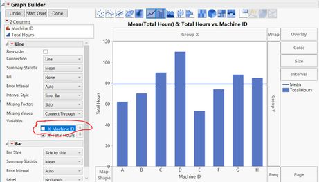
In the Line element area, click on the variables gray triangle and clear the checkbox for the X-axis (Machine ID), as shown in this picture.
Click Done.
It looks like a lot of steps, but really is not that bad. It just takes awhile to type it all. I made this picture in about 20 seconds.
- Mark as New
- Bookmark
- Subscribe
- Mute
- Subscribe to RSS Feed
- Get Direct Link
- Report Inappropriate Content
Re: Add mean to distribution histogram ?
Your example looks like the x-axis is nominal, which means you actually have a bar chart, not a histogram.
In that case, the mean is the total number of observations divided by the number of categories. You can add a reference line and for the value, enter that number.
If this truly is a histogram, then you want the reference line that is the average number of counts in each bar? That would change depending on how many bars you would like to have, which is changed easily using the grabber tool. It becomes a bit more difficult to add your line then.
Maybe a more specific example or clarification of what is being graphed would be in order. You should also probably consider graph builder rather than Distributions.
- Mark as New
- Bookmark
- Subscribe
- Mute
- Subscribe to RSS Feed
- Get Direct Link
- Report Inappropriate Content
Re: Add mean to distribution histogram ?
Thanks Dan for your support.
I was checking and the x-axis data is nominal. It a machine number.
The Y-axis shown is also nominal. it is the grand total sum of working hour we use for assembly of machines.
the distribution shows me the spread in hours, but i would like for simple visualization, to add the average hours used for the sum of machines.
The benchmark line I could add manually as this will not move, but the average could move if I add data.
Maybe graph builder is a better choice?
Martin
- Mark as New
- Bookmark
- Subscribe
- Mute
- Subscribe to RSS Feed
- Get Direct Link
- Report Inappropriate Content
Re: Add mean to distribution histogram ?
It sounds like the Y-axis (grand total hours worked) should be continuous, not nominal.
So, this is what I think you have, correct me if wrong. Your data has two (relevant) columns: machine ID (nominal) and total hours worked (continuous).
If that is the case, I think Graph Builder would be a better choice. I have attached some mock data (with an attached script) to show how to get your desired graph.
Here are the steps to make the graph.
Go to Graph > Graph Builder
Drag Total Hours to the Y zone.
Click the Line element to get a horizontal line drawn at the mean of the hours worked.
Right-click in the graph and choose Add > Bar.
You should now have a line drawn at the mean and a bar that goes up to that horizontal line.
Drag Machine ID to the X-axis.
This will give you the bar chart, but the line is now connecting the tops of all of the bars.
In the Line element area, click on the variables gray triangle and clear the checkbox for the X-axis (Machine ID), as shown in this picture.
Click Done.
It looks like a lot of steps, but really is not that bad. It just takes awhile to type it all. I made this picture in about 20 seconds.
- Mark as New
- Bookmark
- Subscribe
- Mute
- Subscribe to RSS Feed
- Get Direct Link
- Report Inappropriate Content
Re: Add mean to distribution histogram ?
Hi Dan,
Thanks alot.
This did the trick, and it was really not bad.
Martin
- Mark as New
- Bookmark
- Subscribe
- Mute
- Subscribe to RSS Feed
- Get Direct Link
- Report Inappropriate Content
Re: Add mean to distribution histogram ?
Hello,
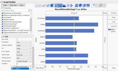
I am following the steps to get a line added to my bar graph for my x variables. When I add it, the line is a count. Any advice?
Thanks,
Rebecca
@Dan_Obermiller Thanks in advance!!
- Mark as New
- Bookmark
- Subscribe
- Mute
- Subscribe to RSS Feed
- Get Direct Link
- Report Inappropriate Content
Re: Add mean to distribution histogram ?
- © 2025 JMP Statistical Discovery LLC. All Rights Reserved.
- Terms of Use
- Privacy Statement
- Contact Us


