- We’re retiring the File Exchange at the end of this year. The JMP Marketplace is now your destination for add-ins and extensions.
- JMP 19 is here! Learn more about the new features.
- Subscribe to RSS Feed
- Mark Topic as New
- Mark Topic as Read
- Float this Topic for Current User
- Bookmark
- Subscribe
- Mute
- Printer Friendly Page
Discussions
Solve problems, and share tips and tricks with other JMP users.- JMP User Community
- :
- Discussions
- :
- Re: Add linear fit , eqn, R^2 to overlay plots
- Mark as New
- Bookmark
- Subscribe
- Mute
- Subscribe to RSS Feed
- Get Direct Link
- Report Inappropriate Content
Add linear fit , eqn, R^2 to overlay plots
Hi,
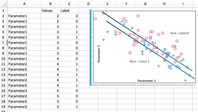
I cannot add linear fit and display equation & R^2 values when using overlay plot feature in jmp by label : 0 and 1. See the attached excel for data and desired plot.
Can you please help ?
Thanks a lot.
Accepted Solutions
- Mark as New
- Bookmark
- Subscribe
- Mute
- Subscribe to RSS Feed
- Get Direct Link
- Report Inappropriate Content
Re: Add linear fit , eqn, R^2 to overlay plots
Your Excel sheet does not have the data, but here is an approach that should work.
Go to Graph Builder.
Drag your X variable to the X zone.
Drag your Y variable to the Y zone.
Drag your Label variable to the Overlay zone.
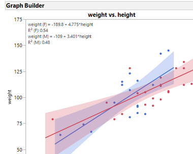
This should give you a scatterplot with different colors for each value of the Label variable.
Now click on the Graph element for the regression line.
You can then modify what is displayed by looking at the regression line options to the left of the graph.
Here is an example using the Big Class data.
- Mark as New
- Bookmark
- Subscribe
- Mute
- Subscribe to RSS Feed
- Get Direct Link
- Report Inappropriate Content
Re: Add linear fit , eqn, R^2 to overlay plots
Graph Builder is designed for graphs, not analysis. Fortunately, everything you want to do can be done through Fit Y by X which is an analysis platform.
Choose Fit Y by X. Specify your X and Y variables.
When the scatterplot appears, go to the red triangle and choose Group By... and specify your labels variable.
Go to Fit Special and choose your transformed fit. It will be done for each value of the labels variable.
Right-click the Y-axis and select Axis Settings. In the dialog, in the upper left is the scale control for you to change to a log axis.
- Mark as New
- Bookmark
- Subscribe
- Mute
- Subscribe to RSS Feed
- Get Direct Link
- Report Inappropriate Content
Re: Add linear fit , eqn, R^2 to overlay plots
Your Excel sheet does not have the data, but here is an approach that should work.
Go to Graph Builder.
Drag your X variable to the X zone.
Drag your Y variable to the Y zone.
Drag your Label variable to the Overlay zone.
This should give you a scatterplot with different colors for each value of the Label variable.
Now click on the Graph element for the regression line.
You can then modify what is displayed by looking at the regression line options to the left of the graph.
Here is an example using the Big Class data.
- Mark as New
- Bookmark
- Subscribe
- Mute
- Subscribe to RSS Feed
- Get Direct Link
- Report Inappropriate Content
Re: Add linear fit , eqn, R^2 to overlay plots
Hi Dan,
Thanks a lot for your quick solution. I appreciate it.
One more thing: If I want to change Y axis to log scale & want to do Fit Special : Transformed Fit log, can I acheive this in Graph Builder mode ?
THanks,
- Mark as New
- Bookmark
- Subscribe
- Mute
- Subscribe to RSS Feed
- Get Direct Link
- Report Inappropriate Content
Re: Add linear fit , eqn, R^2 to overlay plots
Graph Builder is designed for graphs, not analysis. Fortunately, everything you want to do can be done through Fit Y by X which is an analysis platform.
Choose Fit Y by X. Specify your X and Y variables.
When the scatterplot appears, go to the red triangle and choose Group By... and specify your labels variable.
Go to Fit Special and choose your transformed fit. It will be done for each value of the labels variable.
Right-click the Y-axis and select Axis Settings. In the dialog, in the upper left is the scale control for you to change to a log axis.
- Mark as New
- Bookmark
- Subscribe
- Mute
- Subscribe to RSS Feed
- Get Direct Link
- Report Inappropriate Content
Re: Add linear fit , eqn, R^2 to overlay plots
Hi Dan,
Thanks a lot! Really appreciate your help.
Recommended Articles
- © 2025 JMP Statistical Discovery LLC. All Rights Reserved.
- Terms of Use
- Privacy Statement
- Contact Us


