- New to JMP? Let the Data Analysis Director guide you through selecting an analysis task, an analysis goal, and a data type. Available now in the JMP Marketplace!
- See how to install JMP Marketplace extensions to customize and enhance JMP.
- Subscribe to RSS Feed
- Mark Topic as New
- Mark Topic as Read
- Float this Topic for Current User
- Bookmark
- Subscribe
- Mute
- Printer Friendly Page
Discussions
Solve problems, and share tips and tricks with other JMP users.- JMP User Community
- :
- Discussions
- :
- Re: Actual by predicted plot confidence region
- Mark as New
- Bookmark
- Subscribe
- Mute
- Subscribe to RSS Feed
- Get Direct Link
- Report Inappropriate Content
Actual by predicted plot confidence region
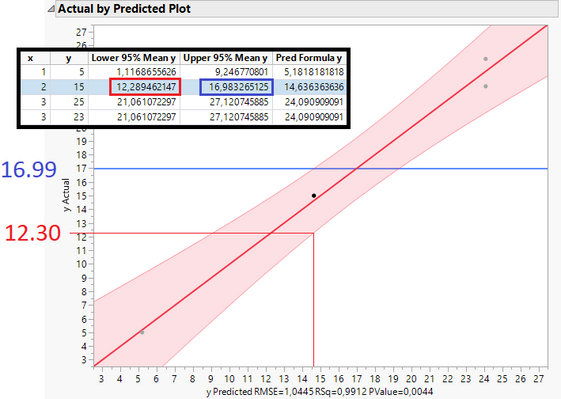
Here is a simple linear regression with just one independent variable x. The predicted y (Save Columns -> Pred Formula) as well as upper and lower 95% confidence values (Save Columns -> Mean Confidence Limit Formula) are shown too. Have a look at the second data point:
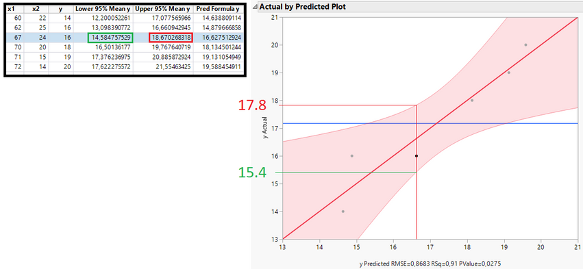
The upper and lower confidence values match with the plot (16.99 and 12.30 on the y axis are very close to the calculated values in the table, marked red and blue). However in multiple linear regression it doesn't match. Example with two independent variables x1 and x2 (have a look at the third data point):
From the table above I expected 14.58 for the lower 95% value but it is 15.4. The upper 95% value (18.67) deviates too (17.8).
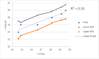
This is the scatter plot in excel. Clearly the confidence region looks different (broader):
So my question is, how are the confidence bands in the actual by predicted plot calculated? It looks like the uncertainty around the mean is lower than on the edges but what is the math behind the confidence calculation? Thanks.
Accepted Solutions
- Mark as New
- Bookmark
- Subscribe
- Mute
- Subscribe to RSS Feed
- Get Direct Link
- Report Inappropriate Content
Re: Actual by predicted plot confidence region
Hi @OmegaHard ,
I think you might be graphing something different than what you're looking at in the table. In the tables, you're looking at the confidence interval on the mean, not the prediction. Read about some of it here. What I think you're intending to look at is what JMP call the "indiv" confidence interval. According to JMP's online help:
Mean Confidence Limit Formula
Creates two new columns in the data table called Lower 95% Mean <colname> and Upper 95% Mean <colname> where colname is the name of the Y variable. These columns contain both the formulas and the values for lower and upper 95% confidence limits for the mean response.
Indiv Confidence Limit Formula
Creates two new columns in the data table called Lower 95% Indiv <colname> and Upper 95% Indiv <colname> where colname is the name of the Y variable. These columns contain both the formulas and the values for lower and upper 95% confidence limits for an individual prediction.
Note also that there is a difference between Confidence Shaded Fit (confidence region for the mean expected response) vs Confidence Shaded Indiv (confidence region for an individual prediction). I believe the want the Indiv and not the Fit.
Confid Shaded Fit
(Not available for all fits.) Shows or hides a shaded confidence region for the expected response (mean).
Confid Shaded Indiv
(Not available for all fits.) Shows or hides a shaded confidence region for an individual prediction.
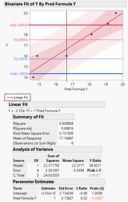
If you look at the Indiv CI shaded and saved formulas, you get exactly what you expect. Notice the difference between the Fit vs Indiv -- the Fit is much narrower because it's about the overall mean response, whereas the Indiv is an individual prediction. This is all copied from your data tables you shared.
Also, make sure that when you're comparing the CIs for your actual by predicted plots, and those saved to the data table, that you do it with the actual by predicted data and not accidentally save the CI formulas from the Fit Y by X (using X as the regressor).
The actual calculation of the 95% confidence intervals for the indiv prediction is somewhat complicated and you can see it by looking at the formula in the relevant column, for example:
Calculating it by hand is not very easy, but it's possible. A quick Google search brings up this, which might help you get started, but doing this calculation isn't something easy like just adding a plus or minus.
Here's the data table I used when trying to replicate your issue.
Hope this helps,
DS
- Mark as New
- Bookmark
- Subscribe
- Mute
- Subscribe to RSS Feed
- Get Direct Link
- Report Inappropriate Content
Re: Actual by predicted plot confidence region
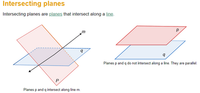
Hi @OmegaHard In addition to what @SDF1 said, you are comparing apples and oranges; when you have a plane in 3D space (Y=B0 +B1*X1+B2*X2), there is a line in the X1 X2 space where the predicted Y is constant. i.e., if you imagine the intersection of the tilted plane, Y=B0 +B1*X1+B2*X2 (your regression equation) , with the plane Y =C (predicted value is some constant), the result is a line. Along that line (X1= a + b*X2), the predicted value of Y is constant (predictions at those X1, X2 values along that line are all the same). However, the confidence and prediction intervals along that line are not constant; they widen as you move away from the center of the data. The observed vs predicted plot does not reflect this (and it's not designed to). While the observed vs predicted provides a nice visual, the interval it shows does not take this into account. The short(er) answer? Do not use the observed vs predicted plots when predicting in the X1, X2 space. See pic below for an example of the line of intersection of two planes (to relate that to my example, q is Y=C, and P is Y=B0 +B1*X1+B2*X2).
- Mark as New
- Bookmark
- Subscribe
- Mute
- Subscribe to RSS Feed
- Get Direct Link
- Report Inappropriate Content
Re: Actual by predicted plot confidence region
Hi @OmegaHard ,
I think you might be graphing something different than what you're looking at in the table. In the tables, you're looking at the confidence interval on the mean, not the prediction. Read about some of it here. What I think you're intending to look at is what JMP call the "indiv" confidence interval. According to JMP's online help:
Mean Confidence Limit Formula
Creates two new columns in the data table called Lower 95% Mean <colname> and Upper 95% Mean <colname> where colname is the name of the Y variable. These columns contain both the formulas and the values for lower and upper 95% confidence limits for the mean response.
Indiv Confidence Limit Formula
Creates two new columns in the data table called Lower 95% Indiv <colname> and Upper 95% Indiv <colname> where colname is the name of the Y variable. These columns contain both the formulas and the values for lower and upper 95% confidence limits for an individual prediction.
Note also that there is a difference between Confidence Shaded Fit (confidence region for the mean expected response) vs Confidence Shaded Indiv (confidence region for an individual prediction). I believe the want the Indiv and not the Fit.
Confid Shaded Fit
(Not available for all fits.) Shows or hides a shaded confidence region for the expected response (mean).
Confid Shaded Indiv
(Not available for all fits.) Shows or hides a shaded confidence region for an individual prediction.
If you look at the Indiv CI shaded and saved formulas, you get exactly what you expect. Notice the difference between the Fit vs Indiv -- the Fit is much narrower because it's about the overall mean response, whereas the Indiv is an individual prediction. This is all copied from your data tables you shared.
Also, make sure that when you're comparing the CIs for your actual by predicted plots, and those saved to the data table, that you do it with the actual by predicted data and not accidentally save the CI formulas from the Fit Y by X (using X as the regressor).
The actual calculation of the 95% confidence intervals for the indiv prediction is somewhat complicated and you can see it by looking at the formula in the relevant column, for example:
Calculating it by hand is not very easy, but it's possible. A quick Google search brings up this, which might help you get started, but doing this calculation isn't something easy like just adding a plus or minus.
Here's the data table I used when trying to replicate your issue.
Hope this helps,
DS
- Mark as New
- Bookmark
- Subscribe
- Mute
- Subscribe to RSS Feed
- Get Direct Link
- Report Inappropriate Content
Re: Actual by predicted plot confidence region
Thanks a lot for your answer.
If you look at the Indiv CI shaded and saved formulas, you get exactly what you expect. Notice the difference between the Fit vs Indiv -- the Fit is much narrower because it's about the overall mean response, whereas the Indiv is an individual prediction. This is all copied from your data tables you shared.
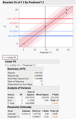
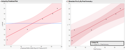
Actually the bivariate fit of y and y predicted you have shown does not produce the exact same confidence region as shown in the actual by predicted plot when comparing both:
When looking at the third data point from left we can clearly see that the confidence region around that point is slightly different. The uncertainty at the edges at the actual by predicted plot is higher too.
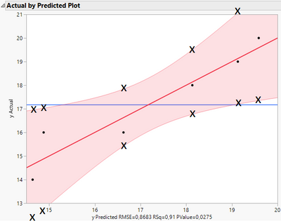
I would like to know the Formula of the upper and lower 95% CI values shown in the actual by predicted plot. I mean these points:
I am not able to save these values to the column. If I could do that I would next click on Formula to show how it's beeing calculated.
- Mark as New
- Bookmark
- Subscribe
- Mute
- Subscribe to RSS Feed
- Get Direct Link
- Report Inappropriate Content
Re: Actual by predicted plot confidence region
Hi @OmegaHard ,
Thanks for the additional information. I don't think I fully understood what your original post was about. After your latest post, it appears that what you're interested in understanding is something more along the lines of:
1) When using the Model platform (e.g. with two X's, X1 and X2) to predict Y, why is the shaded region in the Actual by Predicted Plot not in agreement with the lower and upper 95% CIs that can be saved to the data table?
2) How to calculate the shaded CI as shown in the Actual by Predicted Plot?
The answer to 1) has to do with what @MRB3855 was discussing with the multiple planes, X's being used to predict one Y. This causes the confidence and prediction intervals to change as you move further away from the center, resulting in a change in the statistical test results, which show up as curvature in the shaded area.
An answer to 2) is that it's not entirely what is being shown. The shaded area is actually a visual representation of whether the statistical test of interest is significant at the alpha level you chose or to default (like the F-test for analysis of variance). But, because the confidence and prediction intervals are not constant, the test changes as you move away from the center. If the shaded area encloses the blue line, then the test is not significant, if far away, then it is significant. In the case of your example, it would be something more borderline because it's pretty close to the overall mean. So, the shaded area is a CI, but not necessarily on the prediction, like what you are expecting from the CI formulas that are saved to the data table.
JMP does not provide any documentation (that I've found) on how they generate the shaded area in the Actual by Predicted Plot, but you can find more documentation on their calculation of the CIs -- the formulas that are saved to the data table. You can find some stuff here and here.
This is one of the reasons why I tend to compare my actual and predicted using the Fit Y by X platform instead, you're not getting this visual representation of the significance test, but the true CIs on the indiv predicted or mean.
I still think it's an interesting question as to how can one generate the same shaded area (or at least curves) as JMP does for the Actual by Predicted Plot as I think it could be a useful tool to have for sharing visuals with stakeholders.
Sorry for my mistake in misunderstanding your original post.
Hope this helps!,
DS
- Mark as New
- Bookmark
- Subscribe
- Mute
- Subscribe to RSS Feed
- Get Direct Link
- Report Inappropriate Content
Re: Actual by predicted plot confidence region
Hello, I was also very interested in this exact question: How exactly is the shaded CI calculated in the Actual by Predicted Plot when using "Analyze -> Fit Model"? Where is the formula?
These plots are invaluable tools when analyzing DoE results. I'm quite surprised about the apparent lack of clear documentation or available formulas explaining this calculation. Given how frequently this plot is used in assessing DoE outcomes, it would be beneficial to have more transparency around its underlying methodology.
Has anyone successfully reached out to JMP Support for clarification on this matter? Or are there perhaps academic papers or technical documents that discuss JMP's methodology for these calculations? It seems like a significant oversight for such an important feature to lack proper documentation.
- Mark as New
- Bookmark
- Subscribe
- Mute
- Subscribe to RSS Feed
- Get Direct Link
- Report Inappropriate Content
Re: Actual by predicted plot confidence region
Hi @LinkageFrog and welcome. You are asking about the leverage plot. And, there is plenty of documentation/transparency.
- Mark as New
- Bookmark
- Subscribe
- Mute
- Subscribe to RSS Feed
- Get Direct Link
- Report Inappropriate Content
Re: Actual by predicted plot confidence region
Hi @LinkageFrog : More here that may be helpful.
https://community.jmp.com/t5/Discussions/Whole-Model-Leverage-Details/td-p/760845
- Mark as New
- Bookmark
- Subscribe
- Mute
- Subscribe to RSS Feed
- Get Direct Link
- Report Inappropriate Content
Re: Actual by predicted plot confidence region
Hi @OmegaHard In addition to what @SDF1 said, you are comparing apples and oranges; when you have a plane in 3D space (Y=B0 +B1*X1+B2*X2), there is a line in the X1 X2 space where the predicted Y is constant. i.e., if you imagine the intersection of the tilted plane, Y=B0 +B1*X1+B2*X2 (your regression equation) , with the plane Y =C (predicted value is some constant), the result is a line. Along that line (X1= a + b*X2), the predicted value of Y is constant (predictions at those X1, X2 values along that line are all the same). However, the confidence and prediction intervals along that line are not constant; they widen as you move away from the center of the data. The observed vs predicted plot does not reflect this (and it's not designed to). While the observed vs predicted provides a nice visual, the interval it shows does not take this into account. The short(er) answer? Do not use the observed vs predicted plots when predicting in the X1, X2 space. See pic below for an example of the line of intersection of two planes (to relate that to my example, q is Y=C, and P is Y=B0 +B1*X1+B2*X2).
Recommended Articles
- © 2026 JMP Statistical Discovery LLC. All Rights Reserved.
- Terms of Use
- Privacy Statement
- Contact Us
