- New to JMP? Let the Data Analysis Director guide you through selecting an analysis task, an analysis goal, and a data type. Available now in the JMP Marketplace!
- See how to install JMP Marketplace extensions to customize and enhance JMP.
- Subscribe to RSS Feed
- Mark Topic as New
- Mark Topic as Read
- Float this Topic for Current User
- Bookmark
- Subscribe
- Mute
- Printer Friendly Page
Discussions
Solve problems, and share tips and tricks with other JMP users.- JMP User Community
- :
- Discussions
- :
- About stem and leaf plot
- Mark as New
- Bookmark
- Subscribe
- Mute
- Subscribe to RSS Feed
- Get Direct Link
- Report Inappropriate Content
About stem and leaf plot
Does anyone know how to construct a stem and leaf plot and a relative frequency histogramon JMP11?
And also, how to know the outliers of the data?
Thx for that, I'm a new learner on JMP
Accepted Solutions
- Mark as New
- Bookmark
- Subscribe
- Mute
- Subscribe to RSS Feed
- Get Direct Link
- Report Inappropriate Content
Re: About stem and leaf plot
Hi Nightkirabuaa,
Here is a step-by-step guide for the plots you mentioned: PDF | Video
(you can find many more of these at jmp.com/learn)
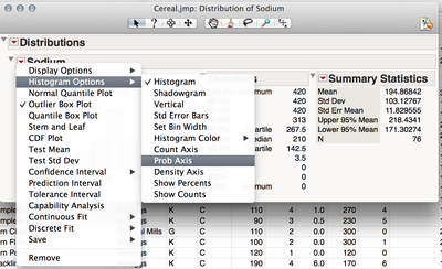
A relative frequency histogram has a y-axis that displays proportion of total rather than n. The guide above shows how to generate the histogram, but I don't show how to get the proportion axis. In the Distribution platform you can specify the type of axis displayed by selecting the Red triangle next to the variable name, then Histogram Options.
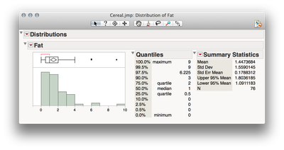
There are several methods in JMP to detect outliers, one of which you will see in the guide above. The histogram displayed in the Distribution platform includes a box plot. Any points that are displayed next to that box plot are "outliers" by the definition of 1.5*IQR+Q3 -- points quite far from the median value. If you wish to exclude those values you can select the points by dragging a box around them then right click > Row Hide and Exclude. Future analyses will no longer included these values in calculations nor show the points in visualizations. If you wish to see the present analysis without those points, select the Red Triangle next to Distribution, then Script > Redo Analysis. You can also turn on "Automatic Recalc" which will monitor the dataset for changes and recalculate when values are modified or points excluded.
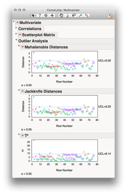
Multivariate outliers can be detected using the Multivariate platform, found under Analyze > Multivariate Methods > Multivariate. Once you launch the platform select the Red Triangle (next to Multivariate) > Outlier Analysis. JMP will show a chart with every point in the data set ordered by row number, and showing on the Y axis a measure of multivariate distance. Points that are above the dotted line are unexpectedly far from the multivariate mean, adjusted for the covariance structure of the observed data.
I hope this helps!
Julian
Recommended Articles
- © 2026 JMP Statistical Discovery LLC. All Rights Reserved.
- Terms of Use
- Privacy Statement
- Contact Us


