- New to JMP? Let the Data Analysis Director guide you through selecting an analysis task, an analysis goal, and a data type. Available now in the JMP Marketplace!
- See how to install JMP Marketplace extensions to customize and enhance JMP.
- Subscribe to RSS Feed
- Mark Topic as New
- Mark Topic as Read
- Float this Topic for Current User
- Bookmark
- Subscribe
- Mute
- Printer Friendly Page
Discussions
Solve problems, and share tips and tricks with other JMP users.- JMP User Community
- :
- Discussions
- :
- 3D bar charts in JMP
- Mark as New
- Bookmark
- Subscribe
- Mute
- Subscribe to RSS Feed
- Get Direct Link
- Report Inappropriate Content
3D bar charts in JMP
Accepted Solutions
- Mark as New
- Bookmark
- Subscribe
- Mute
- Subscribe to RSS Feed
- Get Direct Link
- Report Inappropriate Content
Re: 3D bar charts in JMP
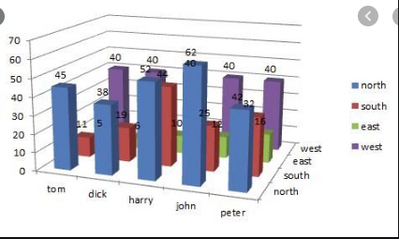
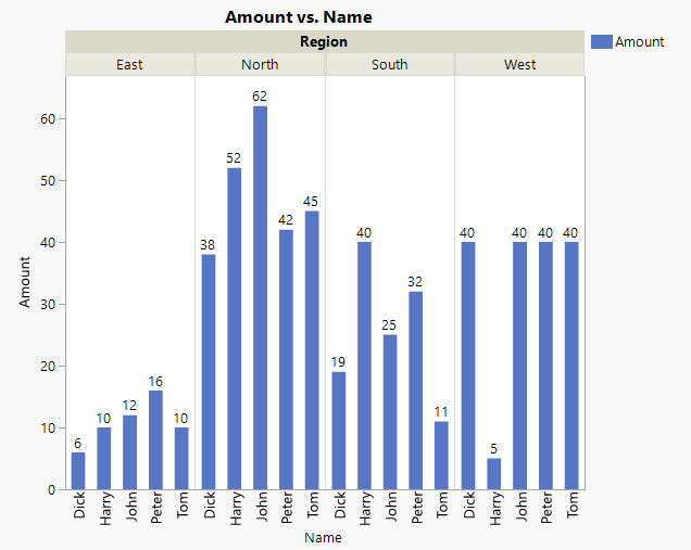
Short answer is no, because JMP only wants to present data in an accurate fashion. You really do not want a 3-D bar chart. Look closely at your 3-D bar chart. The bar in the front left has a height of 45. I know this because of the label on the top. But look over to the axis on the left. It shows that bar to be barely above 40. Compare Tom's west number to the back wall. It should be less than 40, but the value actually is 40. Further, what did Tom have in the east? For that matter, what about anybody in the east? 3-D bar charts add confusion, skew perspectives all for that 3rd dimension which does not provide any information. A better graph would be the following which is easily made in graph builder (I had to guess at some of the numbers from your table -- I couldn't see them!):
- Mark as New
- Bookmark
- Subscribe
- Mute
- Subscribe to RSS Feed
- Get Direct Link
- Report Inappropriate Content
Re: 3D bar charts in JMP
@Dan_Obermiller Thank you Dan for the response. This is just an example I showed to explain what I am looking for but I got your point and I got the graph you showed in the response. Thank you again.
- Mark as New
- Bookmark
- Subscribe
- Mute
- Subscribe to RSS Feed
- Get Direct Link
- Report Inappropriate Content
Re: 3D bar charts in JMP
I just want to add a little bit to @Dan_Obermiller's reply. You have a lot of options for presenting the story in the data in the best way with Graph Builder. I agree with the use of a bar element (length) to represent the data, but you also have choices about how to group and nest the variables. Also be sure to explore the properties list on the left side of Graph Builder in the control panel area. You can modify these properties to further enhance your plot.
I strongly recommend looking at JMP Help > JMP Documentation Library > Essential Graphing. There is a lot of material devoted to Graph Builder. There are many examples with solutions worked out.
Recommended Articles
- © 2026 JMP Statistical Discovery LLC. All Rights Reserved.
- Terms of Use
- Privacy Statement
- Contact Us


