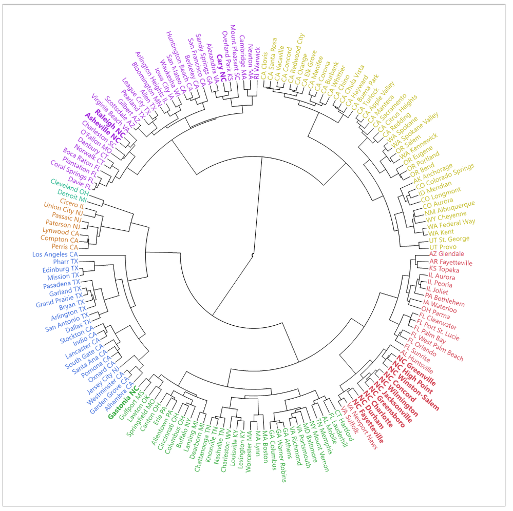
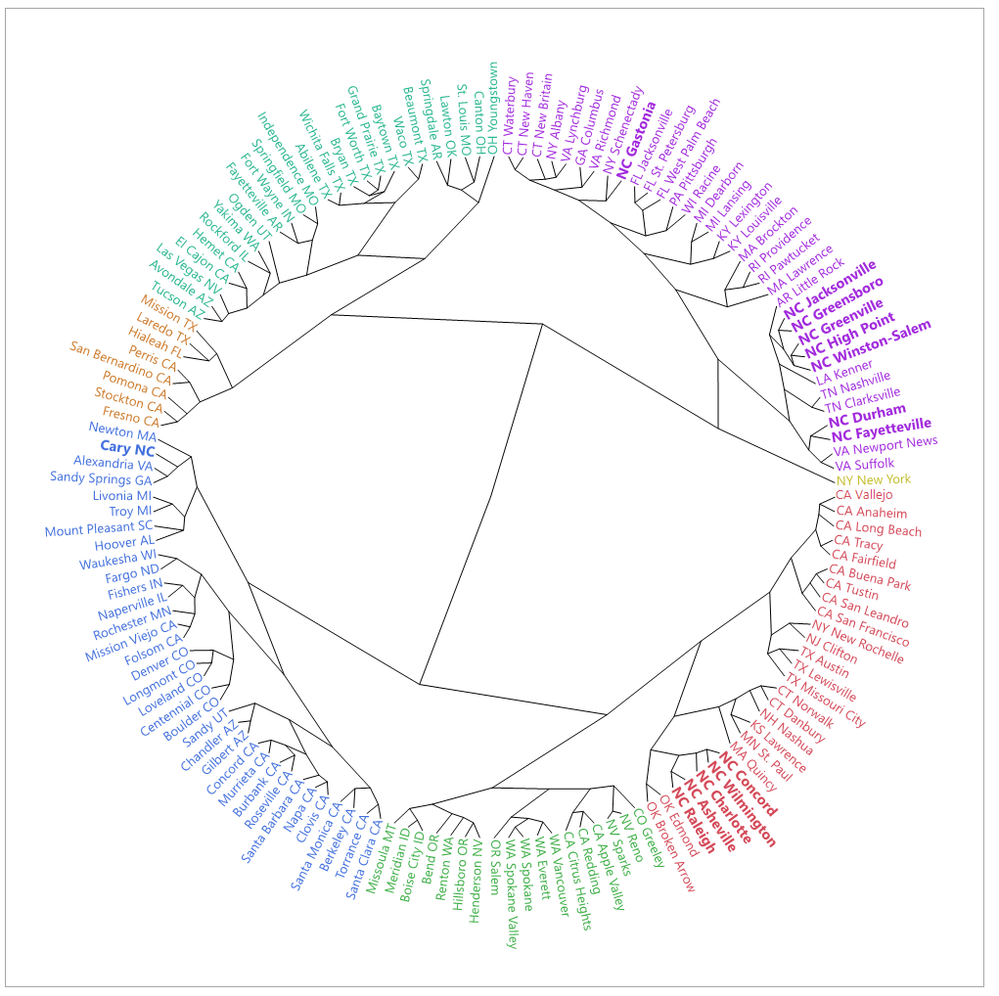
@ezorlo asked how to get the data out of the clustering platform to make a circular dendrogram. This example mostly uses the Leader-Joiner table from the platform.
 Fan style.
 Radial style.
JSL attached.
The JSL makes SVG files and opens them in a browser because zooming works much better. The text in a graphbox does not get larger when zooming. At the start of the file there are some parameters to play with; one of them is for aligning the text. If that value isn't close, the labels at the top and bottom (at the point where they invert their orientation) will look badly spaced.
This example takes a subset of the 500 cities in the downloaded table, and forces all of the NC cities to be selected. The two graphs above were made with different subsets.
Reading the graph: the graph has potential to mislead because you might assume adjacent cities are similar. But some adjacent cities are as different as they can be when their connection goes through the center of the graph. The coloring is helpful.
data from chronicdata.cdc.gov , see the JSL. The cities are being clustered based on chronic health issues.
I used this as a reference.