Return to JMP Fed Gov User Resources Page
22 Dec Webcast - Strategies for Analyzing DOEs
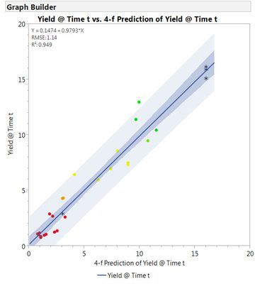
In this webcast we will analyze several DOE data sets. For visual analysis tools we will use the Distribution and the Graph Builder, including data filtering on columns of factors, as well as stacking of factors. Modeling strategies will include conservative approaches such as looking at first order effects before moving on to second order effects guided by "effect heredity" and "effect sparsity" principles. Aggressive strategies will include stepwise regression using several different stopping criteria to prevent overfitting and even fitting "All Possible Models." Actual vs. Prediction plots with checkpoints can be used to help choose models. Various sample graphical and stepwise regression output that may be recreated in the session are shown below:
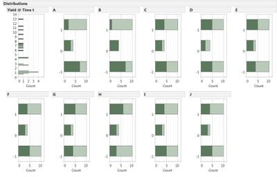
Distribution Platform showing shading of factor levels with top half of response data selected.
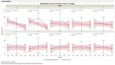
Graph Builder Yield vs Factor Ranges for all 10 Factors. Data summarized by Mean with error bars equal to the confidence interval about the Mean. Smoother curve (blue) and Line Fit (red) to data. Relative size of Main Effects and Curvature can be seen.
Graph Builder showing response values plotted vs individual factor settings with "Smoother" curve
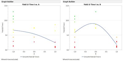
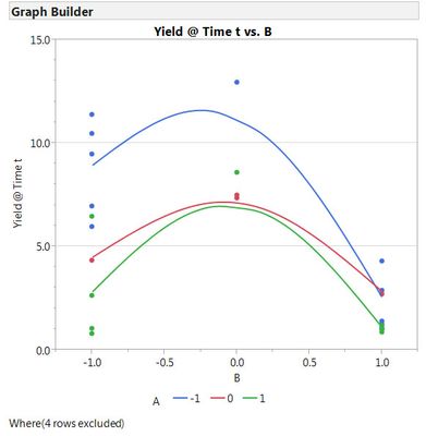
Graph Builder showing response vs factor settings of one factor with second factor overlayed on graph.
Non-parallel lines are indicative of an interaction between factors.
Plot of criterion history for stepwise regression of 24 observations choosing a 4-factor, 9-term model subset of a 10-factor, 66-term quadratic model that is "over parameterized."
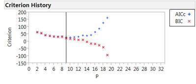
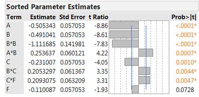
Chart of sorted parameter estimates showing dominance of factors A & B
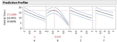
Prediction Profiler set to conditions predicting maximum yield withing ranges of factors. Three checkpoints yielded values of 15.10, 15.93 and 16.16 - all within 95% confidence window (14.4, 20.1).
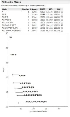
Best 1-term through 8-term models (ignoring constant) from fitting all 10 million possible models for 8 factors.
NOTE domination by A & B followed by C and then suggestion that G may be important.
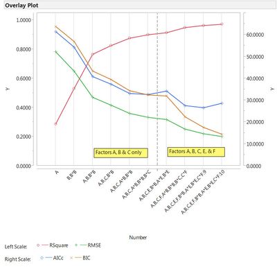
Overlay Plot of 4 metrics from an All Possible Model Table for factors A, B, C, E, and F;
RSquare, RMSE, AICc and BIC vs Model Terms.
Plot of Actual vs Predicted for 3-factor model fit to 24 design trials. Four Checkpoints NOT used in fit are also plotted.
