Recently some of our JMP users in the semiconductor/high tech industry asked a great question related to contour plots. They were plotting values on a wafer map and wanted to visually emphasize only measurements in the outer rims of the wafer using contour plots. Ideally they wanted to see something closer to a doughnut shape to ensure their audience’s eyes went to the measurements in the edges of the wafer. However when they asked JMP to fill (shade) values on a contour map, all parts of the wafer including the middle gets colored. So what is the best way to create essentially a doughnut shape without customized scripting?
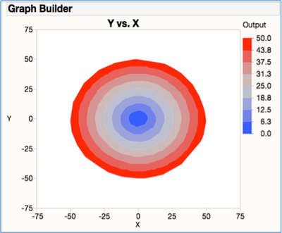
Using some created data in JMP on my Mac, we used Graph Builder to create the view by dragging and dropping in the X, Y and Output column data into the appropriate places in Graph Builder and then selected the Contour Plot icon. (You can see the attached file "doughnut.jmp" to see the data and check out the attached scripts showing each major step below.)
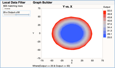
Now to only see the outer bands we originally thought we could take advantage of the Local Data Filter to select only rows with higher outputs (Output >=25), and hide and exclude the other points from the graph. You can see from the figure below that we don’t get the data doughnut shaped view we wanted as the there is still blue color shading filled in for all the values less than 25. So maybe a blueberry jelly filled doughnut, but nothing that will really attract the viewers attention away from the center and out to the outer edges!
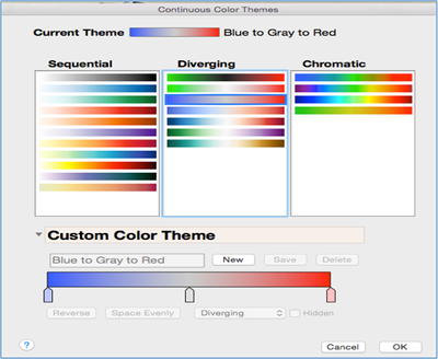
However if we go back to first unfiltered graph view, we may be able to take advantage of JMPs color theme customizations to create our view. So under the Graph Builder’s hot spot, we selected Continuous Color Theme. This brings up a dialog box that lets you control the view. My current theme is “Blue to Grey to Red” as indicated below and is using a diverging pattern.
But by selecting “New” in the Custom Color Theme area, I can now change the colors and the spacing the way I want for my desired view. Once you get it the way you want it you can even use the “Save” button and ensure that this selection will be included in your list of Color Themes for next time. Left clicking on the sliders below the color bar allows you to change colors…in this case I turned the blue into white. Then I moved this slider all the way over to where the grey one in the middle to ensure that the center of the wafer map would look solidly white.
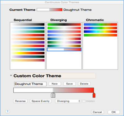
Now that we have adjusted our graph to use this Custom Color “Doughnut Theme,” I can get the desired visual as the white fill in the middle matches the white fill in the graph background. This makes the center of the Contour Plot look empty and gives the attention to the outer rings of the contour plot!
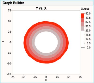
While they would be several other ways to accomplish this view using JMP JSL custom scripting, we were able to create the desired view by just taking advantage of built-in color theme feature. If you can find another way to generate this view with or without scripting, please feel free to contribute it. So the next time someone asks for a visual doughnut, you can now say “no problem…what flavor”?
You must be a registered user to add a comment. If you've already registered, sign in. Otherwise, register and sign in.