- New to JMP? Let the Data Analysis Director guide you through selecting an analysis task, an analysis goal, and a data type. Available now in the JMP Marketplace!
- See how to install JMP Marketplace extensions to customize and enhance JMP.
Scott Wise's Blog
- JMP User Community
- :
- Blogs
- :
- Scott Wise
- :
- Should I Stay or Should I Go: Brexit Referendum Voting Variation
- Subscribe to RSS Feed
- Mark as New
- Mark as Read
- Bookmark
- Subscribe
- Printer Friendly Page
- Report Inappropriate Content
Editor’s Note: This monthly blog from Scott Wise, JMP Principal Engineer, seeks to find interesting uses of statistical discovery to solve deep questions dealing with business, economics, sports, health, food, history and psychology. For our June/July blog we will explore if further drilldown on the Brexit referendum voting variation can help us better understand the magnitude of the surprise exit results. We will also feature some cool JMP 12 graphing visualizations along the way!
In the words of seminal English punk rock band, The Clash;
“Darlin' you got to let me know
Should I stay or should I go?
If you say that you are mine
I'll be here 'til the end of time
So you got to let me know
Should I stay or should I go?”
As an American with part UK ancestry, I admit to being rather fascinated by the recent surprise results of the recent English Referendum, or “Brexit” for short, to leave the European Union. The “leave” win has generated many post articles hypothesizing about how this unexpected event came to be. It has often been painted in the media as evidence of a truly divided UK where many felt they were not being represented by their government and lashed out in a moment of anti-establishment fervor. I knew it was getting a little much when many in the US press pointed to the Brexit results as a harbinger of our own surprising and tumultuous on-going presidential primary and final elections. Even recently I heard of a small group of anti-establishment supporters in my home state of Texas seizing on this story line and calling for a “Texit” referendum to rally fellow Texans into leaving the USA! However, on the other side of the media dial there were many reports claiming the real reason for the Brexit results could be blamed on blatantly manipulative campaigning that fooled UK voters into an exit vote. As well they rolled out many “morning after” stories of voters who now claim post “leave” vote regret in the face of an uncertain future of what the exit will really mean for the UK. So that got me wondering which is it? Was this really the will of the people to leave or a situation where a where a small number of duped voters made the difference in a really close vote?
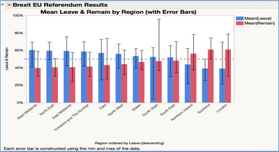
So maybe being able to see the variation in the vote across the UK would help us to better judge how decisive were the actual results. We were able to get access to the official Brexit voting results as reported by the BBC on their website at http://www.bbc.com/news/politics/eu_referendum/results. You can access this data in JMP 12 exploratory analytic software format at the following link on our JMP User Community File Exchange at https://community.jmp.com/docs/DOC-10015. While the overall reported results seemed close with 51.9% voting for “leave” and 48.1% voting for “stay” (only a 3.8% difference), we can see more details by drilling down into the vote by region.
In the chart above, we created a Bar Graph by Region and ordered it first by the regions with the largest “leave” votes. We also drew a reference line at the 50% to help see the overall decision of the of the majority of the voters in each region by voting area percentage. It can be seen that only Northern Ireland, Scotland and London voted under 50% to leave. But by looking at the length of the added Error Bars we can see that there was quite a spread between the minimum and maximum votes among area voting within the regions. Even if we excluded the Gibraltar vote in the South West (where this remote British output wanted to remain in the EU for strategic political reasons and voted only 4.1% for an exit), there seems to be more study needed due to the large size of many of these indicators of variation among votes within the regions. Therefore, what we need is a better way to visually compare the shape of the variation within the regional referendum vote!
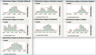
To accomplish this view, we first further combined the English regions into larger categories (Northern England, English Midlands, Southern England) and combined this with London and the separate UK countries to form what we can call region 2. Then we fit a Normal Distribution for each region 2 and saved the density formula for each of the fits to our data table (see the Distribution Region 2 graphs below). While other distribution fit types could have been applied and tested to find the absolute best fit, we chose the normal distribution to allow a nice symmetrical visual representation of the data for graphing purposes.
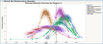
Now with this additional info, we can overlay the distributions for each of these high level regions onto the same graph. In addition to drawing the outlines of the distributions and plotting each within-region area voting point on the graph, we can also shade the areas where more of the data is clustered. See the Normal Density Overlay by Region 2 graph below.
From studying the graph above it seems that outside of the separate remain voting behavior of Scotland and Northern Ireland (which both had strong country wide national interest in remaining in the EU) and the London metro area (which is the home to and benefits from a large amount of international business and young graduates/professionals), the whole of England (from North, to South, to Midland) and Wales overwhelming voted above 50% to leave the EU. This seems to give some credence to the reality that the bulk of English and Welsh voters were not on the fence on this vote and solidly wanted and voted for an EU exit. Whether this came down to anti-establishment resentment, mounting fears on hot topics like EU bail-outs and immigration policy, or just the better effectiveness of the “leave” campaign, it shows a far more united voting block of UK voters that voted for an exit. Note that you can access the data and run the scripts in JMP 12 exploratory analytics software for all the graphs shown above at the following link on our JMP User Community File Exchange at https://community.jmp.com/docs/DOC-10015.
Perhaps the only truth is that things are always changing and this most likely isn’t the first nor last time we will be surprised by large changes in our lifetime. So in the face of this and future changes, at the end of the day we will all need to roll up our sleeves and try to make the best of change, no matter how we personally feel about it. As Bob Dylan signs in his classic protest song;
“Come gather 'round people
Wherever you roam
And admit that the waters
Around you have grown
And accept it that soon
You'll be drenched to the bone
If your time to you
Is worth savin'
Then you better start swimmin'
Or you'll sink like a stone
For the times they are a-changin'”
Now time to get back to the homestead and prepare for the risk from that potential “Texit” vote!
- © 2026 JMP Statistical Discovery LLC. All Rights Reserved.
- Terms of Use
- Privacy Statement
- Contact Us


You must be a registered user to add a comment. If you've already registered, sign in. Otherwise, register and sign in.