There is no doubt that plenty of folks are moving to Texas, especially in my lovely city of Austin. But popular sentiment around town is that all of our new residents are invading from California. Usually the story goes that they are selling their small Californian homes (“McShacks”) for big bucks and then spending it on huge homes and property around town (“McMansions”). Therefore California transplants are often the scapegoats blamed for the cause of rising local house prices and property taxes! A recent article in my hometown sure thinks so! In an article titled “Migration Continues to Raise Area Home Values,” it shows the top migration to Austin, Texas in 2013 from other states, with California coming out on top by a wide margin over the next largest groups coming from Florida, Illinois, Arizona and New York. Check out the article here (http://communityimpact.com/2015/07/01/migration-continues-to-raise-area-home-values/)
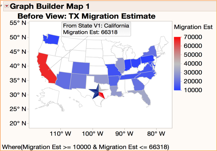
However these numbers are by no means standardized for fair comparisons. California is one of the most populous states in the US, so it would make sense they would have higher total migration than a smaller populated sate, such as Arkansas! To generate a normalized view, first we needed to get an honest pull of the data. While I couldn’t get the same data showing direct migration into the counties comprising Austin, I was able to get census data showing the migration into the entire state of Texas from other states. My data came from the publically available Census 2013 American Community Service State to State Migration Data (https://www.census.gov/hhes/migration/data/acs/state-to-state.html). Next we created a regular US State Map in JMP Graph Builder where we looked at the leading states that contributed at least 10K or more of estimated migration to the state of Texas. See Graph Builder Map 1 – Before View: TX Migration Estimate below. Predictably California stands out as the biggest source of migration to Texas!

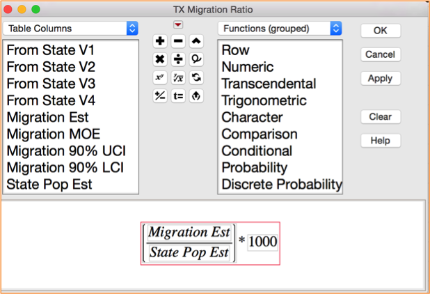
Next in JMP we created a normalized measure by creating a formula where we divide the Migration Estimate by the State Population and then multiply it by 1,000. We called this the TX Migration Ratio and it reflects the total number of migrants out of 1,000 people that came to Texas from another State! See below for the actual formula set-up in JMP.

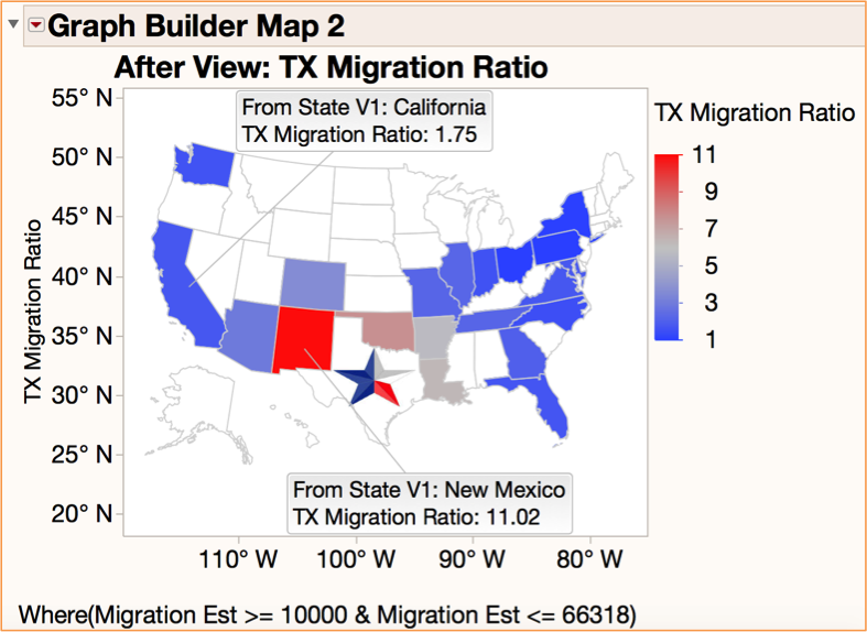
Now we can generate a much more fair chart by plotting the new TX Migration Ratio! Now California does not look as big a normalized migration source as the states surrounding the “Lone Star State” like New Mexico, Oklahoma, Arkansas and Louisiana. See Graph Builder Map 2 - After View: TX Migration Ratio.

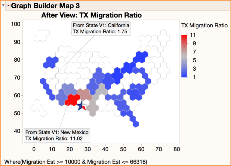
Also I had recently read the excellent JMP User Community Blog on Hexagonal and Square United States Maps for Graph Builder contributed by nathan.weatherly. In this posting Nathan provides additional state mapping types (hexagonal, square, etc.) in order to show US mapping fairly without discriminating the visual based on differences in the geographic sizes of the states! So if we have already normalized the statistic, perhaps one of Nathan’s maps would provide for a better view! See the Graph Builder Map 3 - After View: TX Migration Ratio.

While there are probably other good ways to better standardize this data, the lesson is to challenge conventional views and always think about better ways to represent and visualize important data. In this case it might even change our thoughts about any imminent California invasion of Texas! As a fellow migrant from Georgia to Texas over eighteen years ago, I will say “Howdy” to my new neighbors from California and echo the words of Lyle Lovett who penned the appropriate song lyric “That’s right, you’re not from Texas, but Texas wants you anyway!”