By Chris Kirchberg & Scott Wise – JMP Global Enablement Team
Many customers have recently asked how to create Volcano Plots in JMP. The Volcano Plot is a popular graph that is utilized when screening many p values and mean comparisons between two conditions. Used heavily in clinical and genomic research, it is also a very strong screening tool in industrial settings where many parameters are measured.
The value of using a volcano plot it that it not only lets you quickly see the most significant p values of interest (seen from the -Log of the p values plotted on the Y axis), but you can also get a sense of the direction and strength between the comparisons (seen from the location on the Difference or “Fold Change” plotted on the X Axis). For example, the points indicated in the graph below with the arrows below would represent comparison pairs with highly significant p values and large directional differences.
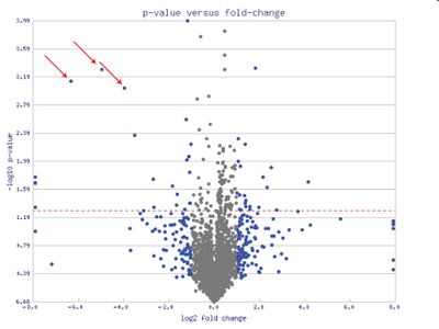 Volcano Plot (Source: Wikipedia)To create a volcano plot in JMP, you can get all the necessary calculations calculated for you from the Response Screening Platform. To demonstrate the steps to follow we will use the JMP Sample data file “Drosophila Aging” which looks at microarray gene expression data on fruit fly (Drosophila melanogaster) aging effects by strain (called Line in the data). First we went to the Process Screening platform (under Analyze – Modeling - Process Screening in JMP 12 and under Screening – Process Screening in JMP 13). This will allow us to explore the relationships between may pairs of variables. In the platform dialog, put in all the continuous columns to compare (from log2in_TMS1 to log2in_CG11317) into the Y Response box, and the Line into the X box. Note that the Volcano Plots often work best when the columns to measure have already been transformed into their log values (as this makes it easier to graph), but it is not always necessary to do so in your raw data.
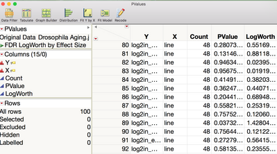
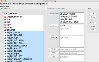 Then hit OK to run the Response Screening that will give us the “Line” comparison for each column. This provides a Response Screening window and a separate P Value table. This table will give us the P Value data for the Y Axis of our Volcano Plot.
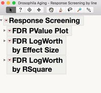
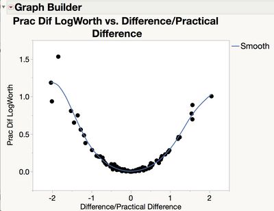
 We then select the Save Compare Means under the Response Screening window header red triangle are. This opens a new untitled table with many numeric details of the means comparisons. We now have the Difference column that we can plot on the X axis of our Volcano Plot. Notice as well there is a pre-scripted graph saved to this data table that shows Practical LogWorth by Relative Practical Difference. While this is a similar graph in some ways, it is not the same as the Volcano Plot as it is made to graph Practical Differences and Practical Logworth comparison statistics. As these “Practical” calculations are not vital for making the Volcano Plot, we will focus instead on just what we need from the tables.
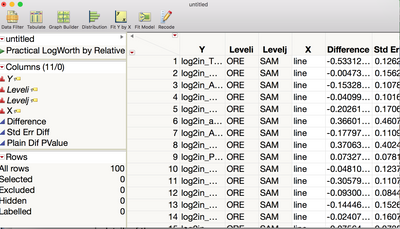
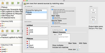
To get all the needed data from these two tables into one location to graph, we did a Column Join from the Tables Menu to merge the Untitled table with the PValues table. We set up this dialogue box to match on the common “Y” column which contains the comparison column ID and end up with a new “master” table that we called Volcano Plot Data. Now we have access to both difference data and p value data to make our desired graph.
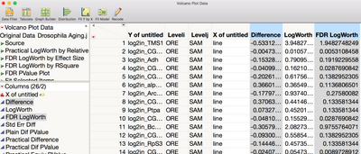 All that is left is to do is to open the Graph Builder and create our Volcano Plot. With the information on this combined table, there are many options for the type of Volcano Plot we can create. First step is to open a blank Graph Builder from the Graphs Menu. Then we dragged in the Difference column over to the X Axis. For the Y Axis, we then have a choice of using the LogWorth (the –Log 10 of the comparison p value) or the FDR (False Discovery Rate) LogWorth (the same log values against a more conservative estimate of the p value that minimizes the chance of false discoveries). We prefer using the FDR LogWorth and dragged that over to the Y Axis. The last move was to put in a reference line on the Y Axis to help surface our significant FDR P value points. By right clicking on the Y Axis of the graph, we put a reference line at 1.3 which is the FDR LogWorth level that would equal 95% confidence in significance (a p-value cutoff of ~0.05).
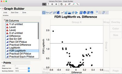 From the chart below we can see that only two points (log2in_TMS1 = 1.948 FDR LogWorth and log2in_BcDNA_GH06717 = 1.367 FDR LogWorth) are above the reference line of FDR LogWorth 1.3 (more than 95% confidence in the statistical difference in the mean comparison). Also, we can tell from the direction Difference that in both cases the “SAM” Line mean is smaller than the “ORE” Line mean as indicated by the negative values. Lastly the magnitude of the Difference would tell us that the farthest significant point (log2in_TMS1 = -0.533) has a greater difference than the next significant point (log2in_BcDNA_GH06717 = -0.319).
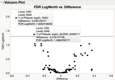
In short the Volcano Plot helps visualize level mean comparisons among many columns of measures so we can quickly pick not only what is significant, but also how big and in what direction are the differences!
You must be a registered user to add a comment. If you've already registered, sign in. Otherwise, register and sign in.