- JMP User Community
- :
- Blogs
- :
- Scott Wise
- :
- “How Domestic is My Car?” (Graph and Dashboard Exploration)
- Subscribe to RSS Feed
- Mark as New
- Mark as Read
- Bookmark
- Subscribe
- Printer Friendly Page
- Report Inappropriate Content
Source: #163706 @ www.pexels.com
Recently there has been quite a bit written about the potential effects of current political trade-war tariffs that can cause rises in the prices of parts and goods exported from many countries. In particular, many warn of the risks posed to the supply chains of many major US manufacturers, especially those in the automobile industry. A particular CNN Money blog that caught our eye was even titled “Every US-made car is an import. That’s bad news for automakers.” (https://money.cnn.com/2018/07/02/news/companies/auto-tariffs/index.html). The article asserted that all US based automakers have a large percentage content of foreign sourced parts in their car lines. This means that new tariffs that increase prices for imported auto parts would ultimately raise the costs of finished vehicles for the maufacutrers. The article even provided a link to the NHTSA (National Highway Traffic Safety Administration) website that provides the underlying public data showing the percentage of domestic and international parts for all 2018 carlines that can be bought in the US. (https://www.nhtsa.gov/sites/nhtsa.dot.gov/files/documents/2018_aala_alpha_06262018.pdf). This provided us a golden opportunity to use a new graph type and dashboard view in JMP exploratory analytic software to test out this article’s assertion and even get a peek into how much foreign parts are in the very cars we personally drive!
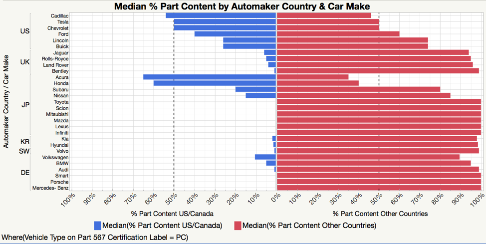
The NHSTA dataset had information on over 719 car lines sold in the US in 2018. This much info would make it difficult to see trends in the data just by scanning the table or using standard graphing views. One graph that may be of help is a special version of a horizontal bar chart called a “Butterfly Chart.” With two bars drawn in opposite directions over the same measurement scale from a line in the middle of the graph, the resulting shape can often remind one of the shape of butterfly wings! But the real value of this view is in its ability to allow for fast visual comparisons between two variables! In our Butterfly Chart for Median % Part Content by Automaker Country & Car Make for Passenger Cars in the data set, we can easily see for each car make the % domestic (US/Canada) part content on the left (blue bars) compared to the % foreign (Other Countries) part content on the right (red bars). This view alone seems to validate the story line in the article that there really is no car you can buy that has 100% domestic (US/Canada) parts!
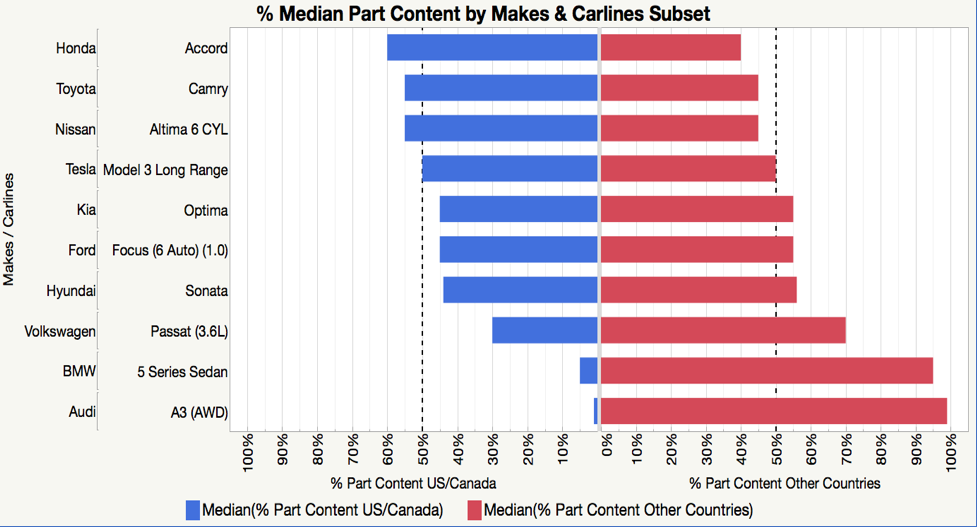
Looking at the 50% dashed reference lines, we can see that most American car makes were in the range of only 40 to 60% domestic (US/Canada) total part content. Interesting is that two Japanese car makes (Honda and Acura) were also above the 50% US/Canada Part Content. However, this view uses medians to summarize the part content across an automakers total car line. So, let’s explore deeper by looking at just a subset comparison of ten popular sedan models. Looking at the % Median Part Content by Makes & Carlines Subset, we see that some foreign automakers (like Honda and Toyota) can contain as much or even more % domestic (US/Canada) part content as even US automakers (like Ford and Tesla)! However, some foreign automakers (like Audi & BMW) have very little % domestic (US/Canada) part content at all.
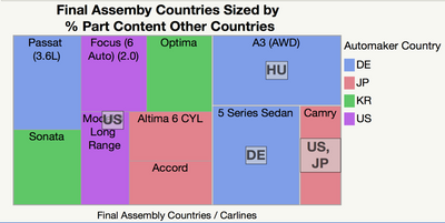
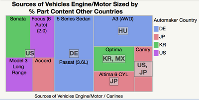
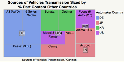
To understand better why this might be, we have additional information in our dataset giving the source countries for final assembly, engine/motor, and transmission. We switch to a different graph type call a Tree Map that will allow us to create boxes sized by % of part content from other countries, grouping them within the country where assembly or major components came from, and all colored by the automaker’s home country. As seen in the series of three graphs below, we can now look at a low % foreign part content car like the Honda Accord and see that it is not only assembled in the US, but engine and transmission sources all come from the US as well. However, a high % foreign part content car like the Audi A3 is assembled outside the US (in Hungary), with the motor and transmission coming from abroad as well (in Hungary and Germany).
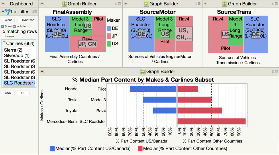
Now for the fun part! Data should be interactive, and we can build a simple JMP Dashboard using the above graphs and a filter. Then we can explore the percent domestic vs. foreign part content in the cars that we drive! See below for a Dashboard that compares four car makes driven with my extended family! In this case my Sister has the most domestic car of the bunch with her Honda Pilot!
If you would like to try making your own selections and see how the cars you drive stand up, please see the following links:
1) Interactively access and view the Butterfly Chart with Data Filters using the new JMP Public site (the new platform for sharing JMP data, visualizations and dashboards).
2) To access the data with all graph and dashboard (scripts) see the JMP Community File Exchange: https://community.jmp.com/t5/JMP-Sample-Data/How-Domestic-is-My-Car-Data/ta-p/70223.
In summary, we now have a much better understanding that building cars often involves getting parts from around the world and this can have a huge impact for automaker part costs depending on sourcing/assembly decisions and changes in global tariffs. Truly the more successful manufacturers in the future will be those who can figure out how to best navigate this challenging business landscape! In the meantime, I’ll just enjoy driving through the small towns of the Texas Hill Country and probably hum a few lines of the classic Robert Earl Keen song “The Road Goes on Forever” which ends with:
“She pulls back onto Main Street in her new Mercedes Benz,
The road goes on forever and the party never ends”
You must be a registered user to add a comment. If you've already registered, sign in. Otherwise, register and sign in.
- © 2024 JMP Statistical Discovery LLC. All Rights Reserved.
- Terms of Use
- Privacy Statement
- About JMP
- JMP Software
- JMP User Community
- Contact

