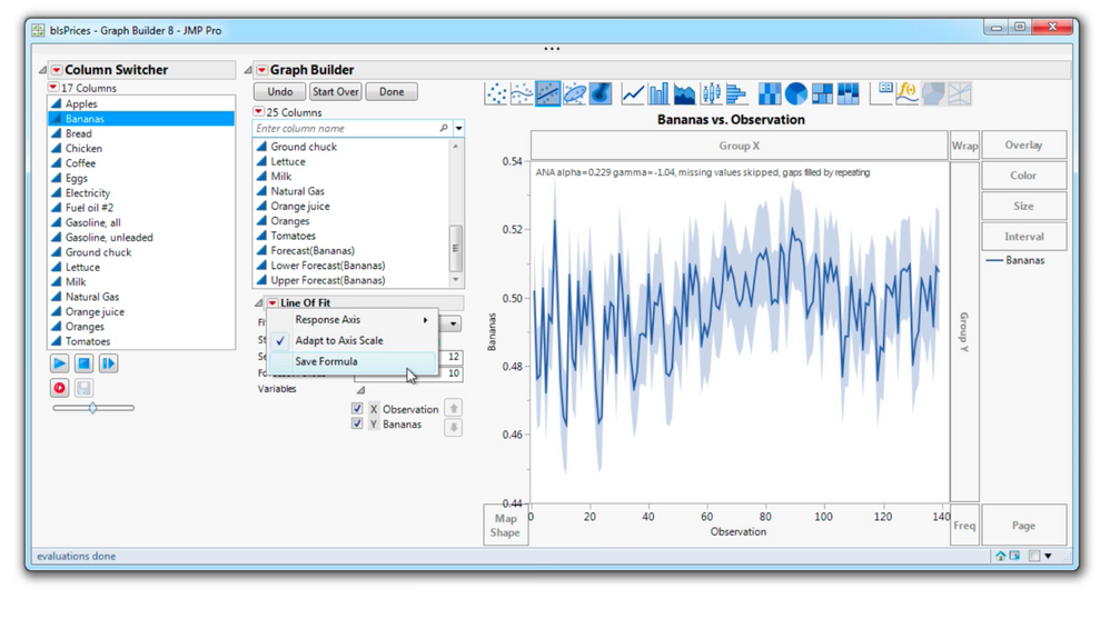
The primary graphing platform in JMP keeps improving. Using the enhanced Graph Builder means new graphs, including time-series forecasts, more customization options for existing graphs, and the ability to drill down for more detail using graphlets.

For Line of Fit, You can Save a formula of fit.
For the Smoother, you can Save a Smoother formula and control bumpiness with more precision.
In the font preference group looks for the Graph Label, Legend, Graph Title, and Caption enhancements.
There's now additional customization for Heatmaps, Treemaps, and Boxplots.
There's extended capabilities for the Line element, including the ability to make Area plots.

The Time Series Forecast in Graph Builder includes options for the
number of seasonal and forecast periods and allows a basis for a column-switcher-driven series of forecasts.
And let's not forget the powerful hover windows or Custom graphlets for drilling down into your data added by right-clicking in Graph Builder.
Here in Graph Builder, I'm showing the Burglary rate for each stat, but I'd also like to see if Total Crime is going up or down in that State or a trajectory. To visualize that additional graph, I made a separate Graph Builder showing the rate by year. Next, I copied the script to the clipboard, then went to the original graph and right-clicked and selected Paste Graphlet. Now when I hover over a State area, a hover graph appears of crime rate by year and changes as I hover around. And Good news, it looks like most crime is generally going down.

Launch Graph Builder now to view all of these powerful enhancements.
You must be a registered user to add a comment. If you've already registered, sign in. Otherwise, register and sign in.