I looked at data on all US domestic flights for 2008 to find out when is the worst time of the year to fly.

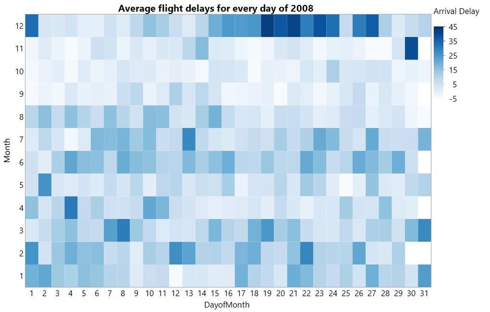
The heatmap above was plotted using JMP’s Graph Builder from millions of rows of data and tells you about seasonal variation in average flight arrival delays.
The dataset used has 1 row per flight, which means over 7 million rows of data. For each flight we have the departure date, the scheduled departure time, the airline carrier and much more.
Month of the year was plotted on the Y-axis and day of the month on the X-axis. Each cell is one day of the year. The colour, sorry, the color (we are dealing with American data here) of the cell tells us about the average arrival delays for flights on that day: strong blue for the longest delays.
Can you see when is the worst time of year to fly? No big surprise that the days around Christmas are a bad time. Early September to late November seems like the best time of year. On some days in autumn fall 2008 flights were arriving ahead of schedule, on average.
I’m writing this on the 22nd November 2018 – Thanksgiving. Thanksgiving 2008 was the 27th November. I can see from the 2008 data that the following Sunday and Monday (30th November and 1st December) were bad days for delays.
If you are currently away for Thanksgiving in the US, I wish you luck with your journey back.
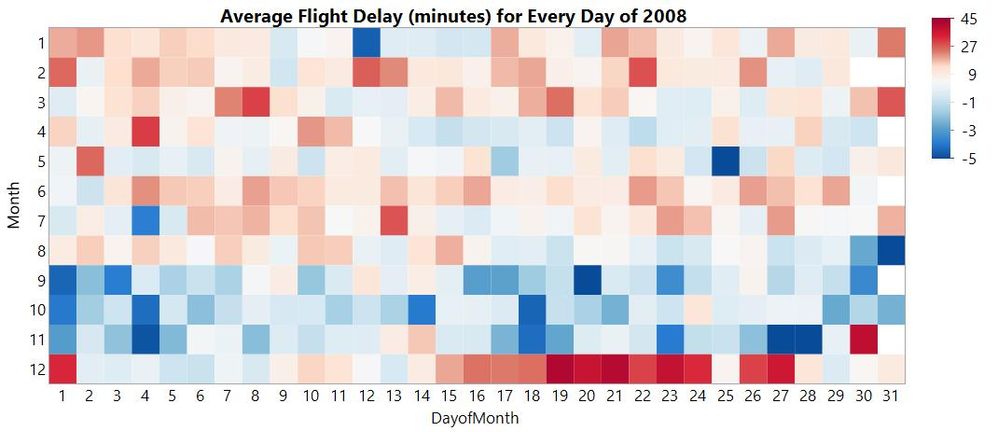
Here is an alternative view with "bad" travel days in red and days where flights arrived early (on average) in blue.

I also reversed the order of months so it looks more like a familiar year planner. Do you think it works better?
You can interact with some of these analyses in JMP Public. Including this distribution plot:
Click on the delay categories to get a sense of which days of the week and months of the year are the best and worst for flight delays.
Here is a quick video to show how quickly you can visualise this large dataset with Graph Builder in JMP.